
Success Stories
Delivering insights-based, award winning solutions so our clients evolve, grow, and succeed.
-

Pan-PATH & mychoice™ – Fox Chase Cancer Center
Increasing accessibility to bilingual patient education and empowerment resources for underrepresented patient audiences
- Content Strategy
- UX Design
- Website Design
- Messaging & Positioning
- WordPress Design & Development
-
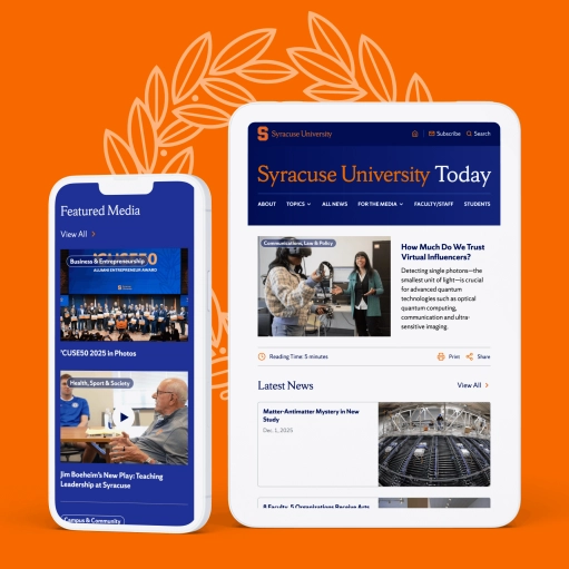
Syracuse University Today
Better UX, content strategy, and multimedia features boost engagement and visibility for a major higher ed news website.
- WordPress Design & Development
- Audience Research
- Usability Testing
- Website Design
- Analytics & Site Performance
- Content Strategy
-
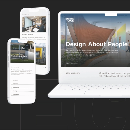
EwingCole
EwingCole is an award-winning provider of architecture, engineering, interior design, and planning services for some of the nation’s most noteworthy venues and facilities.
- WordPress Design & Development
- Search Engine Optimization (SEO)
- Website Support & Maintenance
- Content Strategy
- UX Design
-
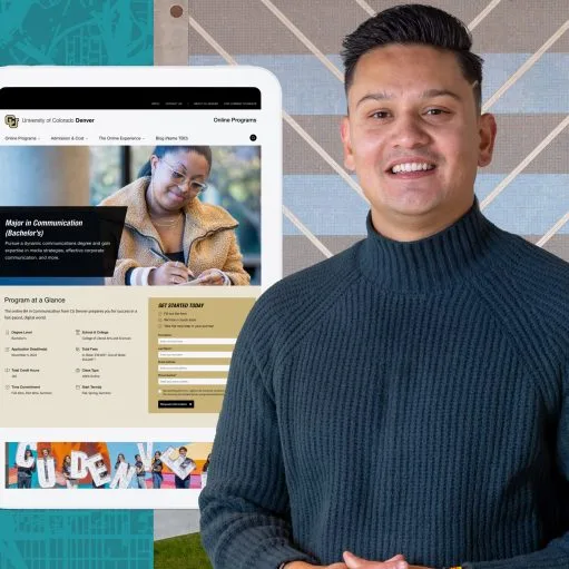
The University of Colorado (CU) System
A series of comprehensive website redesign projects puts compelling and accessible user experiences front and center for Colorado’s largest institution of higher education.
- Drupal Design & Development
- Analytics & Site Performance
- Search Engine Optimization (SEO)
- Website Support & Maintenance
- Content Strategy
- Audience Research
-
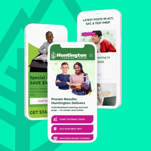
Huntington Learning Center
A multi-site WordPress design framework, UX & content strategy boost engagement and conversions for 275+ sites across a national corporate franchise system
- WordPress Design & Development
- Search Engine Optimization (SEO)
- Website Support & Maintenance
- Content Strategy
- UX Design
- Audience Research
-
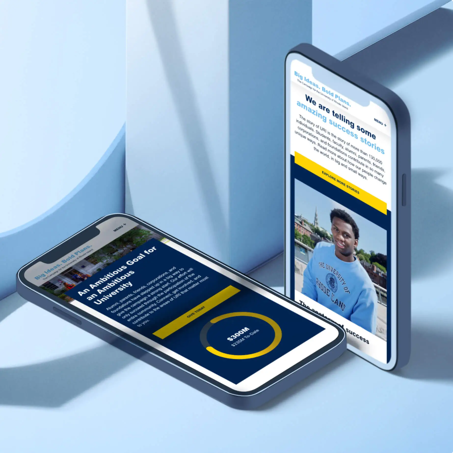
University of Rhode Island Foundation & Alumni Engagement (URIFAE)
Two future-focused websites boost connections and support for a dynamic public R2 research university
- WordPress Design & Development
- Content Strategy
- UX Design
- Audience Research
- Messaging & Positioning
- UX Research
-
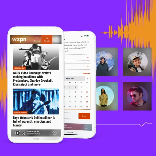
WXPN
Research-infused digital strategy and connected brand ecosystem for a nationally recognized public radio leader
- Other Content Management Systems
- Website Support & Maintenance
- Content Strategy
- UX Design
- Audience Research
- Messaging & Positioning
-
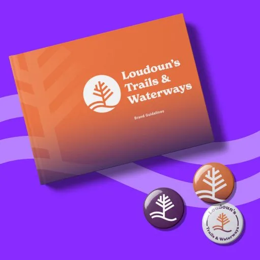
Loudoun’s Trails & Waterways
A naming, visual identity & branding initiative spurs community adoption and engagement for an evolving park & trail system
- Audience Research
- Messaging & Positioning
- Identity & Brand Design
-
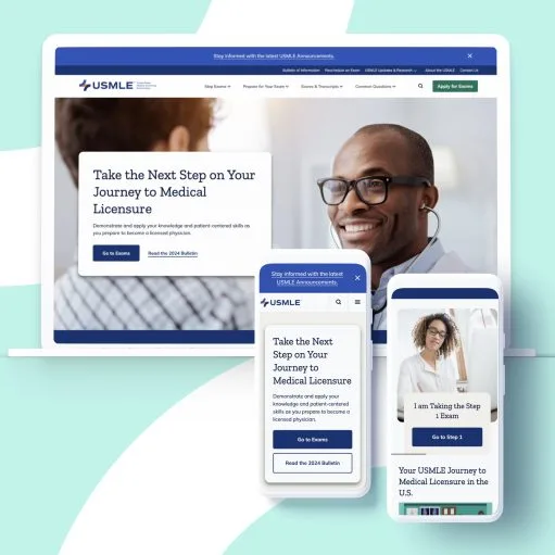
U.S. Medical Licensing Examination
Better wayfinding, site architecture, and content strategy lead to healthier med student testing & portal experiences
- Content Strategy
- Analytics & Site Performance
- UX Design
- Drupal Design & Development
- Audience Research
- Website Design
-
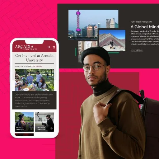
Arcadia University
Performance, UX & visual upgrades create a strong brand narrative for a top PA private university
- UX Research
- Web Application Development
- Website Support & Maintenance
- WordPress Design & Development
-
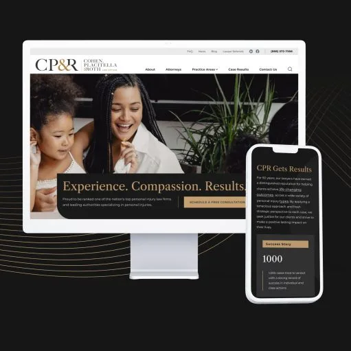
Cohen, Placitella & Roth
A polished digital presence & content strategy builds trust & connections for renowned personal injury law firm
- Content Strategy
- Audience Research
- Search Engine Optimization (SEO)
- Website Design
- Analytics & Site Performance
-
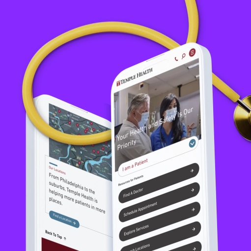
Temple Health
Enterprise web design, consolidation & optimization for a world-renowned hospital system
- Analytics & Site Performance
- Search Engine Optimization (SEO)
- Content Strategy
- Website Design
- UX Design
- Drupal Design & Development
-
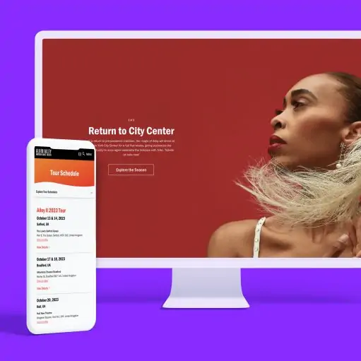
Alvin Ailey American Dance Theater
Alvin Ailey needed a partner to merge three legacy sites into one while upgrading from Drupal 7 to Drupal 8 to provide good user experiences, maintain future security, and support ongoing growth.
- UX Design
- Messaging & Positioning
- Analytics & Site Performance
- Drupal Design & Development
- Website Support & Maintenance
-
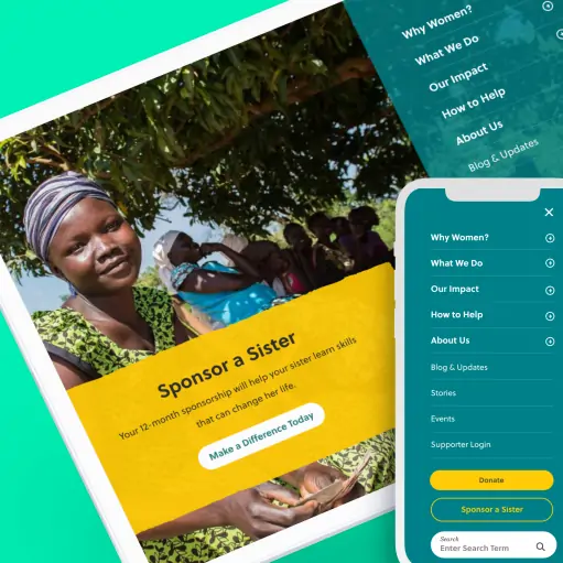
Women for Women International
Usability assessment, UX and conversion optimization drive vital donations for a global non-profit
- Content Strategy
- Website Design
- Drupal Design & Development
- Messaging & Positioning
-
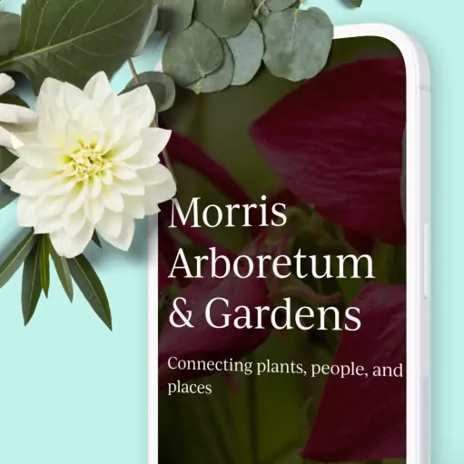
Morris Arboretum & Gardens
Thoughtful design and content strategy build better connections between plants, people, and places
- Audience Research
- Messaging & Positioning
- Content Strategy
- Website Design
- Drupal Design & Development
-

Neil deGrasse Tyson
An immersive experiential website boosts sales for a NYT bestseller from the world’s top astrophysicists
- UX Design
- Website Design
- Content Strategy
-
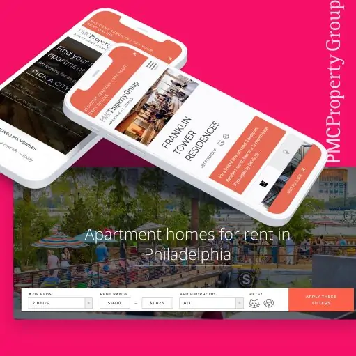
PMC Property Group
Wide-ranging branding, strategy, & promotion initiatives for one of the East Coast’s largest residential real estate development firms
- Content Strategy
- Identity & Brand Design
- Website Support & Maintenance
- Messaging & Positioning
- Website Design
- Analytics & Site Performance
-
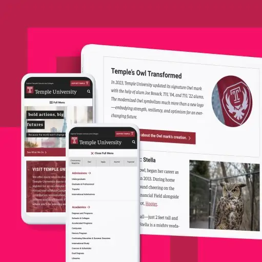
Temple University
Rethinking the digital student experience in the quest for strong higher ed enrollments.
- Content Strategy
- UX Research
- Usability Testing
- Web Application Development
- Analytics & Site Performance
- Website Support & Maintenance
-
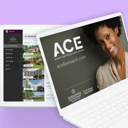
Berkshire Hathaway HomeServices Fox & Roach
Nationwide branding and promotion for a proprietary digital marketing suite for agents
- Content Strategy
- Audience Research
- Identity & Brand Design
- Messaging & Positioning
-
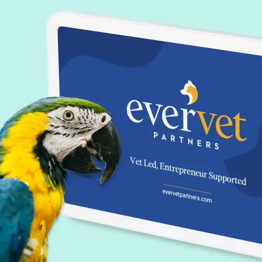
EverVet Partners
Comprehensive branding and growth strategies for a newly launched national veterinary acquisition and support firm
- Content Strategy
- Audience Research
- Messaging & Positioning
- Identity & Brand Design
- Website Design
- WordPress Design & Development
-
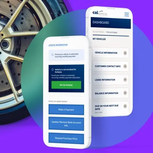
CAL Automotive
CAL Automotive has spent 30 years promoting effortless car leasing programs. Targeted UX & web app feature upgrades helped their keep that promise.
- UX Design
- UX Research
- Web Application Development
- Website Support & Maintenance
-
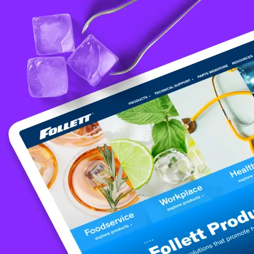
Follett Products
Future-focused web design, development, and lead-generation for a global B2B manufacturer
- UX Research
- Content Strategy
- UX Design
- Drupal Design & Development
- WordPress Design & Development
- Usability Testing
-
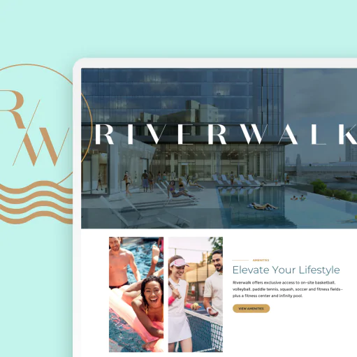
PMC Property Group — Riverwalk
End-to-end branding, design, and digital strategy for a luxury Philadelphia rental community
- Messaging & Positioning
- Website Support & Maintenance
- Identity & Brand Design
- Website Design
- Content Strategy
-
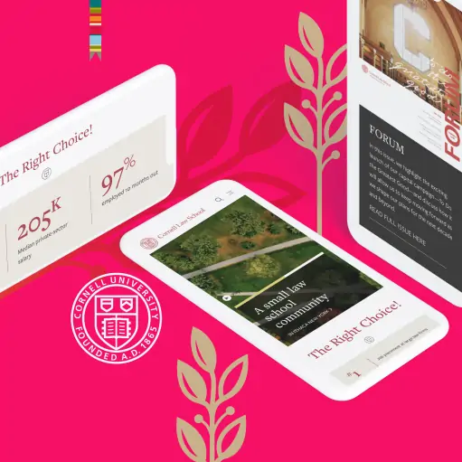
Cornell Law
Explore our user research, web design, and WordPress development project for Cornell University’s prestigious law school
- Analytics & Site Performance
- Content Strategy
- Website Design
- WordPress Design & Development
-
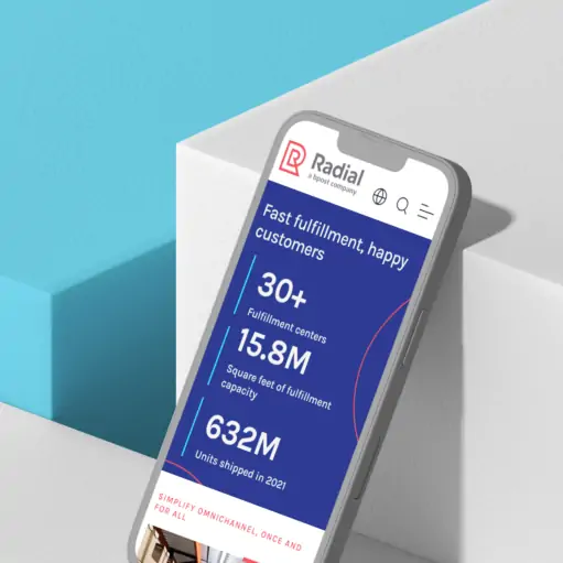
Radial
Global eCommerce growth is explosive – we partnered with Radial, a bpost company, to establish a stronger foothold
- Messaging & Positioning
- Content Strategy
- Website Design
- WordPress Design & Development
- Website Support & Maintenance
-
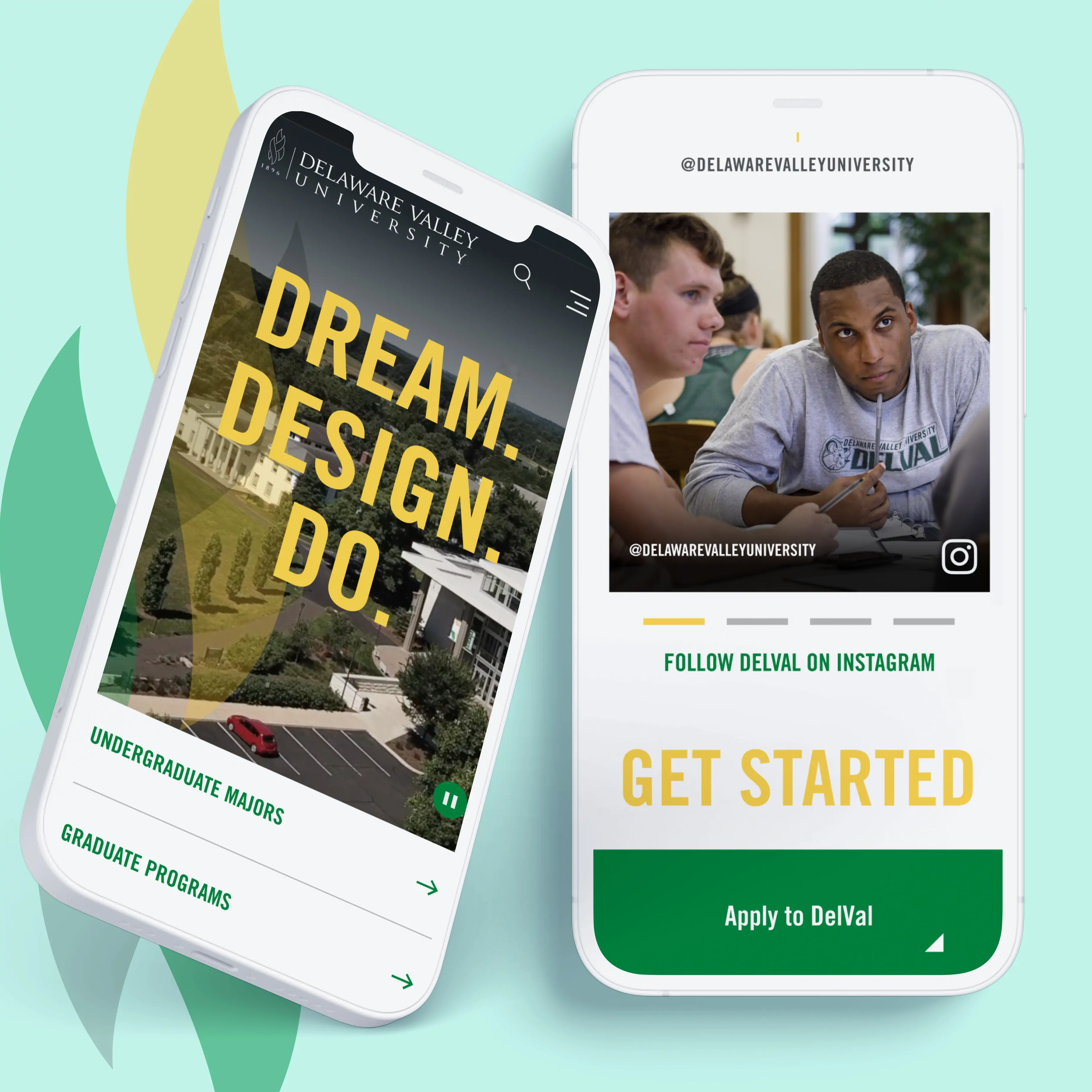
Delaware Valley University
An award-winning website boosts communication and enrollment efforts for an evolving private university
- Messaging & Positioning
- Analytics & Site Performance
- Content Strategy
- Website Design
- Drupal Design & Development
- Website Support & Maintenance
-
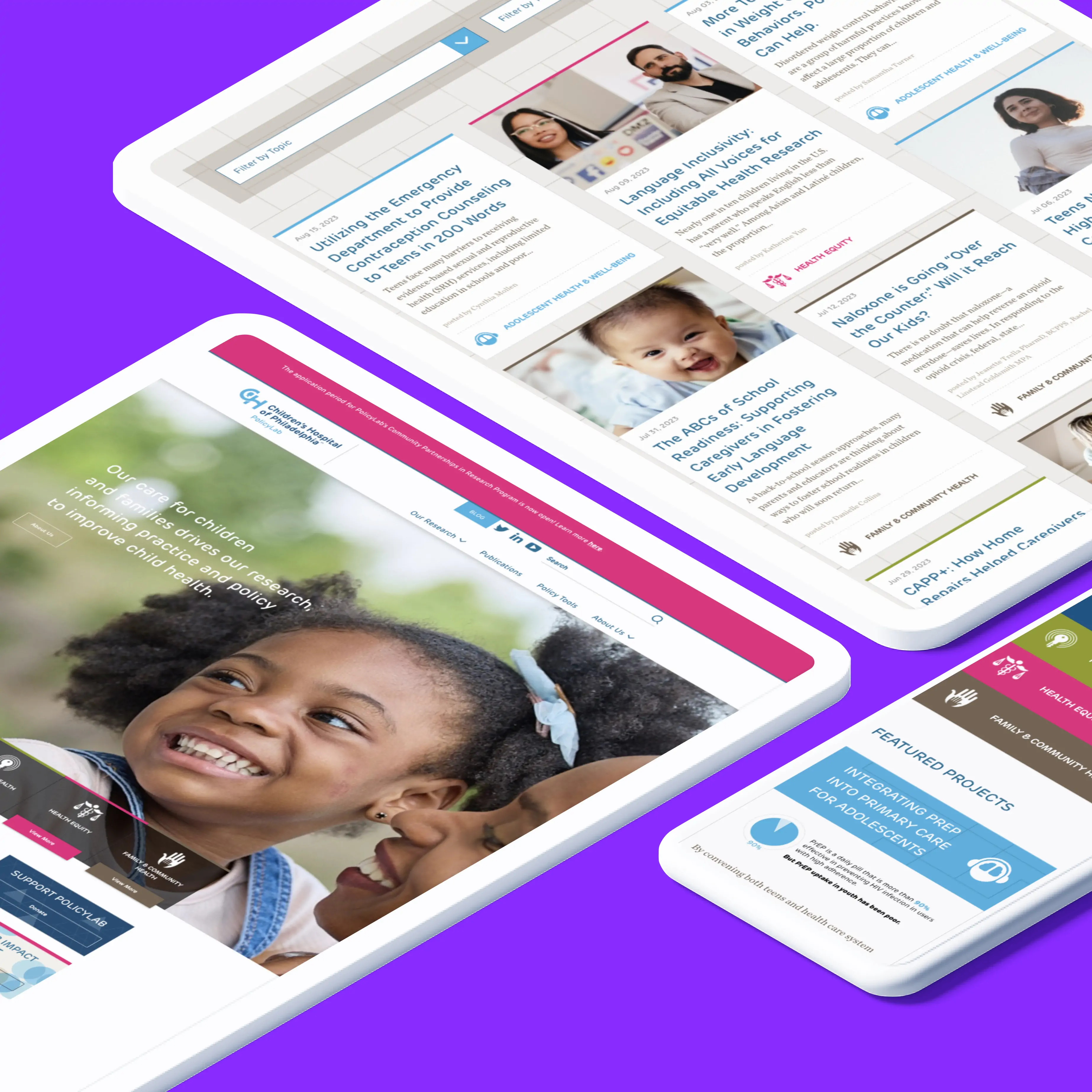
PolicyLab – Children’s Hospital of Philadelphia
Unified branding and better user journeys for a pediatric health research leader
- Identity & Brand Design
- Content Strategy
- Website Design
- Drupal Design & Development
- Website Support & Maintenance
-
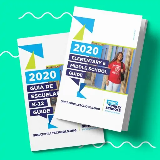
GreatPhillySchools
Amplifying user trust with bold & unified rebranding
- Identity & Brand Design
- Messaging & Positioning
-

Philadelphia Ballet
Brand promotion, strategy, and daring new creative for an iconic cultural institution
- Content Strategy
- Identity & Brand Design
-
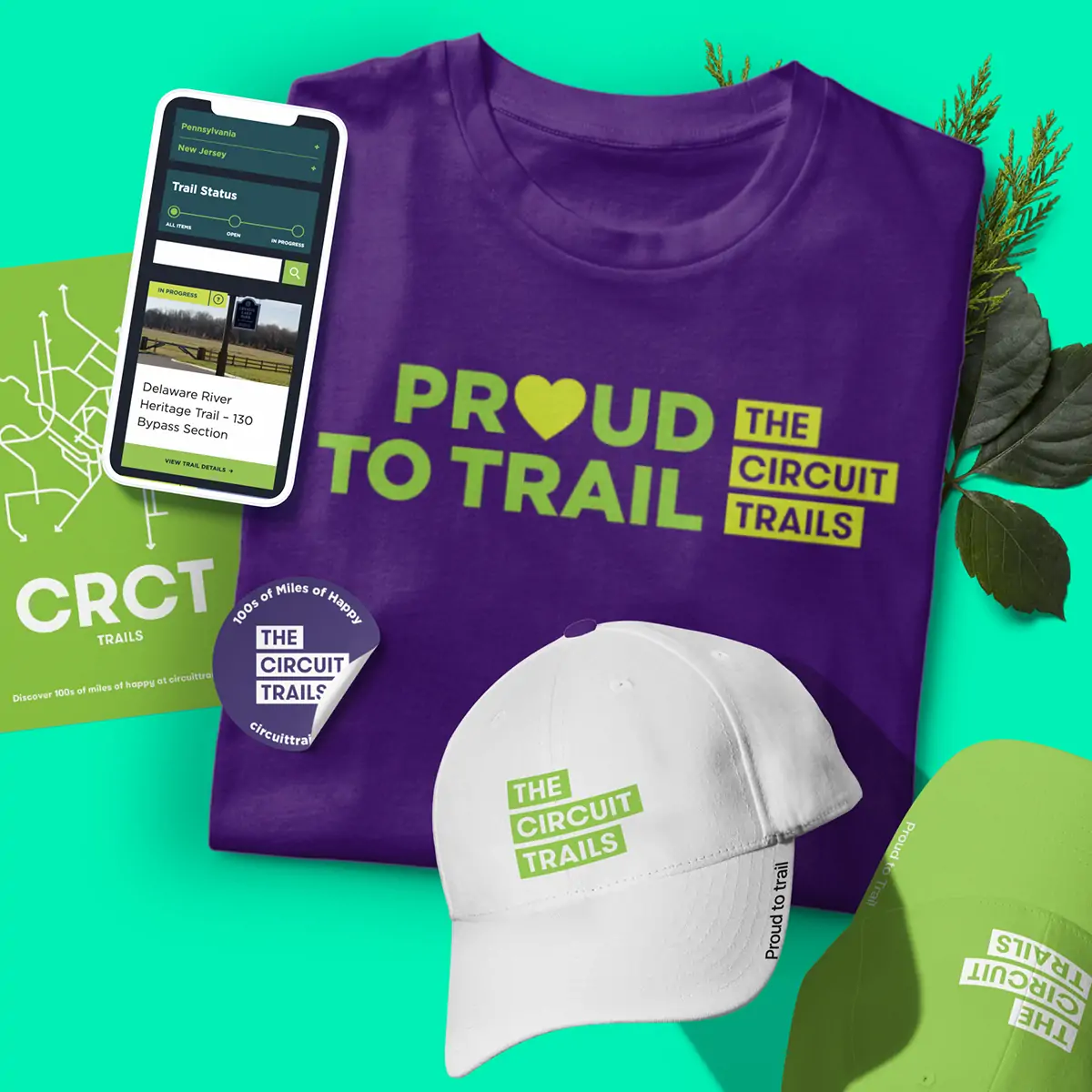
The Circuit Trails
Social influence and community fuel a comprehensive brand awareness campaign
- Audience Research
- Messaging & Positioning
- Identity & Brand Design
- Website Design
- Drupal Design & Development
Eastern Standard has worked with a variety of clients across many different industries.
- We work with colleges and universities such as The University of Pennsylvania, Cornell, Harvard, Penn State, Temple University, Arcadia University, Delaware Valley University, and Eastern University.
- We’ve worked with healthcare and hospital system clients such as Temple University Health System, Cooper Health, IQVIA, Children’s Hospital of Philadelphia, United States Medical Licensing Examination, and others.
- In the legal and law sector, our team has worked with Cohen, Placitella & Roth, Saul Ewing, and Marshall Dennehey.
- Our arts and culture clients include The Philadelphia Ballet, Alvin Ailey American Dance Theater, the Philadelphia Orchestra, and others.
- Our B2B clients include Radial, Follett Products, Motor.com, and others.
- We’ve worked with nonprofit clients like Women for Women International, ChildUSA, and Knowles Teacher Initiative.
- Our real estate clients include PMC Property Group and Berkshire Hathaway HomeServices.

