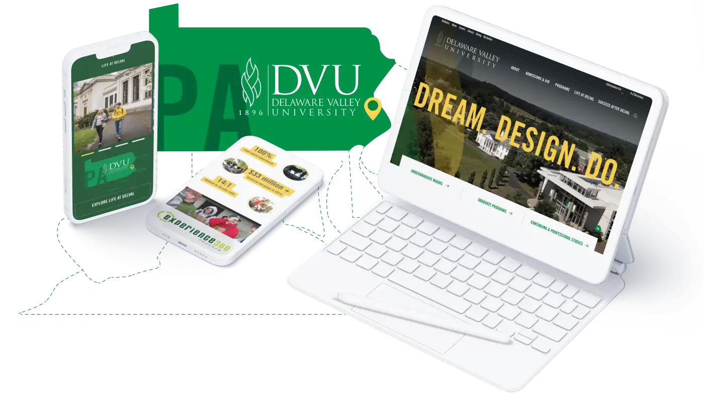
Delaware Valley University
An award-winning website boosts communication and enrollment efforts for an evolving private university
OVERVIEW
Delaware Valley University evolved from a small agricultural college into a formidable interdisciplinary university. They needed a modern digital experience to usher their web presence into the future.
DelVal prides itself on its beautiful campus, close-knit community, and commitment to real-world experiential learning for all. Their website needed to communicate all of these appealing attributes — and provide easy paths to information — to increase enrollment numbers in the highly competitive suburban Philadelphia higher education market.
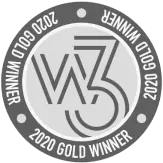
Awards
Pain Points & Challenges
The university’s legacy site wasn’t serving them well on a variety of fronts:
The architecture was difficult to navigate, creating a barrier to need-to-know entry information like financial aid and diversity metrics.
The content collection blurred lines between internal and external messaging and contained extraneous information with limited interactivity.
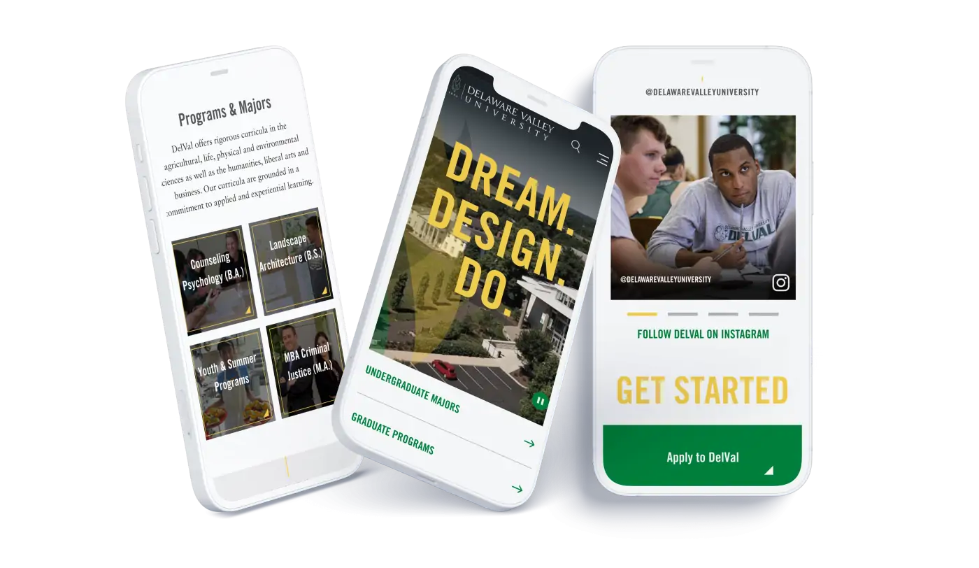
A dated design didn’t reflect recently updated brand standards and offered inconsistent viewing experiences on the mobile devices most often used.
Mobile is often the first — and only — medium prospective students use to evaluate a college before applying or moving on. Optimized digital experiences must be a top priority in higher education.
Discovery & Research
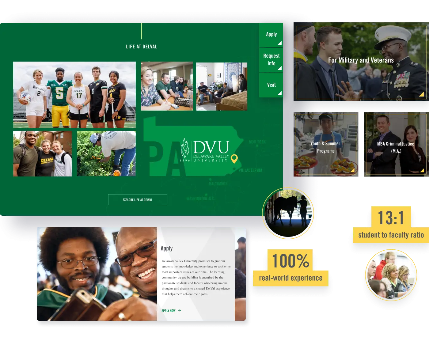
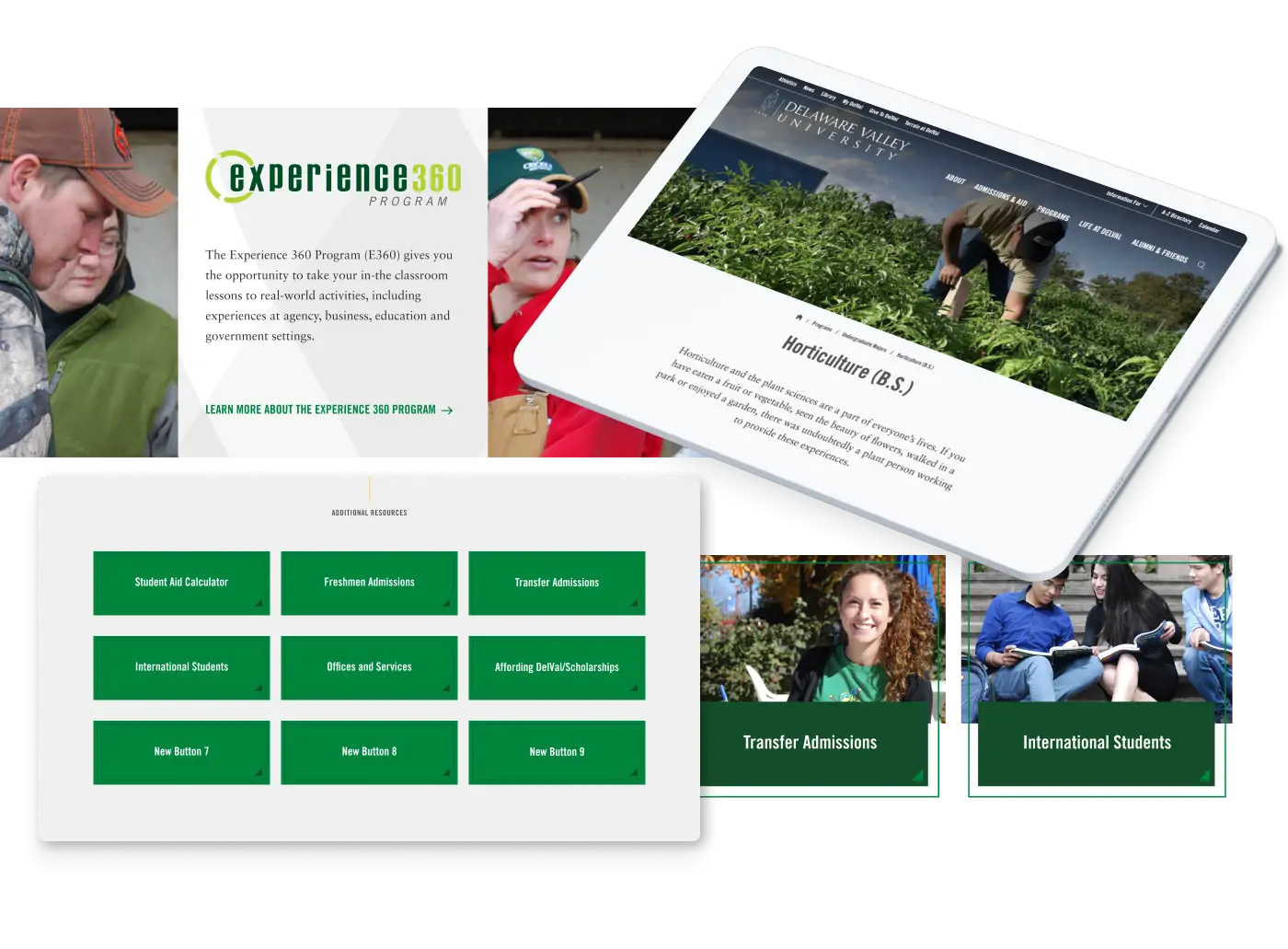
Stakeholder workshops showed that the university needed repositioning as more than “just an ag school” with robust academic offerings and close proximity to the huge employment hubs of Philadelphia and NYC. They needed to better leverage their differentiators: an award-winning E360 experiential learning program, accolades and faculty achievements, small class sizes, graduate programs, and employment rates.
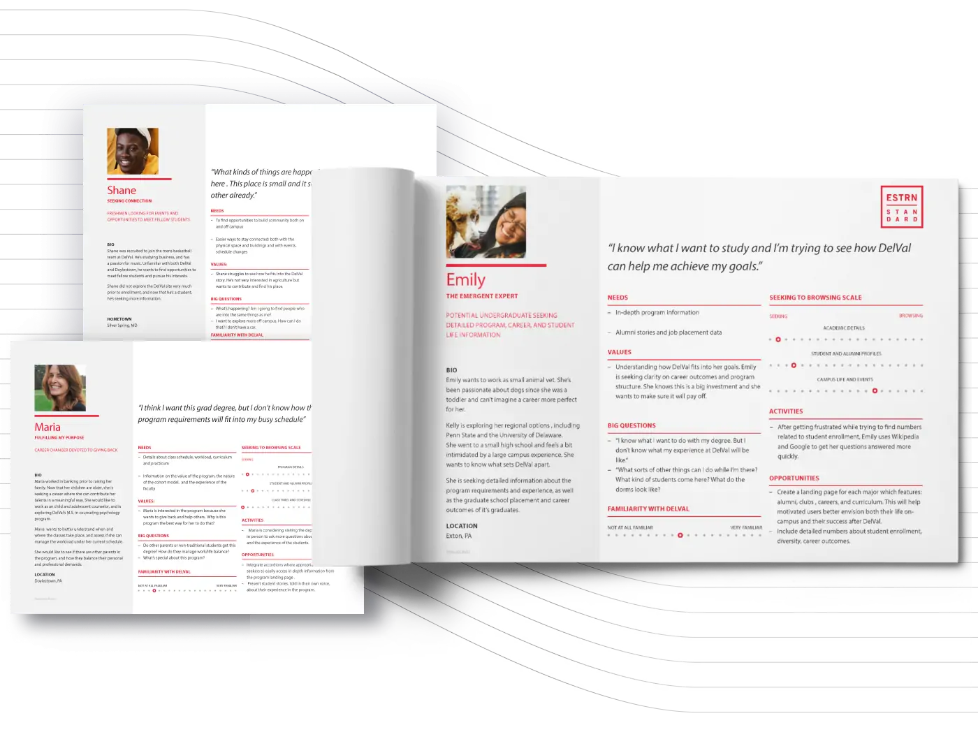
On-campus intercept interviews with current, transfer, and prospective students and parents identified UX barriers on the legacy site, as well as criteria that they considered critical to their evaluation process like diversity, program, and financial aid details.
Drawing on these findings and our experience in the higher ed market, we created detailed user personas, journeys, and a student lifecycle map showing how specific users would move through the site and third-party enrollment platforms based on their objectives and pain points.
Content Strategy
A detailed content inventory mapped DelVal’s legacy content to the new sitemap and earmarked copy to be created, migrated, revised, or deleted. A content workshop provided a vital North Star for an intensive copywriting phase, which we managed working with both DelVal’s in-house and contractor writing teams. To ensure that future revisions made by the teams align with the new standards, we provided training and companion guides covering brand voice, web writing for higher education, SEO/accessibility best practices, and more.
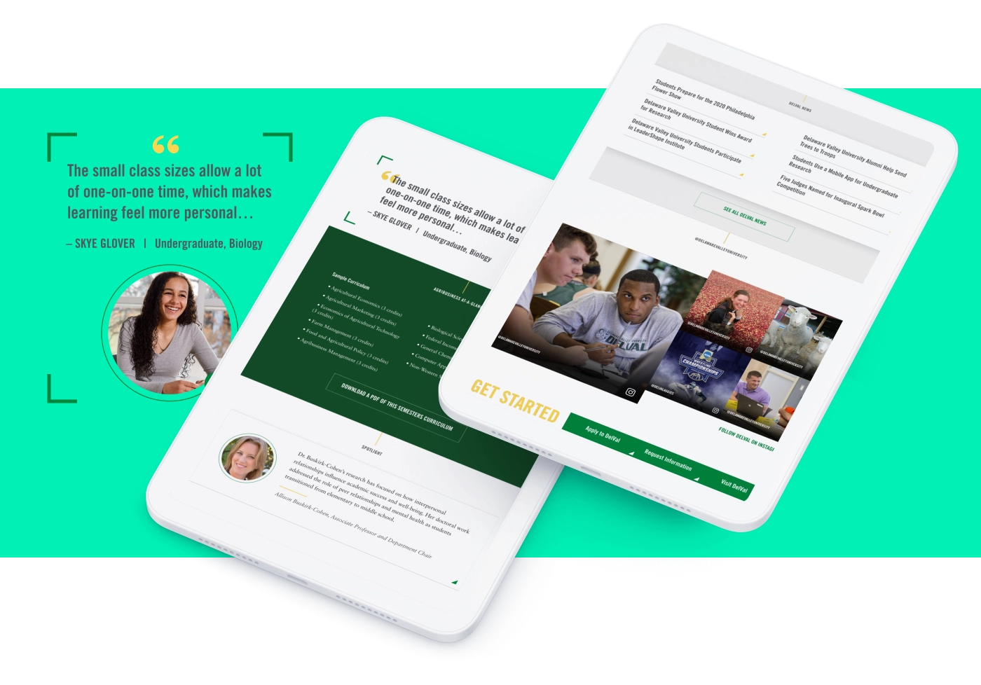
To provide big-picture context on program pages, we highlighted related career paths and featured program alumni in the context of their current jobs. We also pulled in direct quotes and featured faculty among program content to convey DelVal’s hands-on culture and tight-knit campus feel.
A custom Instagram component allows content managers to curate specific postings aligned with related audiences and majors pages — not just from DelVal’s account but also from students, clubs, faculty, and programs with dedicated accounts — helping students imagine themselves living and learning on campus.
User Experience & Web Design
The new Drupal site guides prospects through a compelling introduction to the school and its noteworthy accomplishments, leads them through to the application form, and ends with a look at success after DelVal — mirroring the real-world student journey. It also offers direct paths for other audiences like committed students and parents, grad students, and continuing ed seekers in need of quick access to deeper levels of granular information like course schedules, tuition details, dorm life, and more.
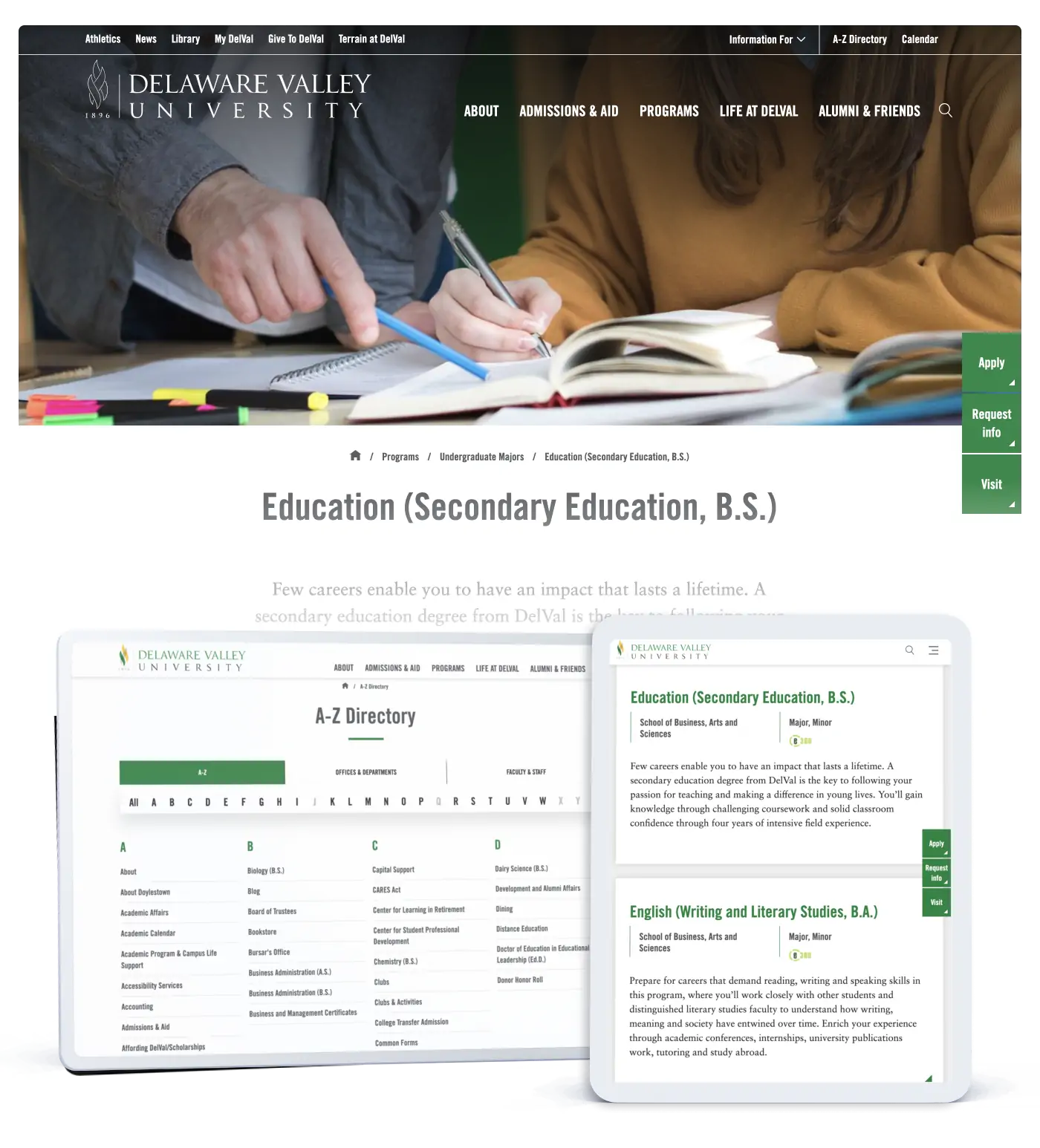
The bold new aesthetic and design maximizes readability and offers intuitive site architecture, a powerful search function, seamless integration with third-party platforms, and prominent and logically labeled “sticky” menus with clear CTAs. As a result, users quickly understand what they’re looking at, where they need to go next, and how to get there with ease.