
Cohen, Placitella & Roth
A polished digital presence & content strategy builds trust & connections for renowned personal injury law firm
OVERVIEW
CPR is a personal injury law firm on a digital mission: Capture more leads, generate more cases, and make a real difference in clients’ lives. They needed a nimble and collaborative agency partner to help them achieve those goals effectively.
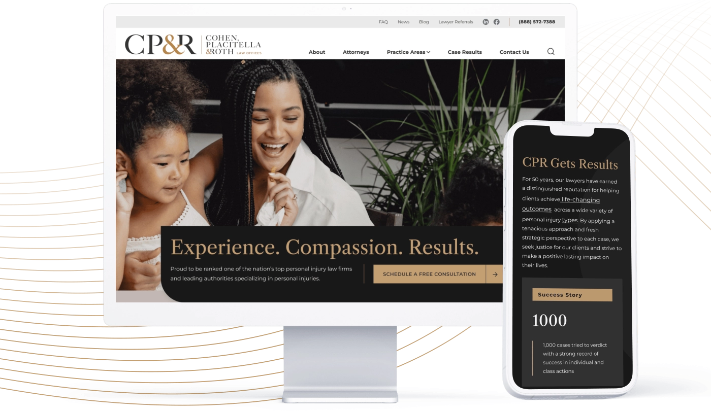
A top-to-bottom website overhaul helped them present a polished and trust-inspiring first impression, boost confidence for prospects and referrals, and educate users about their rights when it comes to personal injuries and legal claims.
SOLUTIONS: STRATEGY MEETS CREATIVITY
The client competes in a saturated increasingly national market notorious for aggressive marketing techniques that sow public distrust. CPR wanted to take the high road to focus on their ethical commitment to people and substantive social issues for which they can make a difference — a true departure from market norms.
We needed to build stakeholder alignment and consider complex concurrent initiatives that spanned everything from branding to content, SEO, UX, visual design, messaging, and digital marketing strategies, as well as their ongoing website management needs.
Because the client was rolling out new brand guidelines as the web redesign was getting started, they wanted to integrate their new brand identity and related elements into a legacy site reskin — a stopgap solution that would provide visual consistency across key graphic elements until the larger website redesign could be completed.
CPR BY THE NUMBERS
PAIN POINTS & CHALLENGES
To establish a cohesive baseline for goal-oriented content, we identified 20 key pages and created content prescriptions for each, identifying the key content needs for users on each of the most critical pages. We then sorted through and pared down vast amounts of legacy content to create nearly 3 dozen digestible and optimized new pages of copy that will also guide new copy that the client creates going forward.
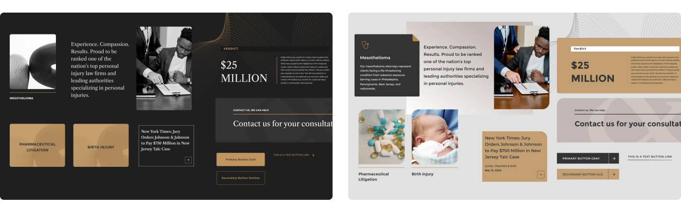
A color palette that feels polished, prestigious, calming— with gold used sparingly as an eye-catching element — in addition to abstract curved lines and textural elements that feel professional, stylish, and contemporary.
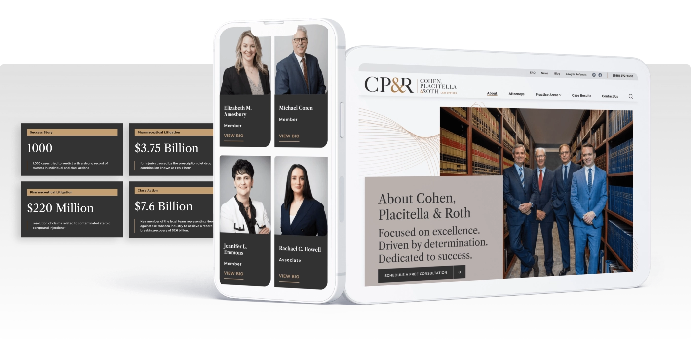
Photo content and styling recommendations that reflect solid client connections, an empathetic approach, and desirable outcomes.
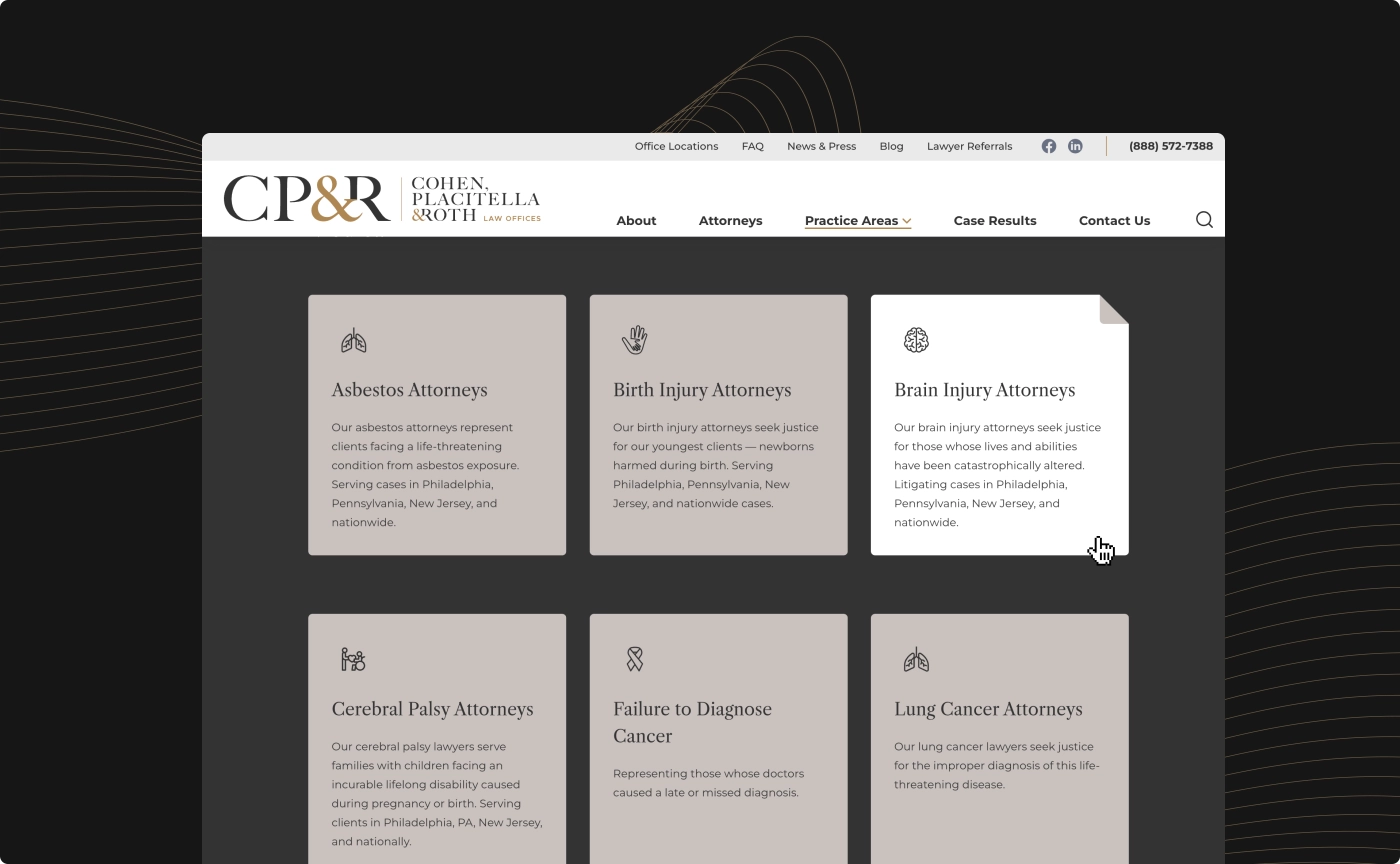
Iconography that was curated to convey a positive feel, even when relating to sensitive subjects and difficult practice areas. We leaned into medical care themes and away from cliche legal imagery like gavels, scales, building columns, and courthouse scenes, which may evoke feelings of stress.
An elegant amount of white space that intentionally steers the user to focus on educational and action-oriented content.
Content Strategy
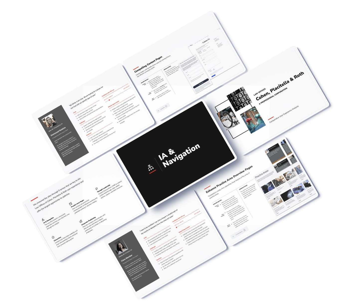
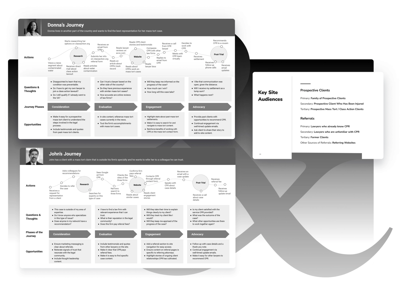
To represent “typical clients,” including referring attorneys — and illustrate what their journey through the site needed to look and feel like — we crafted personas and messaging maps showing which content areas and messages were key to informing their decisions and next steps.
Visual Design
Because the client had done prior brand work, there were existing logos, color choices, and fonts that partially informed the web project. Using these concepts as a starting point, we added sophisticated visual elements and animation effects that took them to the next level across the site. From the first design exploration, the client team was excited about our proposed solutions, including:
CPR’s new content strategy is defined by:
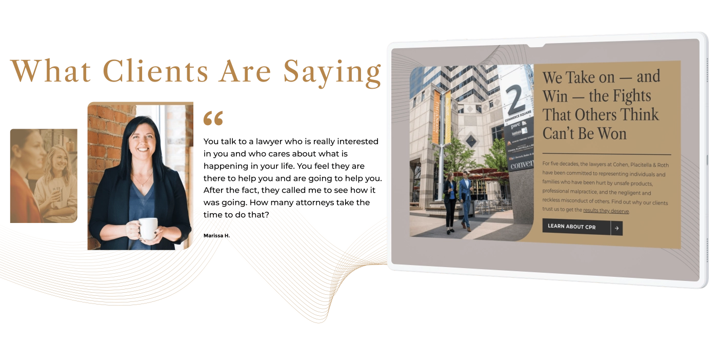
Building trust and credibility through positive case results, settlements, jury awards, and client testimonials. Clear, bold messaging radiates confidence throughout the experience while avoiding the perception of bragging, which some audiences report as a turnoff.
Breaking down legal terms and processes into everyday language so potential clients feel comfortable and informed when contacting the firm for a consultation or more information. We intentionally avoided off putting blocks of dry text that are likely to be overwhelming for someone in a vulnerable place who is not used to legal jargon.
Focusing on prompt and compassionate communication, which is especially important when speaking to prospects who may be tired or in pain as they deal with major medical and legal issues and search for help.
Positioning the attorney team, especially more junior members, as SMEs through blog posts and news stories, and promoting the firm’s connection to a network of professionals beyond the legal realm that helps clients with other important services.
Leading users to complete conversions, such as calling for a free consultation and joining the firm’s newsletter distribution.
“89% of prospects want information about a lawyer’s reputation. 68% want to read reviews from former clients.”
UX, SEO & ADA Upgrades
Our UX team led the project through sitemap and wireframes to create a smooth user journey, closely comparing feedback on designs to the audience research we gathered and ensuring that we stayed true to our original promises.
Most legacy pages suffered from a complicated collection of unnecessary sub-pages with duplicate information repeated on location-specific child pages — up to 15 in some cases. For the new site, we condensed and converted the information to more immediate on-page content, alleviating the number of clicks needed to get users to the information they seek.
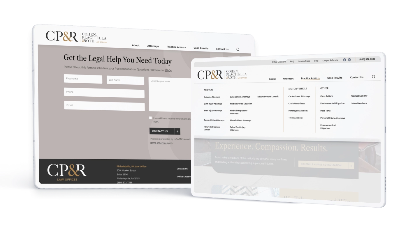
Because CPR has such a large range of practice areas, we relabeled them for consistency and clarity and regrouped them in a way that made them easier to find and understand — arranged alphabetically and within themes.
For much-needed visual prominence and easy access to information addressing common user queries, we added FAQs and Lawyer Referrals to the utility navigation. And while the main nav previously featured siloed testimonial and video library pages, we opted to disperse that content throughout the experience, paired with related content for maximum relevance and impact. We also added a previously missing Search function and Attorneys category for easy user access and more prominence.
To encourage users to schedule a free consultation — the primary conversion goal of the site — we added a contact form on every page, with clear calls to action and multiple ways to get in touch, which is especially important for older clients who are intimidated by webform technology or fearful of privacy breaches.
After performing a best-practices SEO review, we ensured that all keywords and meta tags will enhance the site’s ability to generate traffic, drive leads, and rank strongly in keyword searches related to the firm’s name, attorneys, practice areas, and geographic specialties.
With a sharp focus on meeting stringent accessibility standards, this site achieved a perfect pre-launch ADA scan showing zero issues with overall quality or barriers to using the site.
In the end, we’re proud that all of the effort that went into this site translated into a final product that looks effortless and is well poised to carry CPR into the future, as we continue to assist them with ongoing web management, including maintenance, tech support, enhancements, and search engine optimization.
A Resource for Individuals Suffering with Traumatic Brain Injury: TraumaticBrainInjury.com
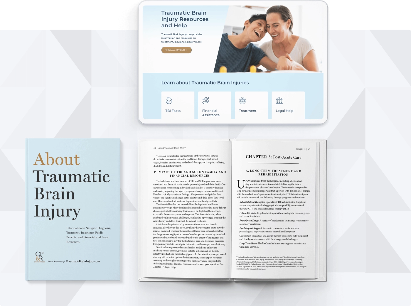
Our most recent initiative for CPR was completely reimagining one of their other existing digital properties, a website created to help patients and families navigate life-altering traumatic brain injury diagnoses while at the same time driving conversions for the firm.
Leveraging their experience helping people who suffered a traumatic brain injury, the CPR team wrote an entire book to serve as a resource for individuals and families.
Starting with WordPress as the preferred CMS, we created an inviting and soothing visual design and an impactful content strategy to better meet the needs of users with TBI-related impairments.
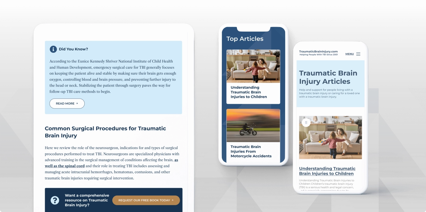
Thoughtful presentation and easy discovery of a deep and growing collection of interrelated medical, legal, and financial resources and tools
Formatting, design, publication, and content protection strategy for a client-authored companion ebook
Populating the blog through a combination of original writing and extracted book content
Ongoing content creation, search/generative engine optimization, and lead generation services


