The UX Design Secrets of the Top .EDU Websites
Your new college or university website was just released into the wild. If everything went according to plan, the launch was smooth, the content is on point, and user experience glitches are non-existent. Here’s what should come next.
When you consider all of the audiences that higher ed sites target, it might be easier to ask, who don’t they target? Their users include:
-
Prospective and current students
-
Prospective and current parents
-
Faculty, staff, and other internal stakeholders
-
Alumni
-
Community members
-
Donors
-
Researchers and academics
-
Governmental and accrediting organizations
-
Industry partners
-
Media members
-
And more
Saying that it’s a challenge to effectively meet the expectations of so many different audience types is an understatement, to be sure. But there are some design tools and tricks that make the job far easier — and the best .edu sites leverage them time and time again.
Let’s take a look at the top 10. How many is your site currently using?
1. An Immediate, Attention-Grabbing Value Proposition
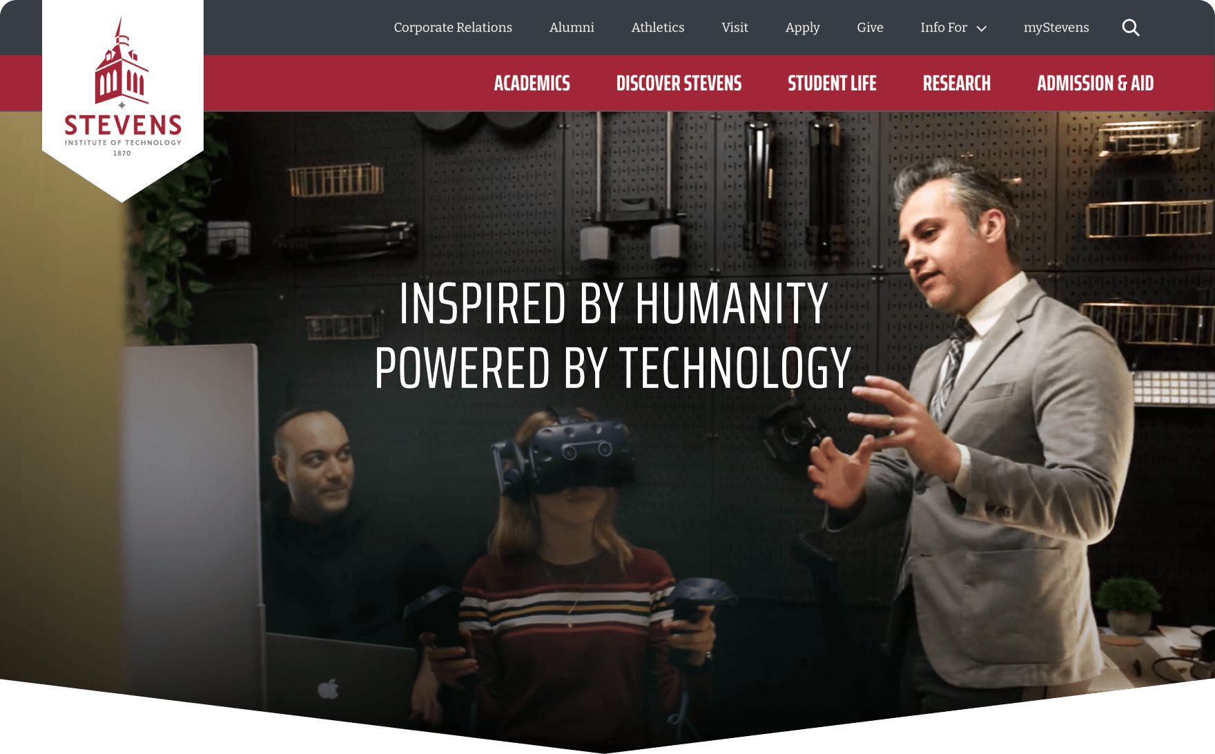
The landing page hero section — the uppermost visible portion of the homepage — is the most valuable piece of real estate available on an entire college or university website. The .edu digital marketing teams who understand this know that they have to avoid simply featuring a pretty picture or flashy video — and instead explain in 2 seconds or less what makes their school different.
SOLUTIONS THAT STAND OUT:
-
Authentic messaging featuring real differentiators that are supported by data (not just generic claims of “academic excellence”)
-
Strategically placed and clearly labeled calls to action that support this value proposition: Why [School Name], Explore Top-Ranked Programs, Read Student Success Stories, etc.
2. Audience-Driven Navigation
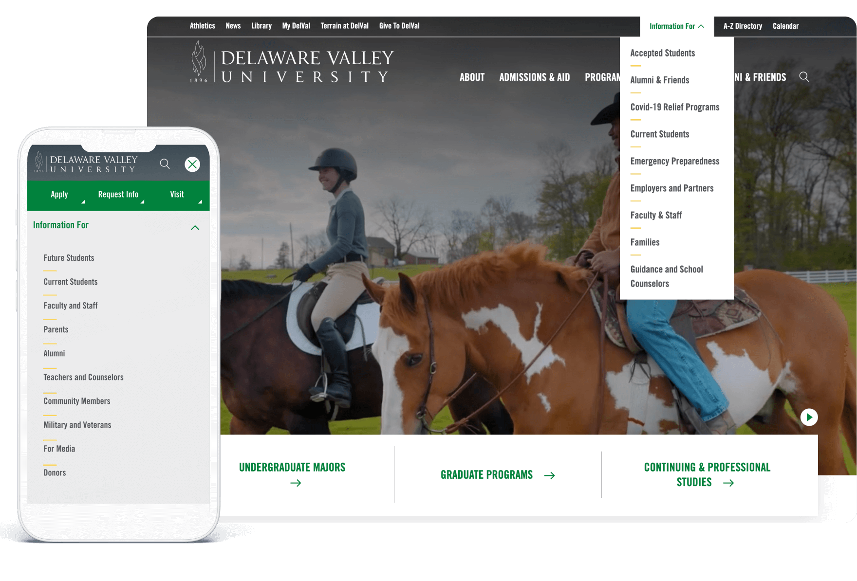
By allowing different user groups to self-identify who they are and what they’re looking for, colleges and universities help them choose the user journey that best matches their needs. From there, they can make smart personalized content recommendations that swiftly guide them through the conversion tunnel.
SOLUTIONS THAT STAND OUT:
-
“I am a [fill in the blank]” navigation with pre-set dropdown menu options (e.g., Future Student, Current Student, Parent, Alumni, etc.)
-
Clearly defined paths for popular tasks: Apply | Visit | Give | Request Info | Explore Programs
- Recommendations for upcoming events such as campus open houses and high school career fairs based on the user’s location
3. A Program / Degree Explorer
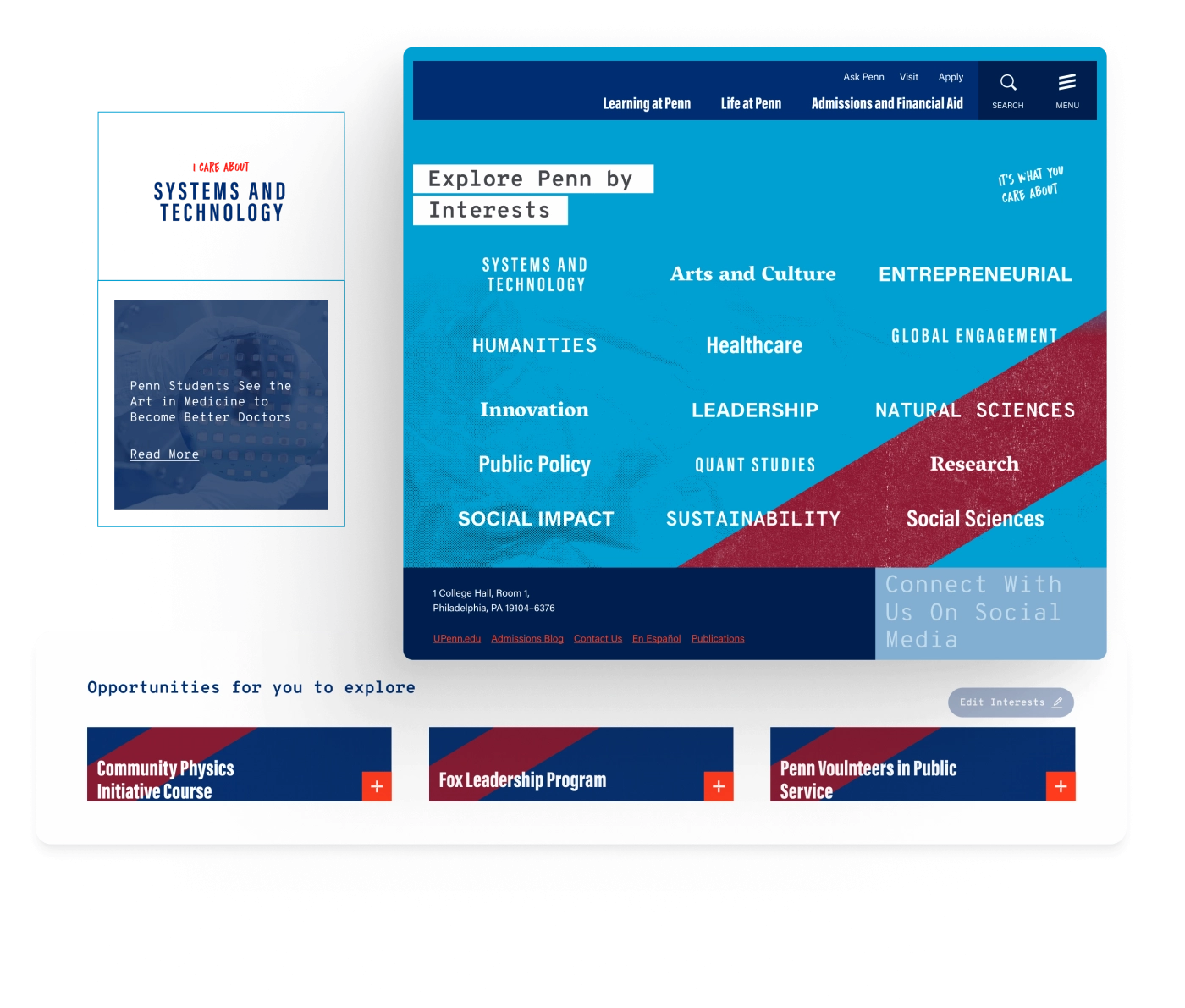
With college admissions wars heating up nationwide, prospective students are often the highest-priority higher ed website audience. Colleges and universities who help prospects easily find, learn about, and meaningfully connect with their preferred program are the ones who come out a step ahead.
SOLUTIONS THAT STAND OUT:
-
“I am interested in [fill in the blank] (e.g., healthcare, architecture, business, the arts) with program recommendations based on user responses. By taking this approach, institutions can guide students to programs that may appeal to them without requiring that they know the specific fields of study they offer. Bonus: They can also encourage prospects to pursue hybrid or build-your-own degree programs.
-
Filters and refinement options by interest area, degree level, and learning mode (in-person, online, virtual, and/or hybrid)
- “Compare Programs” features that clearly illustrate how the offerings, benefits, and outcomes of one study path stack up against another
- Plainly stated future outcomes: “What job/salary can I get with this degree?”
4. Powerful Internal Search
The Klein College of Media and Communications redesign is one of many complex projects we have take on for Temple University.
More often than not, higher ed websites are complex with extremely broad and deep content collections. Incorporating smartly designed internal search functions allows them to serve up the most relevant, audience-specific content as possible.
SOLUTIONS THAT STAND OUT:
-
Auto-complete or predictive search field suggestions featuring the most historically popular keywords and phrases (e.g., “academic calendar”, “tuition”, “admissions” “alumni events”)
-
Agentic AI tools that act like a “search concierge” by querying multiple internal databases or content types across a large university network (e.g., blog posts, product listings, help docs) and returning/synthesizing all relevant results.
-
Voice-enabled search functionality
-
Filtering options by audience or content type
-
Prioritizing high relevance of search results that avoid including log-in restricted or internal-facing content in public-facing results
-
Providing clean search results layouts that show the result type (e.g., News, Programs, People, etc.), highlighted keyword matches, and descriptive summaries rather than just raw links
5. Centralized Faculty and Course Directories
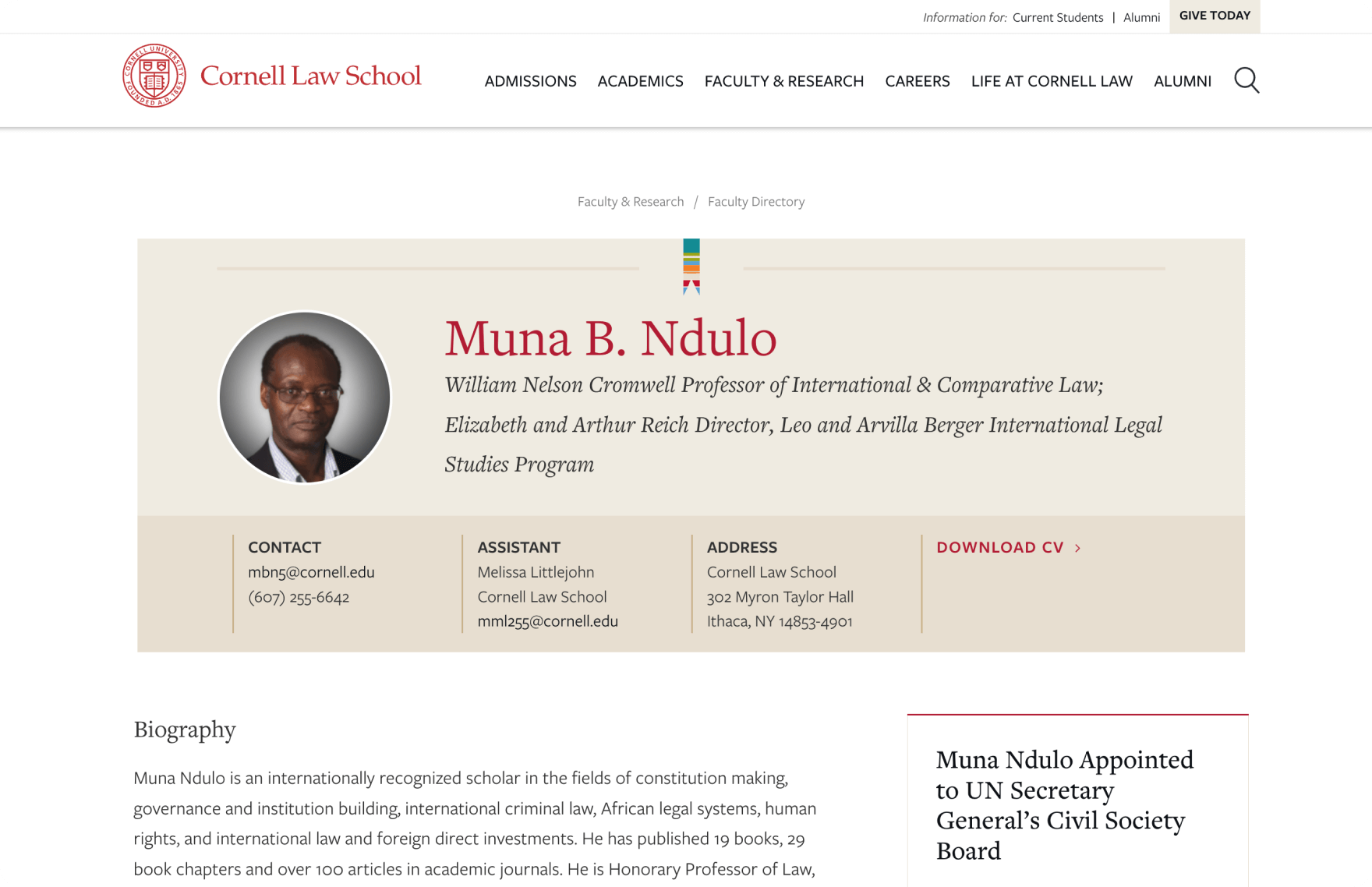
As part of an optimized overall .edu content strategy, centralizing key assets like the faculty directory and course catalog provides a host of surprisingly significant benefits — from simplified content discovery to enhanced personalized searches to easier academic planning and site maintenance updates.
SOLUTIONS THAT STAND OUT:
-
Highlighting the expertise and initiatives of esteemed faculty members as a hiring tool that attracts prospective applicants and new hires
-
Easy exploration of faculty, departmental, and institutional offerings and achievements to foster strong connections and long-term engagement with alumni, potential donors, and community members
-
Easy-to-browse broad and deep course offerings that reinforce leadership in higher education
6. Impactful Statistics
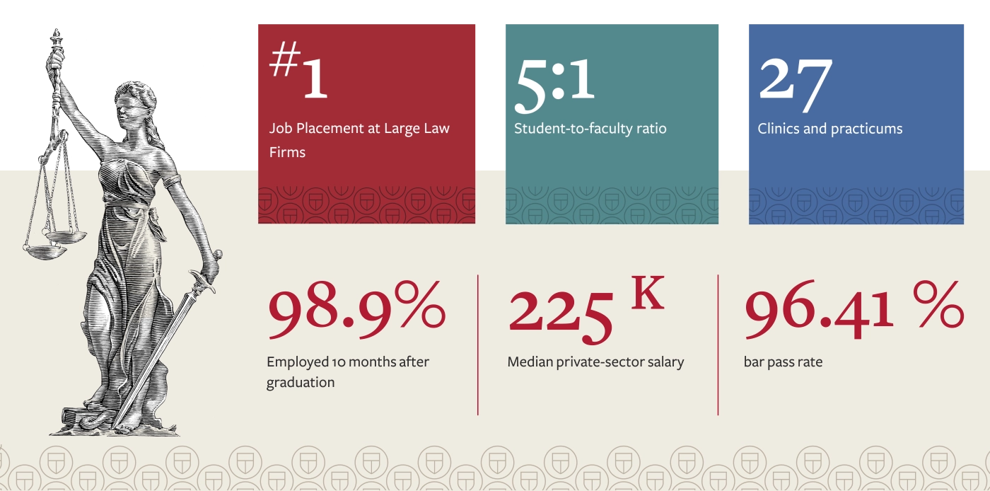
Numbers don’t lie. Incorporating statistics is a highly effective way for colleges and universities to give prospects “reasons to believe” by leveraging their accomplishments, rankings, accolades, and program outcomes to boost credibility and conversions.
SOLUTIONS THAT STAND OUT:
-
Highlighting current impressive organizational facts and figures like national program rankings, growth statistics, financial aid awards, and post-graduation employment/salary rates. (Caveat: Outdated information will be a turnoff to prospects, at best — and a serious red flag about declining performance, at worst).
7. Mobile-Optimized Visual Strategy
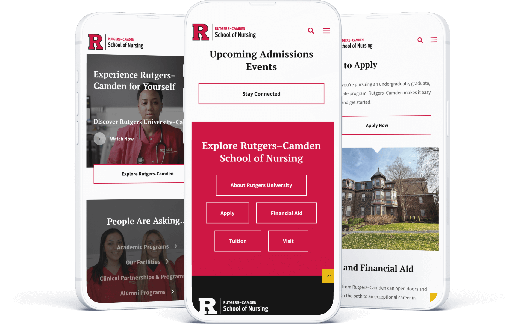
The savviest .edu digital marketing teams know that prospective college students visit .edu sites almost exclusively on their cell phones — and they take care to approach the design of each section of each web page with a mobile-first philosophy. The old saying “don’t sweat the small stuff” goes out the window here because every little detail matters.
SOLUTIONS THAT STAND OUT:
-
Layouts that aren’t fussy or difficult to take in via small screens
-
User-friendly, appropriately sized touch targets like CTA buttons
-
Seamless click-to-call and map integrations
-
Intentional and intuitive content hierarchy
8. Authentic Visual Storytelling
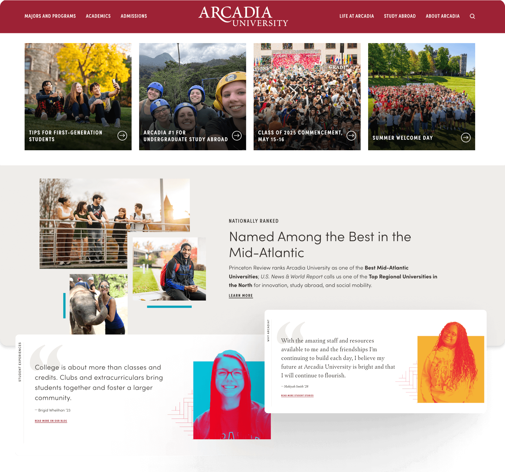
Colleges and universities simply can’t sell authentic campus experiences if they’re leaning too hard into stock imagery, uninspired graphics, or dated videos.
SOLUTIONS THAT STAND OUT
-
Real photos of students and faculty engaging in authentic campus environments
-
Short video loops or TikTok-style stories
-
Authentic student success stories & testimonials embedded in content
-
User-friendly virtual campus tour integrations
9. Baked-In Accessibility
At this point, we find that higher ed website teams are universally much more in tune with ADA requirements for accessible web experiences because they want to do the right thing by users — and because they know it is required by law.
SOLUTIONS THAT STAND OUT:
-
Screen-reader-friendly layouts
-
Alt text applied to all images and videos
-
Use of strong color contrast
-
Clear visual indicators for hyperlinked images and text
-
Plain language
10. A Footer That Isn’t an Afterthought
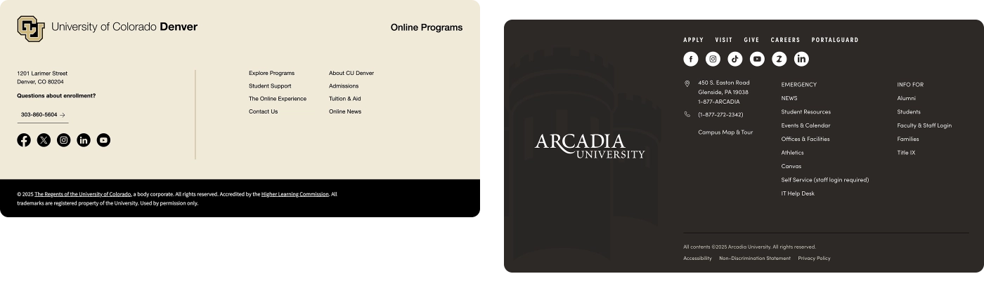
The universal higher ed website footer is an all-too-often overlooked part of visual design, but this is critical real estate — and the best sites use it wisely. This should be a well-organized space that offers quick access to important housekeeping items and evergreen institutional content that need to be available to users but not in primary view.
SOLUTIONS THAT STAND OUT:
-
Contact information that is front and center
-
Social media icons that are regularly monitored to ensure the links are working properly
-
Important secondary navigation menu items and sitemap links
-
Clearly labeled and up-to-date legal disclaimers, disclosures, copyrights, and privacy statements
-
A CMS log in for site managers
-
A “Back to Top” button that allows users to quickly navigate upward without the need for excessive scrolling
Need help incorporating thoughtful design elements that significantly enhance UX for your higher education website? Reach out to start a conversation today.
Q&A
What makes an effective higher education website hero section?
The hero section is the most valuable real estate on a .EDU website. Rather than featuring generic imagery, effective heroes communicate what makes the school different in two seconds or less. This requires authentic messaging featuring real differentiators supported by data, plus strategically placed calls to action like ‘Explore Top-Ranked Programs’ or ‘Read Student Success Stories.’
How should university websites handle navigation for multiple audiences?
Audience-driven navigation allows different user groups to self-identify and choose appropriate journeys. Solutions include ‘I am a…’ dropdowns with options like Future Student, Current Student, Parent, or Alumni, along with clearly defined paths for popular tasks like Apply, Visit, Give, and Request Info. This enables personalized content recommendations through the conversion funnel.
Why is a program or degree explorer important for higher ed websites?
With prospective students as the highest-priority audience, a well-designed program explorer helps prospects find and connect with programs without requiring them to know specific fields of study. Effective explorers include interest-based filtering, degree level and learning mode options, program comparison features, and clear outcome messaging about careers and salaries.
How can universities improve internal search on complex websites?
Higher ed sites with broad content collections need powerful internal search featuring auto-complete with popular keywords, AI-powered tools that query multiple databases and synthesize results, and voice-enabled functionality. These features help serve the most relevant, audience-specific content across the entire university network.
Eastern Standard helps colleges and universities create compelling digital experiences. Our website design team specializes in engaging prospective students for higher education institutions. Contact us to elevate your .EDU website.