
The University of Colorado (CU) System
A series of comprehensive website redesign projects puts compelling and accessible user experiences front and center for Colorado’s largest institution of higher education.
OVERVIEW
A series of comprehensive website redesign projects puts compelling and accessible user experiences front and center for Colorado’s largest institution of higher education.
Select Projects
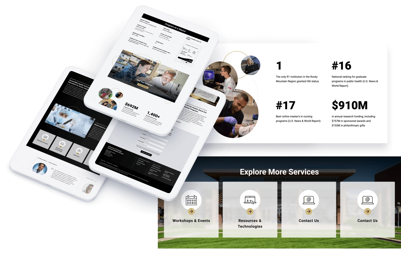
The CU System at a Glance
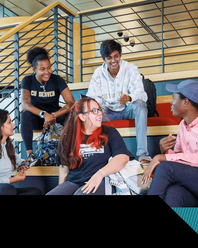
CU Denver: An Impactful & Unified Communications Platform
PAIN POINTS & CHALLENGES
This large-scale site redesign involved multiple schools and units using disparate CMS platforms — along with disconnected SEO, content, visual, content management, and analytics tracking strategies.
Historically, the website had been viewed by many stakeholders as a technology tool rather than a vital communications platform that advances its reputation, storytelling, enrollment, and fundraising efforts.
With completed applications being a mission-critical key performance indicator for the site, too many prospective students were bouncing out of the process due to navigational confusion and friction.
The CU Denver team wanted to boost SEO and increase regional and national market share leveraging bespoke visual, content, and UX solutions while meeting the high bar for global accessibility standards set by the University of Colorado System.
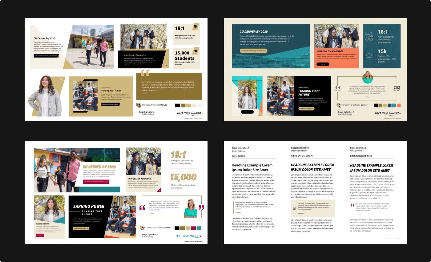
In the design exploration shown here, we presented three different pathways to show how changes to the various elements — including layouts, colors, fonts, and imagery treatments — could shift the vibe of the CU Denver site while staying true to existing brand guidelines. Guided by client feedback, we arrived at an approved style board that informed the full set of visual design layouts.
FEATURED OUTCOMES & WINS
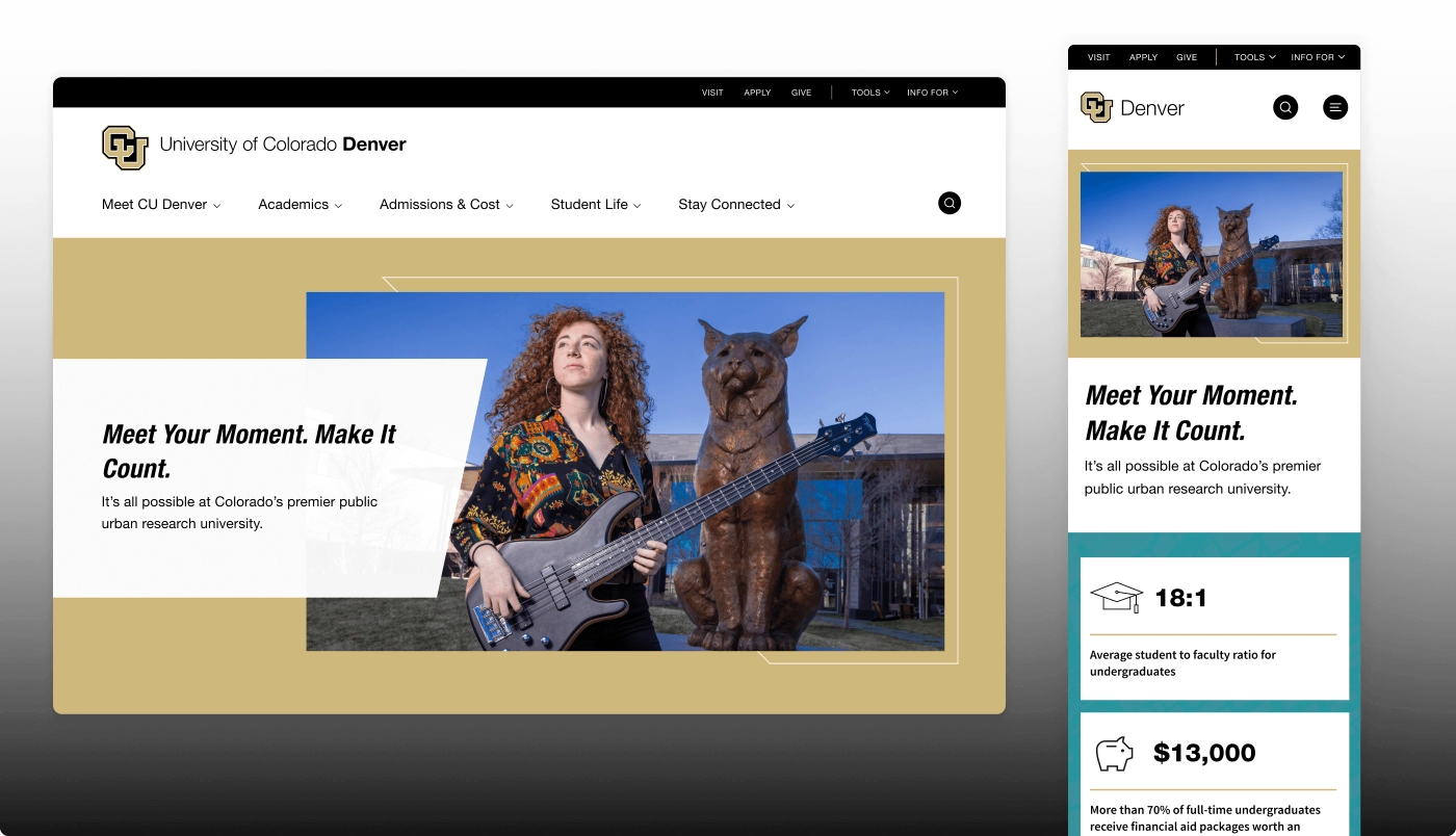
After aligning CU Denver organization-wide on a shared Drupal 10 platform, we implemented a fresh UX, content strategy, and design approach that seamlessly guides prospects to answers to essential questions like, “Is CU Denver right for me?” “What do I want to study?” and “How can I apply?”
A picker component encourages prospects to self-select specific programs, schools, and career interests, while new site-wide optimized copy encourages them to explore the campus’ areas of excellence with a compelling challenge to “Meet Your Moment” at CU Denver.
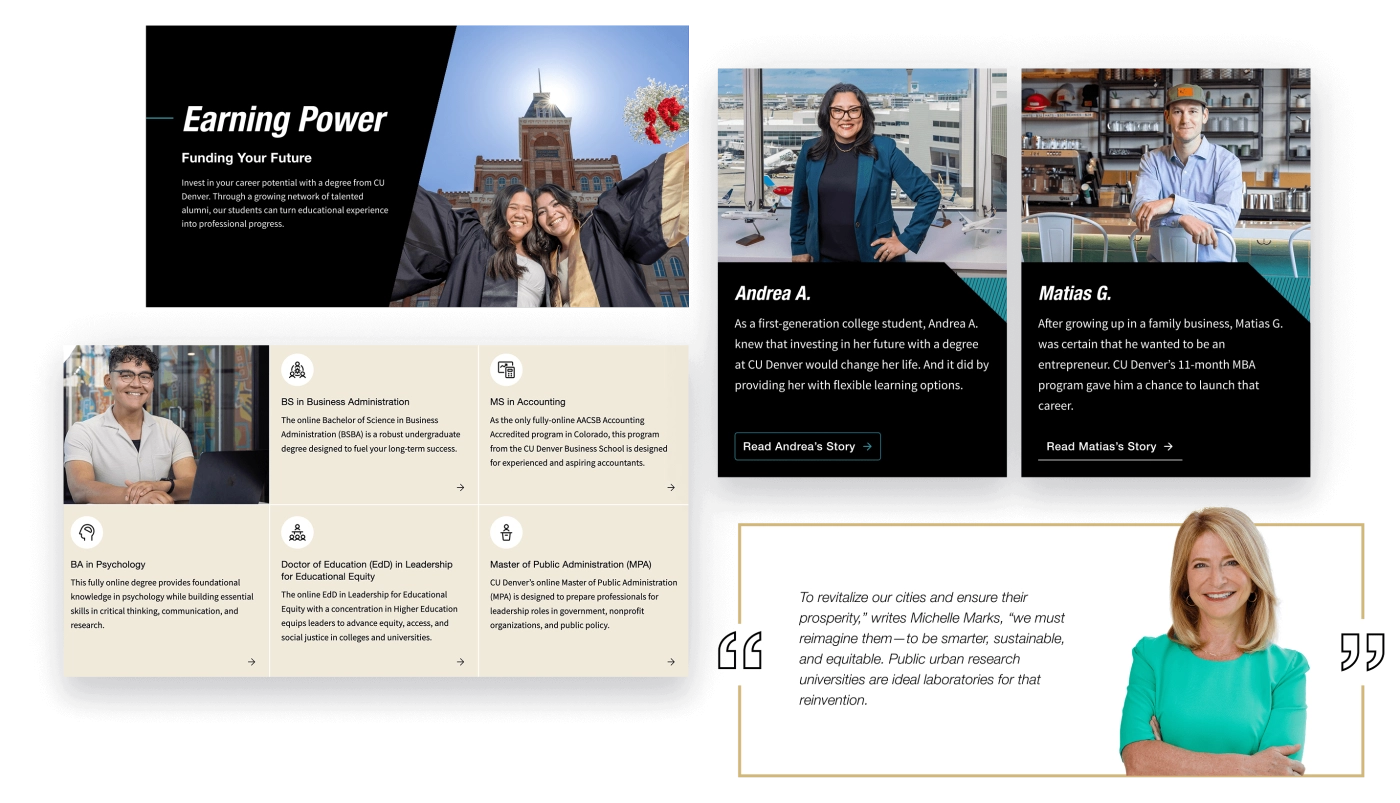
Pivoting away from transactional digital copy to a storytelling-driven approach, the site now conveys real authenticity through everyday language, real-world student stories, and an array of values-driven initiatives peppered throughout the site.
SEO and load speed are both improved, giving CU Denver more competitive positioning among prospective students in the research and browsing phases of their college search journey.
The accessible, user-centric design leverages a flexible component library that meets their team’s current and evolving content governance needs — a conversation we started early in the process since their internal stakeholders are a VIP user group.
Secondary audiences are given clear paths to the information they need through a smartly organized utility navigation menu.
“The partnership between Eastern Standard and our university quickly became a comfortable working relationship, as if we were all in the same organization. There was a lot of work to do, but the excellent planning and productive communication style made the project a gratifying one.”
—JAMES HOUGH, CU DENVER SENIOR WEB DEVELOPER
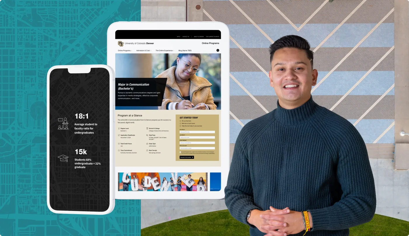
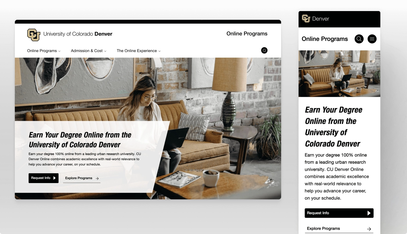
CU Denver Online Programs:
A Modernized E-Learning Experience
Pain Points & Challenges
The CU Denver team had inherited this legacy website, which was falling short in a number of important areas.
They needed to upgrade the site to Drupal 10 and leverage this opportunity to address some long-term site challenges they had been facing.
CU Denver had recently completed a rebranding project, but the UI of the legacy Online Programs website did not reflect it. The visual design felt heavy and overly reliant on a black, gold, and white color scheme.
It was not delivering the quantity of high-quality leads they desired, as measured by requests for information (RFI) and conversions of RFIs to completed applications.
The site is intended for digital marketing only, so conversions are measured by RFI clicks and leads captured in their Slate and Salesforce platforms — making effective calls to action and user-friendly web forms extremely important admissions marketing tools.
We needed to meet the needs and expectations of two co-sponsor stakeholder groups — The Federation of State Medical Boards (FSMB) & The National Board of Medical Examiners (NBME) — as well as five user groups: examinees, state medical boards, medical educators, test contributors & public/patients.
Their deployment pipeline was inefficient and fragmented, resulting in a disjointed experience when pushing code to production.
FEATURED OUTCOMES & WINS
A modern and streamlined new homepage experience puts CUD Online Programs’ value propositions front and center to catch the immediate attention of prospective students.
An intuitive overall hierarchy with clear navigation menu labels and page names tells users exactly where to go next to complete core tasks like exploring degrees and completing applications.
Global visual design upgrades make the site more compelling and help it align better with the new campus branding.
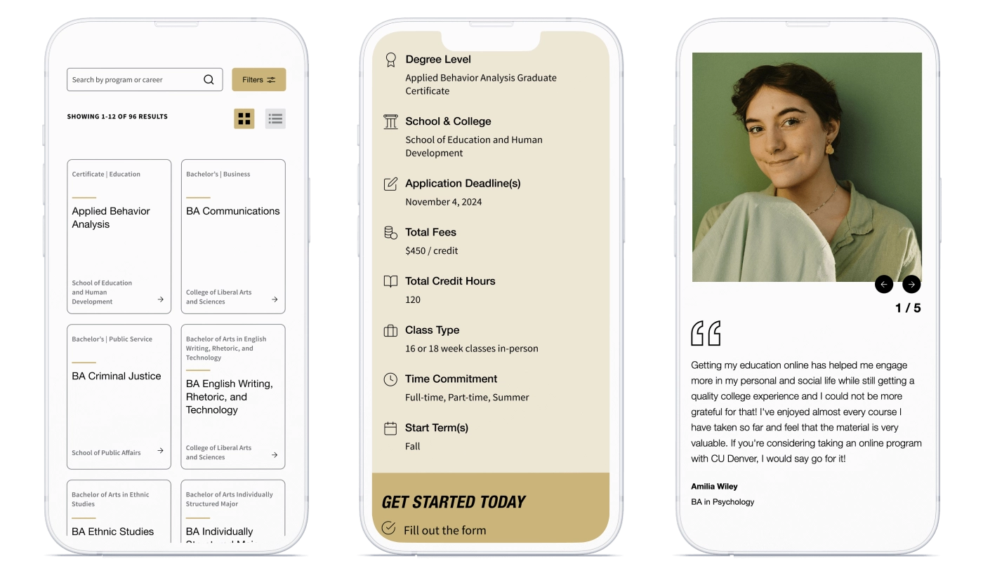
A Program Finder component gives prospects the flexibility to search by their program, school, or career interest.
Approachable language, clear calls to action, and strong proof points — including impressive statistics, testimonials, and more — give users a realistic view of the online learning experience, as well as solid reasons to believe in their own path to success.
Admins have more control over the CMS back end for an easier, more streamlined site management experience.
The sitemap and information architecture are intentionally designed to scale smartly as the campus’ online programs continue to grow rapidly.
Bonus: We helped the client team leverage some efficiencies by implementing the same new and improved content types and components as the CU Denver main project.
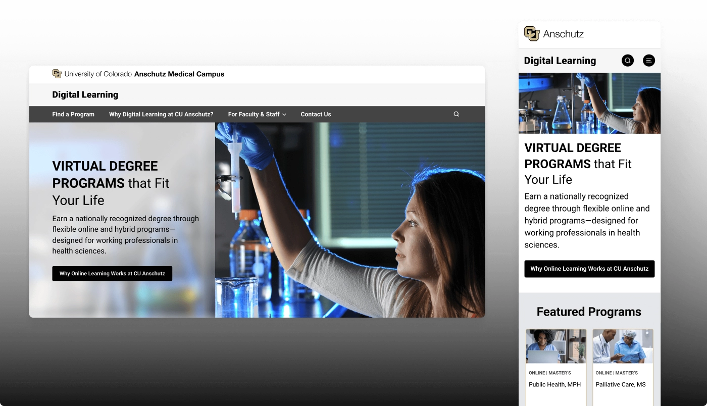
CU Anschutz Medical Campus Office of Digital Learning (ODL): A Centralized Hub That Supports Multi-Modal Health Sciences Education
Pain Points & Challenges
The CU Anschutz ODL team inherited their legacy website, which suffered from visual design and content strategy shortcomings that made it look and feel dated and “flat.”
As a result, it was missing valuable opportunities to promote the campus’s revered status as a destination for world-class healthcare, health science, and public health education. Likewise, it did not convey enough “wow factor” for accomplished professionals looking to advance their careers in these spaces.
Page layouts were too structured to properly showcase the full breadth of ODL’s offerings, from support for multi-modal programs and learning opportunities to an array of other student and staff services.
Some content was outdated and no longer accurate.
In short, the team wanted to start from scratch with a new site and fresh approach.
FEATURED OUTCOMES & WINS
Thanks to a variety of thoughtful upgrades—from a modernized visual approach to a re-engineered sitemap to new content that amplifies ODL’s offerings and value propositions—the overall user experience now feels fresh, cutting-edge, and aligned with the campus’s recent rebranding.
Updated and energized new copy across all site pages amplifies and streamlines how ODL speaks about itself as a central hub for online learning services and resources that serve the needs of CUA students, faculty, and programs.
Optimized messaging effectively conveys the campus values and highlights how students can benefit from the flexibility and convenience of online programs that are on par academically with CUA’s more traditional in-person formats.
Abundant, clear calls to action placed strategically throughout the site — as well as user-friendly webforms prominently placed on every program page — guide users step-by-step through the conversion funnel.
The newly reorganized sitemap and information architecture are flexible and scalable so they can grow with ODL as their initiatives and offerings evolve into the future.


