The Complete Guide to Large Website Menu Design

Do you have hundreds of pages of content that need to be organized into a coherent navigation structure? Here, we share navigation design best practices and insights for menu design on large, content-rich websites.
TL/DR: The Key Takeaways
Large websites depend on clear, scalable navigation to help users find content quickly. Menu design should reflect content depth, user behavior, and device context.
Desktop navigation often benefits from visible structures like horizontal or mega menus that expose key sections without hiding options. On mobile, accordion or off-canvas menus help manage complexity in limited space. Clear labels, logical grouping, and consistent hierarchy matter more than visual style. When navigation is intuitive and accessible, users move through large sites with less friction and better engagement.
Use of the “Hamburger” Menu
When the hamburger menu first showed up as a common user interface (UI) pattern, there was a lot of debate among web designers about how and when to use it effectively. Would users recognize it?, they wondered. When should it be used instead of a tabbed or horizontal menu? Should it be paired with the word “menu”, or is it OK on its own?
Of course, the hamburger menu has since become so ubiquitous that there’s little question remaining about whether or not users will recognize it. It’s probably here to stay.
Should you use a hamburger menu for desktop/wide screens?
When designing for wide screens — where you have enough real estate to show a horizontal menu — you may be wondering if you should leave the user experience the same on desktop and mobile, with the main nav hiding behind a click of the hamburger icon?
While I don’t feel safe saying “it’s never a good idea to use a hamburger menu on wide screens,” I can say that for websites with a large amount of content, we’ve stopped using the hamburger as the UI pattern of choice. Why? Essentially it comes down to “we have the real estate, so there’s no value in wasting it.” It’s one less click, and having the navigation right in front of the user allows us to communicate the main areas of the site immediately.
Effective mega menus/dropdown menus also allow us to provide at-a-glance views of secondary levels of navigation, in many cases more effectively than a hamburger/push menu.
In fact, in several cases where we implemented hamburger menus on the wide/desktop view, we ended up changing back to a more traditional horizontal menu after user testing and reviewing the website analytics. We show more megamenu examples below.
Verdict: In most cases, you should probably use a traditional horizontal navigation on desktop, but if you really want to use a hamburger, make it count. Case in point: this really interesting use of a hamburger menu with a big overlay by ED. for the Boston University School of Theater:
The navigation here functions as its own immersive interface — something you can’t get from a horizontal or mega menu. If you’re just reproducing the same capabilities of horizontal or mega menus in an overlay, the hamburger menu doesn’t give you any advantages. But if you’re going to add capabilities within the overlay that you can’t get otherwise, then the hamburger menu is back on the table as an option for your interface.
Mobile Menu Design Best Practices and Options
When designing deep content collections for mobile screens, the menu choice becomes very simple: You’re going to be using a hamburger — even if you have a horizontal navigation on desktop (which we’ll discuss later) — because you have such limited screen space to work with. The only decision you’ll need to make is whether you want to go with a push or accordion-style feature – we show examples of each of these mobile menu design options below.
In push menus, each item slides out to the left, revealing a panel of sub-items, which is very effective for browsing deep content. We’re fans of this approach — so much so that we even created an ADA-compliant JavaScript library called Traversable Menu to help with the implementation of large push menus.
From an implementation standpoint, however, push menus can create a bit of a problem: In order to create the full menu tree, the entire menu, from top to bottom, is often included in the DOM (in other words, it is all downloaded as part of the HTML of the page, even if the user only sees one panel at a time). So when using push menus for very deep navigation trees, you’ll have to institute on-the-fly loading of sub-items so you don’t have to render the entire menu tree in your HTML.
On the other hand, accordion-style menus allow users to easily see down a level without fully committing to “navigating” to that new level. The accordion approach also allows users to see their current level and the next level simultaneously.
While both of these approaches are valid and easily navigated by users, accordions present a bit of a trap as you expand more levels: Distinguishing one level from the other is usually done by way of indenting, and there’s only so much horizontal space available for that. So for menus where you’re going to want to show two or more levels beneath the primary on mobile, you may want to go with the push menu instead.
Mega Menu Design and Megamenu Examples
Mega menus have seen something of a renaissance in the post-hamburger-craze world, and for good reason: They’re pretty effective at driving users further into a conversion funnel. In other words, they allow users to more quickly get to the content that’s relevant to them.
Best practices for megamenu design
Don’t accidentally de-promote content you’re intending to promote.
There’s currently a trend of making mega menus more elaborate and putting promotional content directly in the menu. That’s not a bad thing, but be careful that there’s a clear distinction between the list of sub-items and the content you’re promoting: If you remove an item from the navigation list in order to include it in a more elaborate card or call to action (CTA), it can lead to a “banner blindness” that has users missing your most important content (because it’s not in the main list of links that they’re scanning).
Make sure your motion paths are forgiving.
Don’t force users to have to move their mouse just so in order to keep the menu from closing on them. There’s a great article in Smashing Magazine that goes into depth on this issue.
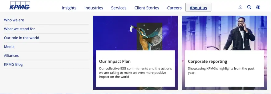
When promoting content in the navigation, make sure it doesn’t interfere with the primary goal of navigation.
In other words, make the design of the nav vs. the design of the content very distinct. KPMG does a good job of this:
Incorporating third level/tertiary items into mega menus
Sometimes you want or need to give users the ability to go a level deeper within the megamenu itself, which would involve showing tertiary menus inside the mega menu.
The first step here is to ask whether this is really necessary. We haven’t yet tested the engagement with tertiary/flyout menus within a mega menu, but we are expecting to deploy one in the coming months.
For an example of this behavior, take a look at the PricewaterhouseCoopers website menu:
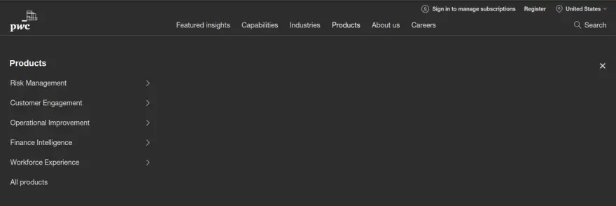
The “products” menu reveals a push menu that you can drill further down into.
One of the drawbacks of this approach is that there’s a lot of wasted real estate in the menu. Some companies, like Oracle, solve this by opening the first menu by default — but that will give those particular items a bias/precedence. Whether it’s acceptable to give those items ‘preference’ by always displaying them will depend on the priorities of your content strategy:
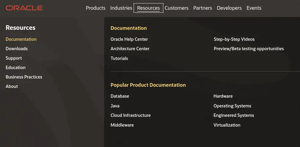
On the Oracle site, the “Documentation” item in the mega menu is open by default
Should mega menus open via hover or click?
If you browse various online conversations on this topic, a common theme is that from a UX design perspective, it makes more sense for the mega menu to open on click because it represents a more purposeful action than a hover.
But in practice, opening a mega menu on hover is far more common than using a click.
2026 Navigation Trends: Smarter, More Accessible, and Human-Centric Website Toolbars
As we move into 2026, large website navigation is evolving beyond traditional patterns to support smarter, more personalized, and more inclusive user experiences. Designers are building website toolbars that embrace AI-driven personalization and adaptive navigation that tailors menus to user behavior. For example, showing popular or relevant sections based on past visits or real-time interaction. This helps users find what they need faster without adding visual clutter.
Accessibility remains a top priority: clear labeling, keyboard support, screen-reader friendliness, and predictable focus states are now essential rather than optional. Inclusive design lowers barriers for users with diverse needs and can improve overall engagement.
Off-canvas menus are also becoming a go-to pattern for large sites, especially when you need to keep the interface clean without stripping away depth. An off-canvas menu is a navigation panel that sits “off screen” and slides in from the side (or occasionally from the top/bottom) when triggered, often by a menu button. It’s especially important on mobile and tablet experiences, where space is limited, but it can also work well on desktop when you’re trying to reduce header clutter or support secondary navigation (like filters, account tools, or deep category trees) without overwhelming the page.
Finally, performance-focused navigation patterns, such as modular menu components that load incrementally or responsive mega menus optimized for both desktop and mobile, ensure that even content-rich navigation feels fast and intuitive across devices.
The prevailing user expectation is that mega menus will appear on hover and not require a click.
So this is an instance where the ubiquity of a particular approach wins out over what our default UX intuitions tell us.
Dealing with the “overview page” problem
When you have menus that open on hover instead of click, you run into a problem: The user essentially skips the main navigation item — the one that provides the hover “trigger” — in favor of a secondary item.
Looking at more megamenu design examples, let’s see how AstraZeneca solves this problem:

Notice how “R&D” is the main navigation label, and then it also lists “R&D” underneath it? That’s because R&D is an actual page, but the main R&D link isn’t clickable — it’s a hover trigger.
Here’s how Capgemini handles the same situation:
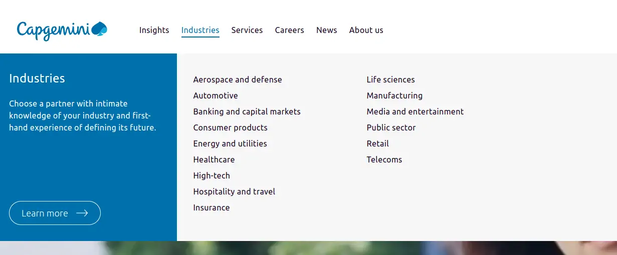
Notice that there’s a prominent “learn more” CTA that takes users to the main industries landing page.
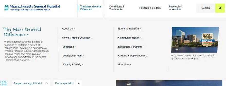
Massachusetts General Hospital takes a similar approach that is well executed:
Incorporating Subsites & Microsites
We’ve done a lot of work that essentially involves creating a “site within a site.” For example, part of a project we undertook with Temple Health was to consolidate 24 previously separate sites into one flagship website. You can see, for example, that the Jeanes Campus has its own presence within the site, as does the Bariatric Program, among others. Each has its own menu structure, header, and footers, even though they’re part of the same website as the main Temple Health website.
There’s a lot to be considered when creating subsites with a main website, but let’s take a look at the two main pieces of advice we have from our experience here.
Try to avoid “doubling up” the navigation
There’s a temptation to show the main site navigation above the subsite navigation, which will absolutely lead to confusion. Especially in instances — and we’ve seen this — where both menus include a menu item with the same title (e.g., “About”).
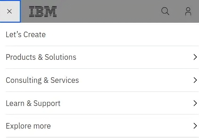
IBM is actually doing this on one of their Watson websites, and it’s not working well. Here’s an example of what not to do:
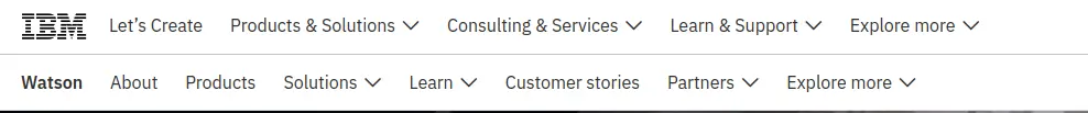
Notice how “Products & Solutions” in the main nav competes with “Products” and “Solutions” in the secondary nav, and how there are “Explore More” options in both menus. This pattern is to be avoided.
Samsung takes a better approach to solving this problem, mainly because they’ve better delineated which navigation is part of the section you are in, and which navigation is for the entire site:

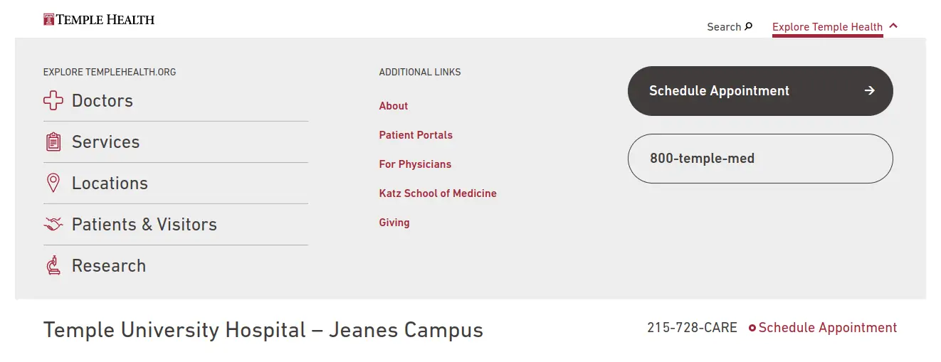
For subsites, incorporate an “escape hatch” instead of doubling the menu
If there’s a good enough reason for the content to live in a subsite in the first place, then you don’t need to confuse the nav by showing the main site navigation there, as well. Instead, use the “escape hatch,” which is a smaller utility link that allows the user to explore the main nav if they want to, but keeps it out of their way if they don’t.
See an example of the escape hatch on that same Temple Health website here:
What About Secondary Navigation on Landing Pages?
We’ve talked a lot about the primary navigation, but what solutions are available for secondary navigation once users land on a page? There are a few options here, but ultimately you need to make sure that your users can easily find links to deeper content.
Tried and true: The sidebar menu
The sidebar menu is a time-tested and ubiquitous treatment for directing users to sub-pages.
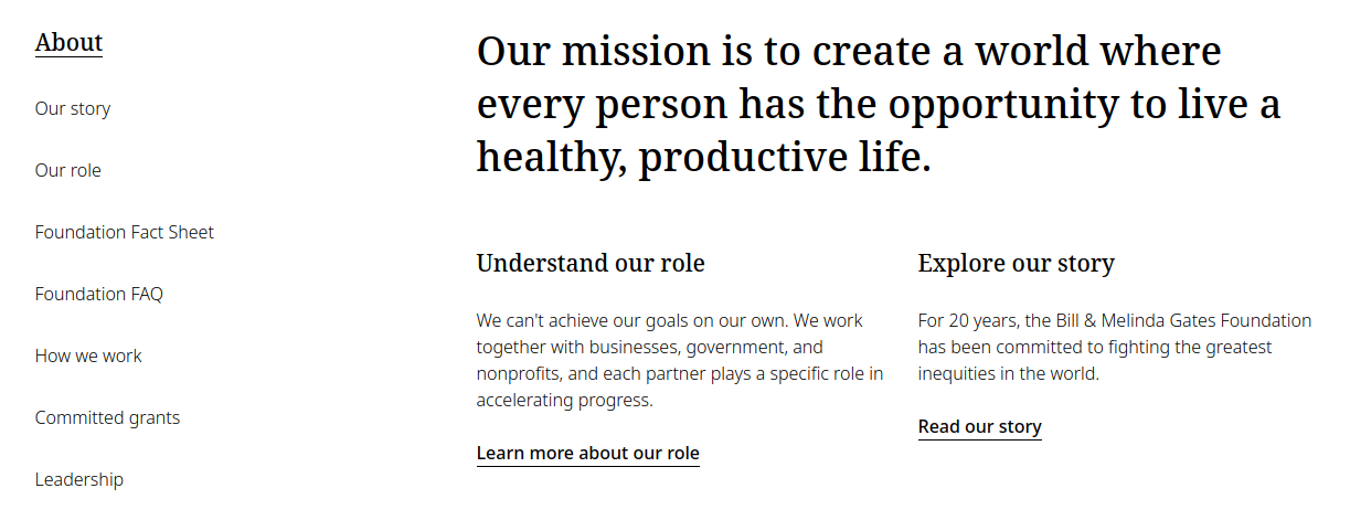
The Bill & Melinda Gates Foundation website uses an elegant sidebar menu to direct users to sub-pages.
Alternatives to the sidebar menu
Recently, we’ve been implementing a lot of alternatives to the traditional sidebar menu. Mobile is a big driving factor for the change, since sidebars don’t really work on narrow screens. Another reason for looking at something else — even on wide screens — is that having the sidebar means that you have a narrower area for content. The content is usually also longer than the sidebar, resulting in a blank space in the sidebar for a majority of the page.
On-page calls to action
For pages that serve primarily as a “gateway” to the content beneath it, you should strongly consider using CTAs that direct users to the deeper content. Consider this example from jefferson.edu:

Users are clearly directed to the sub-page content, and they don’t have to go searching for it.
On-page jump links
We referenced IBM’s website earlier as an example of what not to do for subsites, but let’s revisit the IBM Watson site for an excellent example of on-page jump links that direct users to important parts of the page, with subsequent CTAs to deeper content.

“More in this section” menus
If you’re not using a traditional sidebar menu, it’s important to ensure that users still have access to all sub-pages even if they’re not all represented by a CTA.
For this purpose, we often use a “More in this section” menu like the one shown below, which is essentially a sidebar menu that lives at the bottom of the page after a user has scrolled through other options (or at the top of the page when on mobile, which we’ll talk about below).
Secondary navigation on mobile
On-page CTAs work well on mobile, although you’ll probably want to stack them and limit the height of each item so the options take up a bit less vertical space.
However, even if you’re using a sidebar menu on desktop, where should it stack for mobile — before or after the content? The answer is both! We’ve seen in session recordings and usability tests that some users will miss the on-page navigation even when it’s relevant to where they want to go.
The problem with putting the menu above the content, though, is that you’re asking the user to scroll beyond a lot of possibly irrelevant items before getting to the content. There’s a solve for this, as well, though: Put the first menu inside an accordion that users can choose to interact with or not.
Here’s an example from the site we designed for Temple Health:
At the end of the day, designing and implementing menus that match the requirements of your content and needs of your users is a complex undertaking with long-term implications for your site.
In fact, it isn’t an exaggeration to say that selecting the right navigation from the outset is one of the most important steps you can take to set your site up for long-term UX success. For these reasons, this process should be handled by experienced professional designers and developers who understand the nuances of good user experience and logical information architecture.
Need help creating the best navigation for your content collection? We work with a variety of enterprises and institutions and we provide web design, ux design, Drupal development, WordPress development, usability testing, and website consolidation. Let’s talk!
Q&A
Should large websites use hamburger menus on desktop screens?
For websites with large amounts of content, traditional horizontal navigation is usually better on desktop since you have the real estate available. Hamburger menus mean one more click, and horizontal navigation communicates main site areas immediately. Use hamburger menus on desktop only if the overlay adds capabilities you can’t get otherwise.
What are the best mobile menu options for deep content collections?
Push menus slide items left to reveal sub-item panels, effective for browsing deep content. Accordion-style menus let users see down a level without fully committing to navigate there. Push menus work better for showing two or more levels beneath primary navigation since accordions have limited space for indentation.
Should mega menus open on hover or click?
From a UX perspective, click represents more purposeful action than hover. However, opening mega menus on hover is far more common in practice. This is an instance where ubiquity of approach wins out over default UX intuitions. Make sure motion paths are forgiving so menus don’t close as users move their mouse.
How should subsites be integrated into main website navigation?
Avoid doubling up navigation by showing main site navigation above subsite navigation, which leads to confusion especially when both menus include items with the same title. Instead, use an escape hatch which is a smaller utility link allowing users to explore main navigation if desired while keeping it out of the way otherwise.
Eastern Standard designs intuitive navigation systems for complex websites. Our UX design team creates information architectures that help users find what they need. Contact us about your website navigation.