
How Every Website in Higher Education Got Their Navigation Wrong

We’ve done quite a bit of research, user experience design, and web development in the higher education space, and it’s probably time I let you in on some secrets about how every college and university site has gotten it wrong in terms of menu and navigation structure.
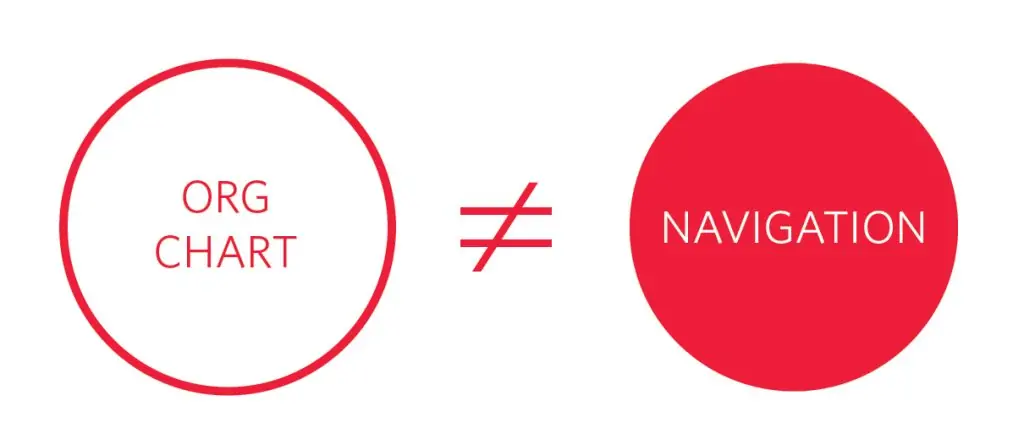
Repeat After Me: “The University Website Should Not Mirror the Organizational Chart”
This seems like common sense, but colleges and universities are notorious for creating sitemaps that reflects their organizational structure, rather than a topic-based approach that groups related information in the same place. As an example: it might be the case that at your university, parking tickets and maps of the campus parking lot fall under the purview of two different organizational units. However, they should still both live under “Parking” on your website. Or, perhaps a more status-quo-challenging example would be: Just because “Creative Writing” and “Journalism” fall under different departments doesn’t mean that prospective students should have to dig through each school and college site to find information about those majors. What if all I know is that I like writing, but (since I’m 17 years old), I haven’t yet decided what that means for my career path?
Prospective College Students Don’t Understand the Difference Between “Undergraduate” and “Graduate”
When it comes to prospective students, you have to remember that your audience is oftentimes 16- or 17-year-old high school students who have never been exposed to higher education and its various terms and nomenclature. When presented with the options of “Undergraduate” or “Graduate,” many high schoolers choose “Graduate” because their thought process is “I’m graduating, so I suppose that’s where I should go.” Your user is now stuck in a silo that’s probably completely irrelevant to them, and double-trouble if clicking “Graduate” actually brought them to an entirely separate site for graduate education.
Also, these terms have different meanings for international students. “Graduate Education” doesn’t mean the same thing around the world, so you may be further confusing the international audience that is so critical to admission efforts.
The Use of Terms Like “Programs” and “Academics” Are So Overloaded and Nebulous That They’re Almost Entirely Useless
As a user, what should I expect to find under your “Programs” menu? Is that the majors offered, or are they extracurricular opportunities that your university or college offers? Is that where study abroad information lives?
What about “Academics”? Is that where I find course information? What about the honors program — is that in there? And faculty profiles? Or maybe those are under “About”?
“At the end of the day, use labels that are helpful and meaningful, not the labels that you use internally or have become accustomed to.”
A user’s expectation of what they will find in a particular section of the university site, compared with what they do find, is an important factor in abandonment. If I’m lost, I stop caring (remember that I’m also potentially 16 years old, and you’re competing with literally 16 other browser tabs, plus the notifications buzzing on my phone). These catch-all buckets are leftovers from a time when college websites were simple informational portals, rather than the most important marketing vehicle a university has for capturing new students. At the end of the day, use labels that are helpful and meaningful, not the labels that you use internally or have become accustomed to.
Q&A
Why shouldn't university websites mirror the organizational chart?
Colleges are notorious for creating sitemaps reflecting organizational structure rather than grouping related information topically. Even if parking tickets and campus maps fall under different organizational units, they should both live under Parking on your website. Users don’t care about internal departmental boundaries.
Why is the Undergraduate vs Graduate distinction problematic for prospective students?
Many 16- or 17-year-old high school students have never been exposed to higher education nomenclature. When presented with Undergraduate or Graduate options, many choose Graduate thinking I’m graduating, so that’s where I should go. Additionally, Graduate Education has different meanings internationally, confusing critical admission audiences.
What's wrong with using terms like Programs and Academics in navigation?
These terms are so overloaded and nebulous they’re almost useless. Users can’t predict if Programs means majors or extracurricular activities, or if Academics contains courses, honors programs, or faculty profiles. When user expectations don’t match what they find, abandonment increases.
What navigation approach works better for university websites?
Use labels that are helpful and meaningful to users, not internal terminology. Remember your audience may be 16 years old, competing with multiple browser tabs and phone notifications. Clear, user-centric navigation is critical since your website is the most important marketing vehicle for capturing new students.
Eastern Standard designs intuitive navigation systems for complex websites. Our UX design team creates information architectures that help users find what they need. Contact us about your website navigation.


