Greater Philadelphia Cultural Alliance
A modern web presence helps an influential cultural nonprofit leader drive stakeholder engagement and protect market authority
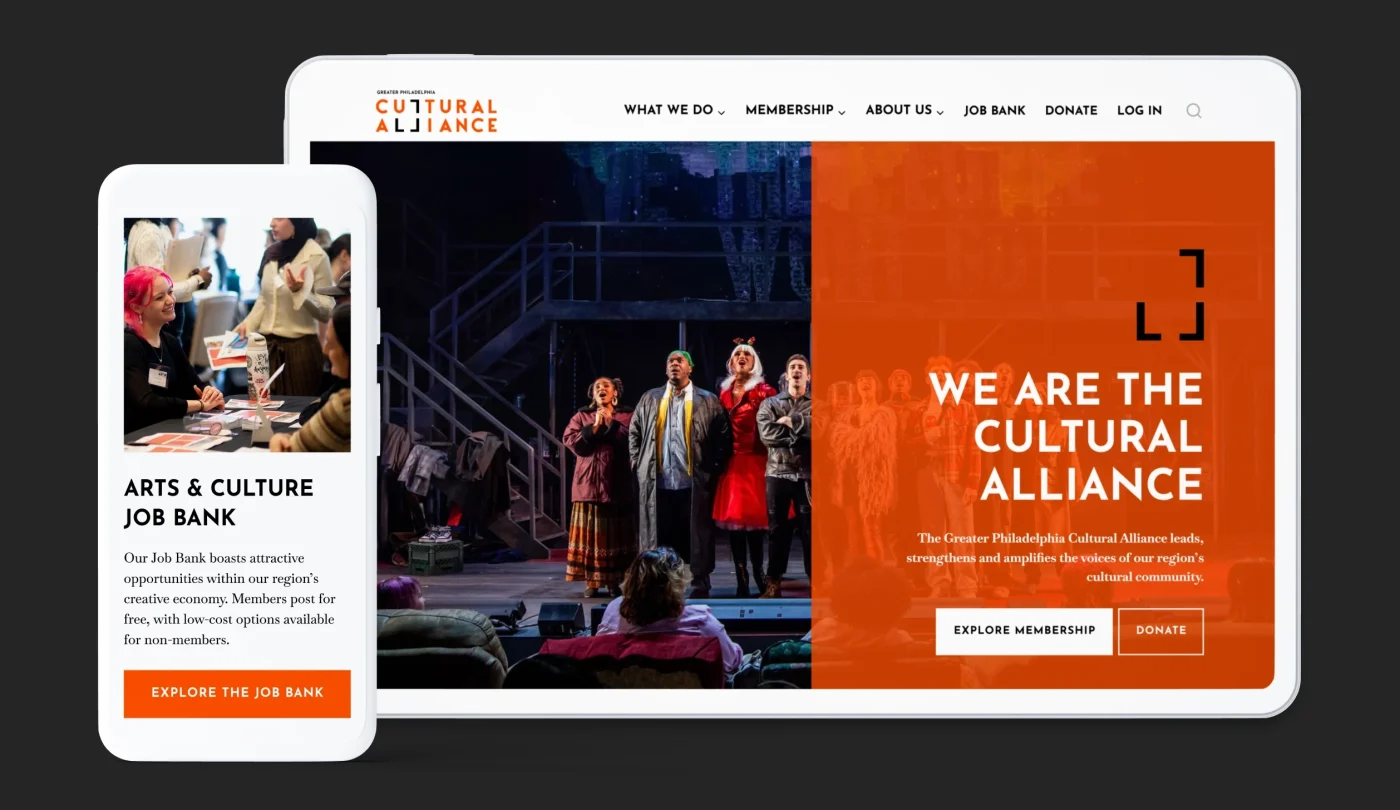
OVERVIEW
Since 1972, the Greater Philadelphia Cultural Alliance (GPCA) has been the premier leadership, advocacy, and audience development organization for its regional arts and culture community. Working across a five-county footprint, it connects a network of 400+ member organizations, artists, and creative entrepreneurs to vital research, advocacy, grantmaking, and workforce development.
Its website — the digital front door that supports the organization’s vast ecosystem — was showing its age and falling short in many ways. To fix it, we partnered with GPCA’s team on a full website redesign that included a Drupal to WordPress migration, upgraded content strategy and information architecture, and fresh visual design.
PAIN POINTS & CHALLENGES
— Multi-Audience Friction: GPCA’s platform needed to serve complex, competing user needs that extend beyond members to legislators, funders, job seekers, and the general public.
— Systemic Instability & Trust Decay: An aging Drupal installation was causing broken links, outdated core pages, and system breakdowns that were negatively impacting user journeys and audience trust.
— Fragmented Tools & Data Loss: Key community assets, including the Member Portal and Job Bank, were operating as disconnected offshoots of the main site rather than clean, purpose-built experiences. And a broken integration meant that email sign-ups meant to feed GPCA’s newsletter and advocacy alert systems were instead routing into CRM systems, quietly cutting people out of communications they’d asked to receive.
— High-Stakes Content Migration: Decades of critical resources and search authority needed to be preserved during the platform transfer.

SOLUTIONS: STRATEGY MEETS CREATIVITY
Visual Design Built Around a Bold New Brand
GPCA had already created a new brand identity centered around a distinctive graphic device called “the frame,” a spotlighting motif that surrounds or anchors content to signal the organization’s focus on its members and mission. We built that concept directly into the new website’s visual language: a bold orange paired with black as the primary palette, five accent colors used for wayfinding across GPCA’s different focus areas, and a considered pairing of fonts that read as confident and enduring rather than trendy.
Each of GPCA’s six core program areas — Membership, Research, Advocacy, Job Bank, Grant Programs, and Workforce Development — got its own custom icon straight from the brand system, so the homepage’s program grid does double duty as wayfinding and brand storytelling.
The approved visual direction was applied consistently across reusable components, hero banners, switchback content blocks, card grids, and data callouts, so the bold new look holds up whether someone lands on the homepage or six levels deep in a research report.
Content Strategy & Information Architecture Tailored to GPCA Offerings & User Needs
We built a new site architecture from a full content inventory and sitemap, grounded in what GPCA’s audiences actually come to the site to do. That work was distilled into a set of content prescriptions covering the site’s highest-priority pages, each mapped to specific audience goals and CTAs rather than generic program descriptions.
The site’s navigation had also outgrown its needs, with three overlapping systems and key resources like the Member Portal and Job Bank buried in inconsistent locations. We streamlined more than half of the existing structure, consolidated the remaining content into one focused navigation, and elevated key programs and resources to where users would expect to find them. The result: a simpler, more intuitive, and action-oriented experience that’s built to support whatever GPCA tackles next.
As part of that effort, we also helped their team isolate member-only content within Salesforce, separating it from the public website for a cleaner experience, easier day-to-day management, and the flexibility to evolve that system later without affecting the main site.

The new site organizes GPCA’s work into clear, self-contained categories, each with its own entry point instead of being buried in dense text. The Advocacy section, in particular, turns GPCA’s “grassroots to treetops” mission into self-serve tools members can actually use: a legislator lookup, voter resources, and a direct sign-up for advocacy alerts, alongside a dedicated CultureWire newsletter sign-up to replace the broken email routing on the old site.
CMS Migration, Done Carefully
We migrated the site from Drupal to a new WordPress build, carrying content across deliberately rather than automatically to protect against the exact content-loss risk GPCA flagged as its biggest fear going in. As part of that work, we audited and mapped legacy URLs, including a long backlog of broken internal links inherited from the old site, so members, press, and job seekers landing on old links don’t hit dead ends.
Accessible & Mobile-Friendly by Design
The new site was built mobile-first and audited against WCAG 2.2 and Section 508 accessibility standards, with a prioritized page-by-page remediation list handed off to GPCA’s team so accessibility improvements can continue as content evolves.