
Takeaways from Usability Testing for a Hospital Intranet
We were recently tasked with performing usability testing on the navigation for an intranet for a major hospital / health system. Below are some key takeaways.
Test Setup
- 15 total tasks
- Two test groups, A/B tested with variations between the two information architectures
- 40 total participants
- Used Optimal Workshop’s “Treejack” platform for menu testing
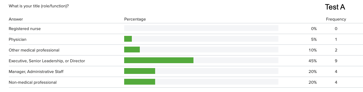
Participant Roles
Sampling of Usability Test Questions
You are looking for contact information for a colleague who works at another campus. Where would you find this information?
Path A: Home > Who We Are > Contact Directories > Employee Directory
Path B: Home > About Us > Contact Directories > Employee Phonebook
- Success Rate: 50%
- First click in both tests was the “Tools & Apps” menu item
- Our recommendation: add a link to the employee directory to the “Tools & Apps” menu
You’ve been feeling low for a week or two straight and feel like you might need some support. Where would you go to find information on what services are offered to help with personal or emotional challenges?
Path: Home > Human Resources > Health Benefits > Mental Health
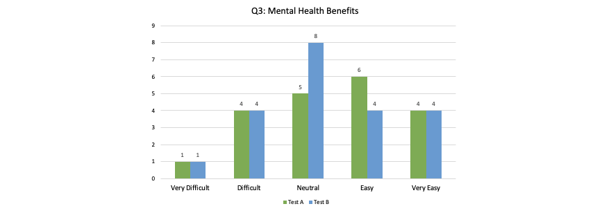
- Success Rate: 65%
- Almost half the participants in both tests clicked “Support Services” for this task, which is not where this information is found.
- 90% of Test A participants clicked on Human Resources
- 76% of Test B participants clicked on “Working at the Hospital”
- Test results suggest that some participants did not know mental health services is an offering available to them at all
- Our recommendation: change “Support Services” label to something less likely to lead to confusion, e.g. “Departments & Services”
- Our recommendation: consider adding a link to this content under “Working at the Hospital”
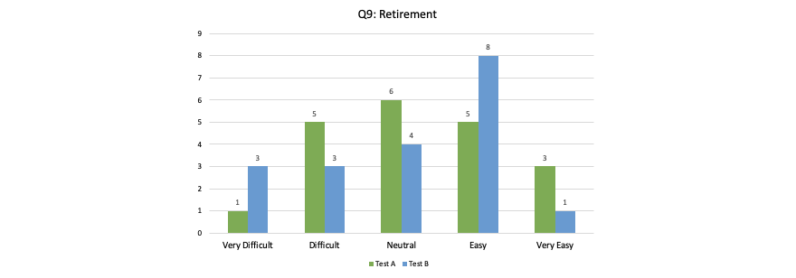
You are planning to retire from the hospital and want to know more information about the process. Where would you look?
Path A: Home > Human Resources > Pay & Financial Benefits > Retirement
Path B: Home > Working at the Hospital > Pay & Financial Benefits > Retirement
Your computer mouse is acting up and you think you need a new one. Where would you look for help?
Path: Home > Support Services > IT
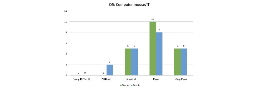
- Success rate: 85%
- Overall, a very successful test
- Our recommendation: re-run this test after changing “Support Services” to “Departments & Services” to ensure success rate remains
Conclusions
The questions above are only a small sampling of the scenarios we created for the usability test. Ultimately, we made a number of recommendations for the primary navigation, home and landing pages, and the UX design of the intranet.
The re-launch of the intranet was a resounding success that allowed the hospital to consolidate their internal resources into a finely-tuned intranet, rather than a series of spreadsheets, sharepoint documents, and word documents.
Q&A
What is Treejack testing for intranet navigation?
Treejack is a usability testing platform from Optimal Workshop that tests menu structures and information architecture. Users are given tasks and must navigate through a text-only tree structure to find content, revealing how intuitive your navigation labels and hierarchy are without visual design distractions.
How many participants are needed for intranet usability testing?
A typical intranet usability test uses around 40 participants spread across test groups. A/B testing with variations in information architecture helps compare different navigation approaches. Testing with multiple participant roles ensures the navigation works for diverse user groups throughout the organization.
What common navigation problems does usability testing reveal?
Usability testing often reveals confusing labels where users expect different content, such as clicking Support Services for employee benefits instead of departmental help. It also shows when users are unaware certain services exist and identifies where adding redundant links in multiple locations improves findability.
How do you measure success in navigation usability testing?
Success is measured by task completion rates and first-click accuracy. A task with 85% success indicates strong navigation, while 50% success signals problems. Tracking where users first click reveals mental models and expectations, informing recommendations for label changes or additional navigation paths.
Eastern Standard creates user-centered digital experiences that drive engagement. Our UX design team applies research-backed methods to solve complex challenges. Contact us about your UX project.


