
Storytelling Through Content-First Design

Beautifully designed websites are a delight to look at, but if the site’s content is incongruous to its aesthetic, the website hasn’t served its main function.
To translate information into meaning quickly and easily for the user, the design should be built with content strategy as the guiding light that shapes the mood, the typography, the hierarchy, the photography, and the color palette.
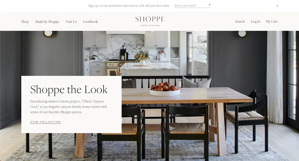
This website for Shoppe, an online home goods store by interior designer Amber Lewis, is an excellent example of content-driven design. Product photography is on full display on this website, showing the user the items that Shoppe sells, as well as Lewis’s interior design aesthetic. The photos blend seamlessly with the website’s UI and messaging, with all elements working together to house the content in an atmosphere that’s as easy, light, and functional as the products themselves.
Another great example of content-first design is this site for Kosloff Architecture. The design takes the concept of content-first quite literally, showing the user an oversized overview of their mission as soon as you land on the site. In support of that primary message, as you scroll through the home page, you are shown images of their work against the minimalist monochromatic backdrop of their design. On top of that, this site uses a unique scroll motion that mimics the angular movement of their projects. All of these elements work together in support of the content: the forward-thinking, dynamic work of this architecture studio.

Define Where Your Story Begins
But how do you build a website around content in such a harmonious way? I like to view the website design process as telling a story. As a foundation for your story, It’s essential to start with a solid structure.
That means a thorough discovery process, including research into the client’s brand and audience, and building well thought-out wireframes that act as the framework for the website user interface. Wireframes denote the functionality and messaging hierarchy of a website, without digging too deep into the visual side of things. While some designers use placeholder lorem ipsum copy for wireframes, I think it’s important to use intentional copy that fits the tone of the client’s brand, even if you need to write it yourself.
When writing or sourcing copy for a website design, the designer should determine the “hero” messaging of the website’s story, as well as the interweaving storylines that act to support the main message.
For example, a homepage wireframe for an independent bookstore website might look something like this:
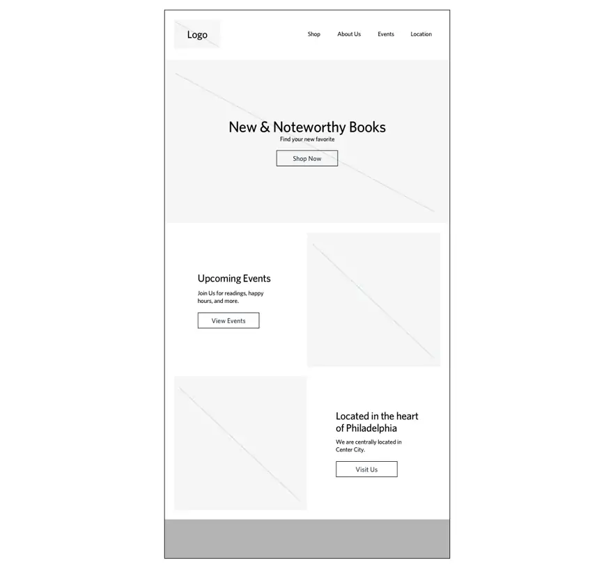
This wireframe establishes functionality, and just as importantly, hierarchy of messaging. The primary “hero” storyline driving this website is shopping, with the secondary supporting messages of attending an event, or finding out where they are located. The basis of this structure and tone are the first building blocks for design.
Fleshing Out the (Relevant) Details
Once you have your wireframes and content in place, you can start layering in visuals to support your messaging. The design elements and details you create should be acting not only as a vessel for the story, but also act as a part of the story itself.
For example, a design element like typography is a crucial element for story-building. Below, the typography on the left would be great for a website for something like an expensive steakhouse: it’s refined and elegant in a way that immediately tells the user that this restaurant will be high end and luxurious before they even look at the menu. In comparison, the typography on the right would be a great choice for a coffee shop because it comes off as friendly, hip, and casual. Both of these choices of typography dictate a clear mood and amplify their messaging effortlessly.

Refined and elegant compared to Hip and casual
Another important piece of a design system is the color palette. Different palettes support different moods, and if you choose the wrong colors, the storyline can become jumbled. In the examples below, the palette on the left is bright and punchy, creating a sunny and energetic mood. In contrast, the palette on the right is more serene and organic. These two sets establish very different moods and storylines.

Bright and punchy compared to Serene and organic
Photography is also a crucial element of a design, and in some cases, like the example for the Shoppe website, the most important driving factor in digital storytelling. Even if two photos are “selling” the same product, they can do so in extremely different ways. To illustrate, take a look at the two very different food images below. While the one on the left is highlighting the communal aspects of sharing a meal, the image on the right is focusing more on the ingredients and details of a specific dish. The first story is one of socializing and sharing; the second is one of texture and taste.

Socializing and sharing compared to Texture and taste
Bringing It All Together
Working together, all of your design details should be telling one seamless, focused story, functionality and visually. The two websites I used as examples in the beginning of this post-work so successfully because every design detail works hard to support the content it holds, and the content and design support the overall brand strategy.
A well-designed website fits like a glove to the shape of its content and identity.
An online store is selling a lifestyle, and an architecture website is as much of a display of craftsmanship as a newly constructed building. If a designer were to build a website first, and then simply input content to fit, the disconnect would be obvious. That’s why, when building a website, it’s important to make content chapter one — and allow the story to unfold from there.
Q&A
What is content-first design and why does it matter?
Content-first design uses content strategy as the guiding light that shapes mood, typography, hierarchy, photography, and color palette. If content is incongruous to the aesthetic, the website hasn’t served its main function. Every design detail should work hard to support the content it holds.
What role do wireframes play in content-first design?
Wireframes establish functionality and hierarchy of messaging without digging into visuals. They denote primary and secondary storylines, like shopping versus attending events. Use intentional copy that fits the brand’s tone rather than placeholder text to establish structure as the first building blocks for design.
How does typography contribute to website storytelling?
Typography dictates mood and amplifies messaging effortlessly. Refined, elegant typography tells users a steakhouse will be high-end before they see the menu. Friendly, hip typography signals a casual coffee shop. Different typefaces support different stories and must align with brand personality.
Why is photography crucial for digital storytelling?
Photography can be the most important driving factor in digital storytelling. Even photos selling the same product tell different stories: one might highlight communal aspects of sharing a meal while another focuses on ingredients and texture. The chosen imagery supports and reinforces the brand narrative.
Eastern Standard develops content strategies that engage audiences and drive results. Our content strategy team creates compelling narratives for complex organizations. Contact us about your content strategy.


