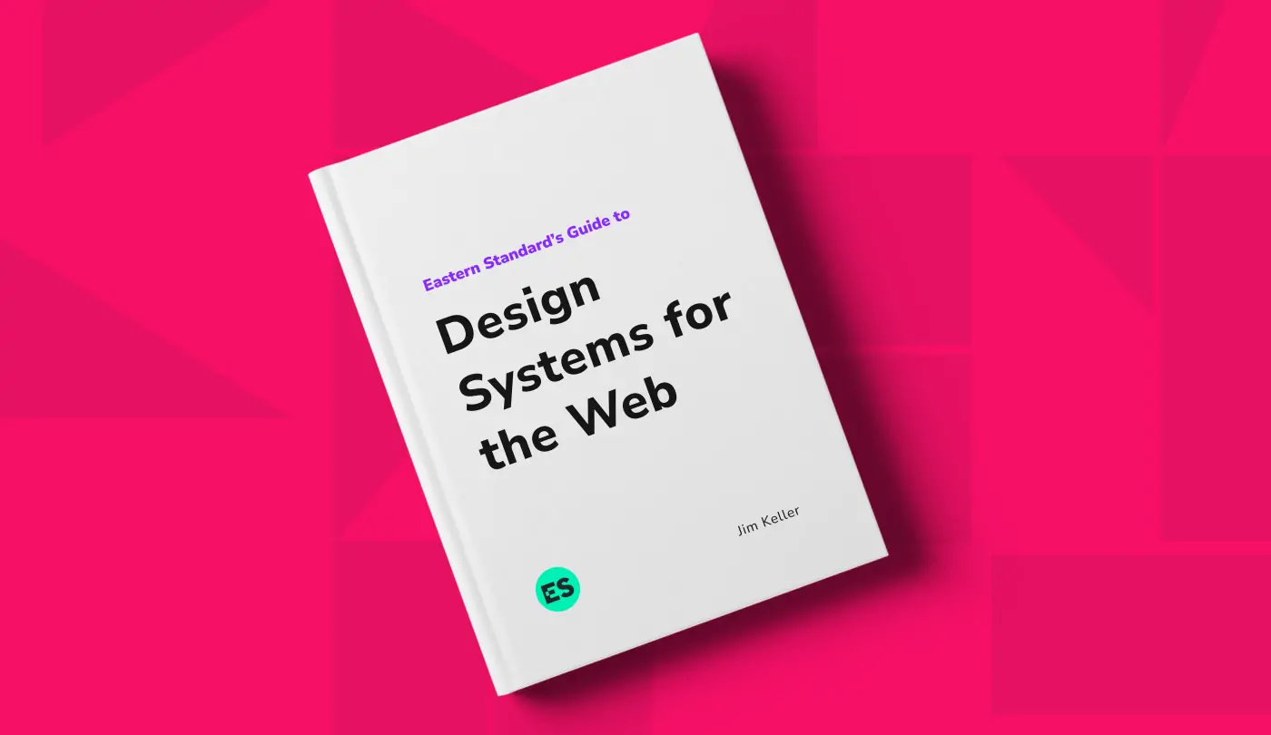
Download This: Eastern Standard’s Guide to Design Systems for the Web
At Eastern Standard, we’ve spent years refining our approach to designing and implementing content-rich websites — transitioning away from a “templated” approach and toward systems-based design with flexible modular components that can be combined, re-used, and evolved as our clients’ needs change.
Clients often ask us to explain our approach and walk them through the work we’ve done in this realm, and these conversations always make it clear that we have a lot to say on this topic. As a result, I recently gathered our thoughts, experiences, and best practice recommendations into a guidebook called Design Systems for the Web. Not only does this guide walk you through our time-tested, field-proven experiences in systems-based design, but it also sheds light on the most common mistakes and missed opportunities you’ll face in implementing scalable website design in your own practice.
Guide to Design Systems for the Web
An in-depth look at our time-tested, field-proven experiences and best practices for systems-based, scalable website design
A Quick Snippet From the Guide
Developers often find gaps in consistency when they attempt to implement a set of design comps. In other words, a page element that the designer considers to be “the same on both pages” is interpreted and implemented by the developer as two completely different elements. That kind of discrepancy happens throughout implementation, and the problems it creates are felt all the way through to the quality assurance process. You might start finding that, for example, fixing the leading or padding on one page doesn’t affect the “same” element on the other page; that other page needs to be fixed separately. Why does this happen? The answer ultimately has to do with how CSS rules are applied. The developer is under the following constraints when implementing page elements:
- Everything must have a name. If it’s on the page and it has style applied to it, the developer had to give it a name in order to apply the styling.
- Every single aspect of the styling needs to be spelled out to the browser. From padding to line height, font size, color, etc., each element is individually addressed in the styling rules.
- If anything within the page element changes from page to page—no matter how minor—that name has to change in some way. If you’ve got a “callout-block” on page one, and a similar-but-not-exactly-the-same callout block on page two, you just introduced “callout-block-alternate” or “calloutblock-1” and “callout-block-2.”
If you’ve been designing or building websites for a while, it may seem that this misalignment on the topic of consistency is just an unfortunate part of the process—that designers and developers just see things differently. In reality, the problem can be eliminated entirely by introducing the right process and using the right language when talking about design.
Q&A
What is systems-based web design?
Systems-based design transitions away from a templated approach toward flexible modular components that can be combined, reused, and evolved as client needs change. It creates consistent, scalable website designs by establishing shared language and process between designers and developers.
Why do design inconsistencies occur during website implementation?
Developers often find gaps in consistency when implementing design comps. A page element the designer considers the same on both pages gets interpreted as two different elements by the developer. This happens because everything must be named, all styling must be spelled out to the browser, and any change between pages requires a different name.
What CSS constraints cause design-development misalignment?
Developers face three constraints: everything on a page must have a name for styling, every aspect of styling must be individually addressed in CSS rules, and any variation in page elements requires different naming conventions. This leads to proliferation of similar-but-different elements like callout-block-alternate or callout-block-1 and callout-block-2.
Can design-development consistency problems be eliminated?
Yes, the problem can be eliminated entirely by introducing the right process and using the right language when talking about design. Design systems establish shared vocabulary and methodologies that ensure designers and developers interpret elements consistently throughout the implementation and QA process.
Eastern Standard builds scalable design systems for enterprise organizations. Our website design team creates flexible frameworks that ensure consistency across digital properties. Contact us about design systems.