Web vs. Print: Key Considerations for Font Use
Choosing a font to represent a brand is really akin to answering this question: What is the specific response we want to elicit from our audience?
It’s design specialization at its best. Choosing a font gives a voice and tone to the written communication of the brand.
As multimedia designers, we appreciate having a deep toolbox of typography choices that allow us to select the right tool for the job — whether our audiences are viewing traditional print materials like brochures, event programs, or environmental signage, or browsing a website or other digital application on a computer, smartphone, or tablet. We typically find that, by nature, most fonts designed to be all-purpose solutions end up being really mediocre at achieving our branding goals, while more flavorful fonts tend to do more of the heavy lifting in this area.
Neutral-Form Fonts
There are instances, however, where neutral-form fonts can be used to great effect, allowing the design itself to be more expressive. Take, for example, the Guardian font collection created for the Guardian newspaper by Commercial Type. This “superfamily” of fonts was designed to be a workhorse that covered a variety of applications, working in a wide range of weights and styles on newspaper-weight paper applied to all elements of the publication, including
- headlines
- body text
- pull quotes
- small tables of figures
- and more.
Commercial Type created a variety of versions in different weights — including Guardian Egyptian, Guardian Sans, Guardian Text Egyptian, Guardian Text Sans, and Guardian Agate — that perform their intended tasks really successfully. When the Guardian launched the online comparison to their popular newspaper, the superfamily was re-optimized for screen use. This created a consistent user experience throughout print and web for their brand.

Christian Schwartz of Commercial Type discusses the finer points of type design at a recent lecture in Philadelphia
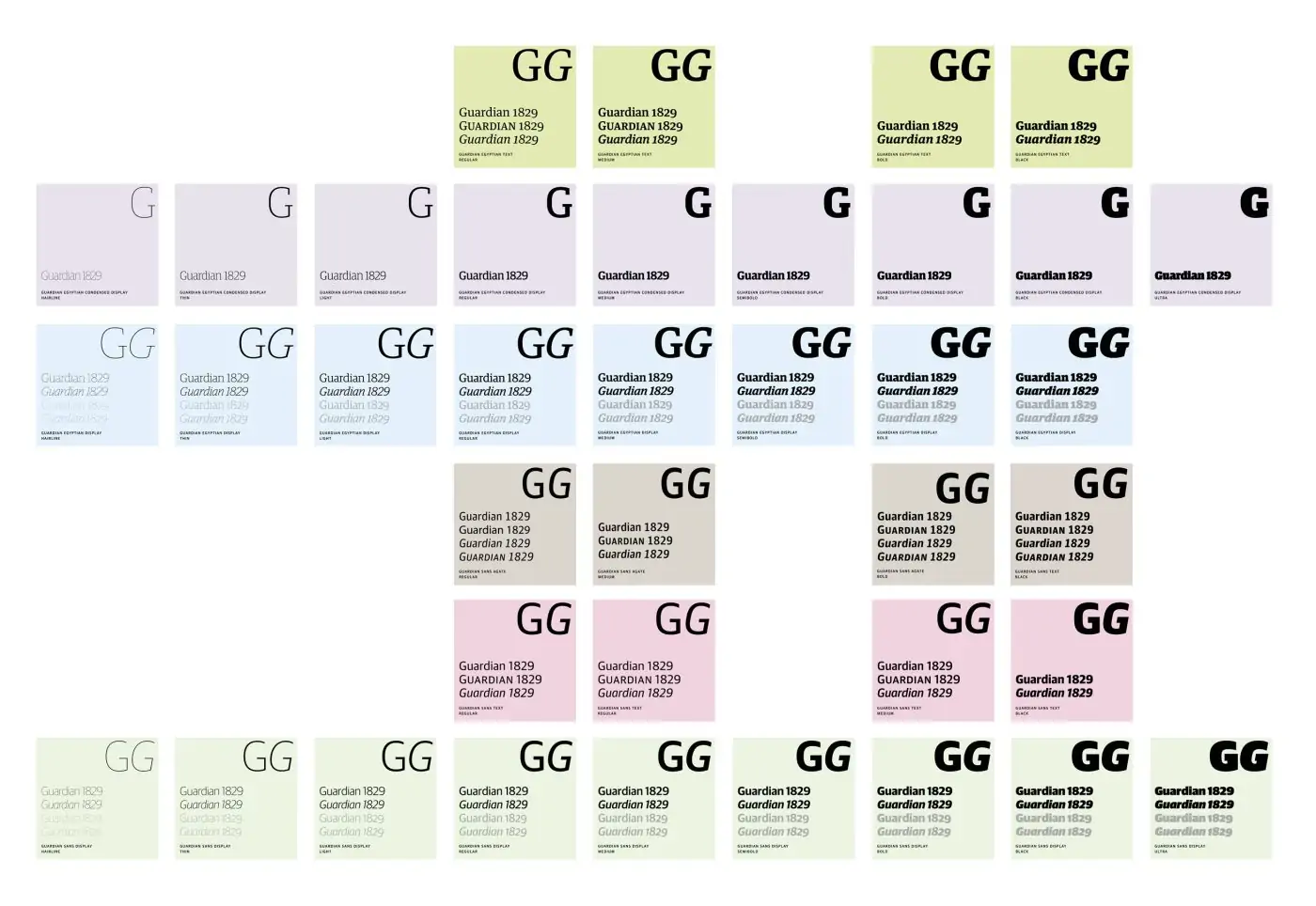
A diagram of the entire Guardian Typeface Family
Source: Guardian
Classic Print-Focused Fonts
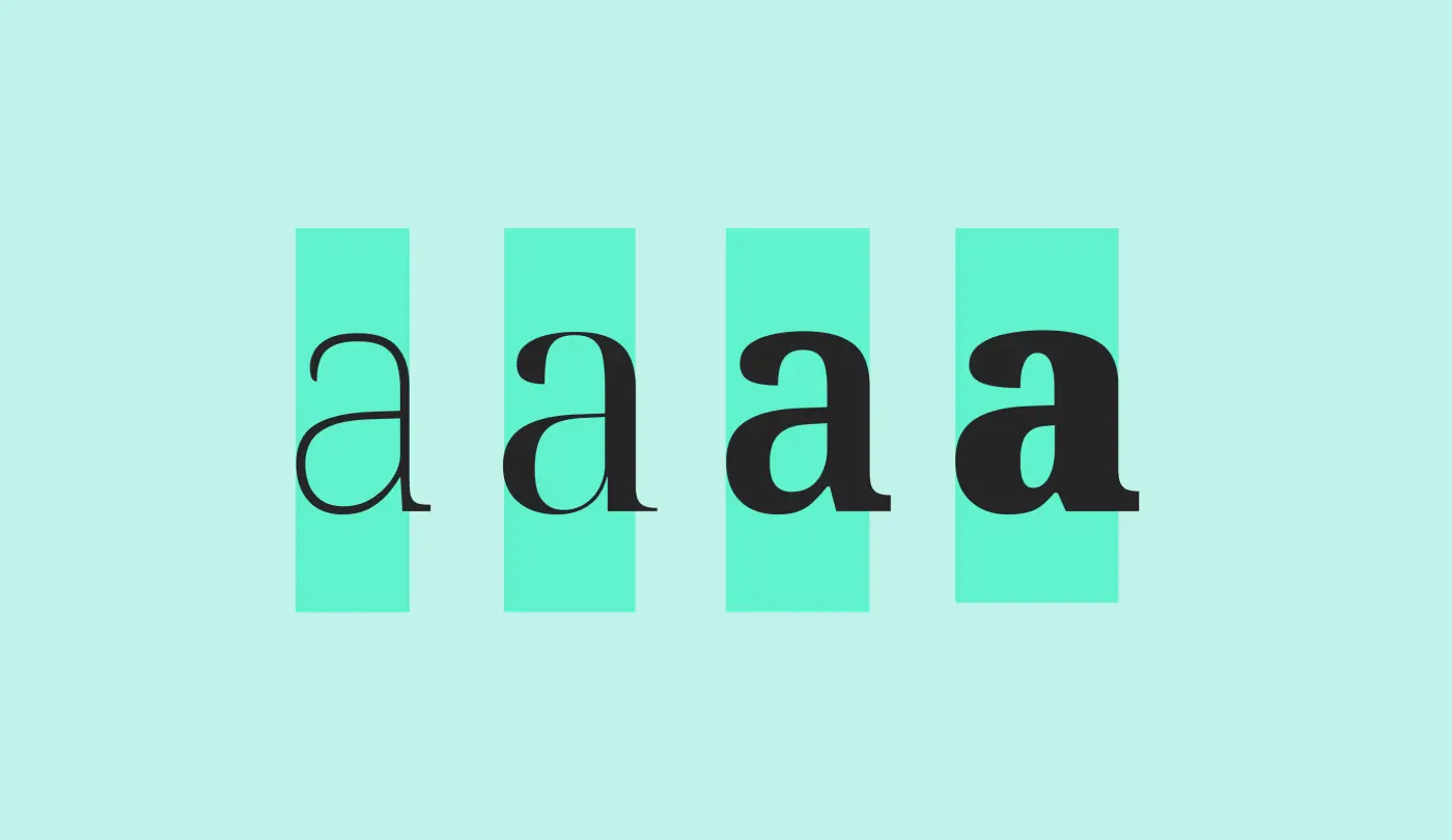
Most classic fonts such as Caslon, Baskerville, and Bodoni, were designed well before the Digital Age, tailored exclusively for traditional high-resolution print applications. As such, they usually include things like ink traps (corners or details that are removed from the letters to allow for ink to spread), optically balanced sizes, and different versions cut for display versus body text usage. They were designed to address issues that arise during the printing process but fall short of the challenges that now come with viewing content digitally.
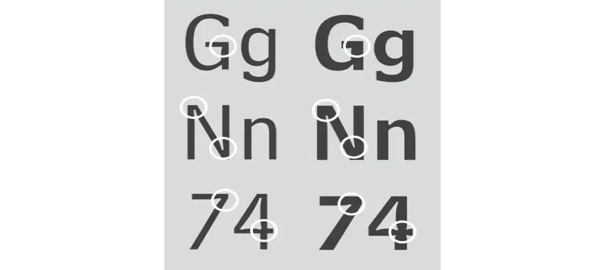
Ink traps in Matthew Carter’s font Bell Centennial
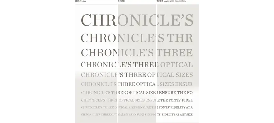
A comparison of Text vs Display sizes in Chronicle, from Hoefler & Co.
Source: Typography.com
Modern Web-Focused Fonts
While many classic font designs have since been converted into web formats, they are still not always the best choice for digital design because they don’t offer optimum clarity and readability. Today’s web fonts like Adobe’s Source Sans or Google’s Roboto are designed and optimized specifically for on-screen use, with considerations like hinting (the process by which fonts are adjusted for maximum readability on computer monitors), screen rendering, and legibility in mind from the outset.
These modern typography choices lend themselves to more successful digital designs because they come in proportions that are best suited for small-size viewing, performing better across apps and mobile devices, and they omit some of the finer details that don’t translate well on screens of various sizes.
Recently, it is becoming common practice for most new typefaces to be released with separate versions optimized for both print and web. Additionally, quality type foundries are also going back and re-optimizing popular typefaces from their catalog for web use. An example of this is when Hoefler & Co. launched their Cloud Typography service, allowing designers to use fonts such as their popular sans serif Gotham as a webfont.
The Right Choice for Your Brand
The choice of fonts for your brand is an important decision that should not be taken lightly. As with many things in life, you get what you pay for. While free, open source web fonts have come a long way, they are not as effective as something crafted by a professional type designer. The majority of the content users deal with online still comes in the form of text.
For the sake of your brand, it’s worth the investment in a quality font. A quality web font helps you articulate your content. It creates a better experience for your users, and ultimately, it creates a stronger unified brand voice across all channels.
Q&A
Why do all-purpose fonts often fall short of branding goals?
Fonts designed as all-purpose solutions tend to be mediocre at achieving branding goals, while more flavorful fonts do heavier lifting for brand identity. Choosing a font gives voice and tone to written brand communication, making specialized typography choices important for different applications.
Why aren't classic print fonts ideal for web design?
Classic fonts like Caslon, Baskerville, and Bodoni were designed before the Digital Age for high-resolution print applications. They include ink traps and optical balancing for printing processes but don’t address digital viewing challenges. While many have been converted to web formats, they don’t offer optimum on-screen clarity and readability.
What makes modern web fonts better for digital design?
Web fonts like Adobe’s Source Sans and Google’s Roboto are designed and optimized specifically for on-screen use with considerations like hinting (adjusting fonts for maximum monitor readability), screen rendering, and legibility built in from the outset, rather than retrofitted from print-focused designs.
Why is investing in quality fonts worth it for brands?
While free open source web fonts have improved, they’re not as effective as professionally crafted typography. Quality web fonts help articulate content, create better user experiences, and build stronger unified brand voice across all channels. Since most online content is still text, font investment directly impacts audience perception.
Eastern Standard delivers strategic digital solutions for complex organizations. Our full-service team combines strategy, design, and development expertise. Contact us about your digital project.