Which Aria Attributes Should I Use? Accessibility and Aria Tags for Common UI Patterns

In this post, I’ve attempted to track down and document best practices recommendations for creating accessible versions of various UI components:
Choose a UI component to see accessibility and aria attribute recommendations:
Hamburger Menus / Push Menus
Accordions
Dropdown Menus
Call to Action Teasers
Hamburger Menus / Push Menus
The “hamburger” menu, where an icon or button triggers a flyout or “push menu” from the side, has become a very common pattern, especially on mobile. Here’s how to apply aria tags to create an accessible hamburger menu:
See the Pen Hamburger Flyout / Push Menu Accessible Example by jimkeller (@jimkeller) on CodePen.
The Trigger(The “hamburger” icon itself)
- The trigger should be a <button> element
- aria-haspopup=”true”
- aria-expanded=”false” (toggle to true when the push menu is displayed)
- aria-controls=”flyout-menu”
- Pressing the enter key should trigger the flyout to appear/open
- Triggering the flyout should cause focus to be set to the first item in the menu
The Flyout Container
- id=”flyout-menu” (this can be whatever you want, but must match the aria-controls attribute of the trigger)
- Pressing escape should trigger the flyout to disappear/close
The menu
- Use <nav> as the container for a menu based on <ul>, <li>, and <a> tags
- All clickable links should be an <a> tag
- Avoid role=”menu” and role=”menuitem”. Read this article for details on why.
- If you have expandable submenus nested within your main <ul>, make sure that the trigger for those submenus follow the same aria-haspopup, aria-expanded, and aria-control rules as the hamburger trigger
- It should not be possible to tab to any menu items when the flyout is closed. Set tabindex=”-1″ on all <a> tags or display:none on parent <ul> tags.
- It should be possible to easily tab through all menu items when the menu is open
Additional information on this pattern, including more details about keyboard support can be found in the “Menu Button” section of WAI Aria Best Practices
Accordions
Note: for implementing accordions, you should almost certainly just use Alex Spirgel’s accordion library .
Each accordion item will have a clickable title, which triggers a particular section of the accordion to open, and a content section, where the expanded content lives
See the Pen Accessible Accordion Example by jimkeller (@jimkeller) on CodePen.
The Trigger (clickable title)
- Should be a <button> element
- Should usually be nested inside an <h2> or <h3> tag so that the titles of the accordion function like headers (imagine if the accordion behavior didn’t exist; you’d just have content separated by headings)
- aria-controls=”section-n” (where n is the relevant content section)
- Pressing up and down arrow keys should change focus to previous/next trigger
- Pressing the home key should focus the first trigger
- Pressing the end key should focus the last trigger
The Content Area
- role=”region”
- add “hidden” attribute (this attribute does not need a value, it just needs to be present. This is critical so that the user does not get “lost” when tabbing to invisible content)
- aria-labelledby=”id-of-button-element-that-opens-this-section”
- Make sure the ID of the content aria matches the aria-controls attribute of the trigger
More information can be found at W3.org’s Accordion Example
Dropdown Menus
See the Pen Accessible Dropdown Menu with aria tags by jimkeller (@jimkeller) on CodePen.
Navigation Bar
- The navigation bar should be a <nav> element wrapped around a <ul> that comprises the actual menu
- role=”navigation”
- aria-label=”Main Navigation” (or some other descriptive text)
Submenu Trigger
(the link that, when hovered/clicked, shows the submenu)
- Should be an <a> element if the trigger is also a clickable link to another page
- Should be a <button> element if the trigger’s only behavior is to open the submenu.
- aria-expanded=”false” (toggle to true when submenu is open)
- aria-haspopup=”true”
The Submenu
(a <ul> element that represents a submenu, and is nested inside a parent <li>)
- aria-hidden=”true” (change to false when submenu is activated)
- aria-labelledby=”id-of-trigger-element”
Call to Action
One of the traps here is that folks often like to use “Learn More” or “Click Here” as the link title for their call to action, but this is not considered accessible. However, you can still have “Learn more” or “Click here” visible on the screen, and simply add aria attributes to make it accessible.
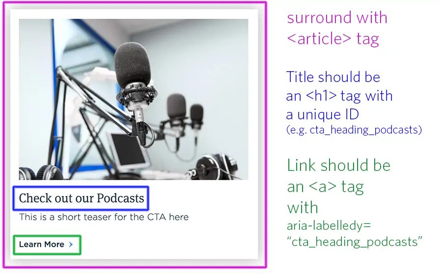
- Put your call to action teaser inside an <article> tag. The teaser represents a discrete piece of content separate from the page it is on.
- Yes, use an <h1> inside the teaser, even if there are multiple teasers on a page. It is OK to reset your heading order within a semantic tag like <article>
- Make sure to set an ID on the <h1> tag. If you are in a templating system and working with dynamic content, simply use a random number at the end of the ID, so it becomes something like “cta_heading_349234”. It’s not important what the ID is, only that it is unique.
- For the <a> tag (“Learn More”) in the example above, make sure you set aria-labelledby=”cta_heading_349234″ or whatever the ID of the heading is
- For best UX practices, the entire CTA should be clickable, not just the link. However, if you have a link tag surrounding the entire card, you should apply the same aria-labelledby attribute and also set it to be tabindex=”-1″ so that only one link per teaser gets keyboard focus when tabbing.
Additional notes and helpful links
Aria tags are critical to the accessibility of websites for those using assistive technology. They are far from the whole story when it comes to accessible user interfaces, but you should incorporate them as a standard part of your code practice. Many developers have a tendency to think of accessibility as something that’s added onto their code after it’s written. This is the wrong approach.
Your default practice for building out templates should always include accessibility concerns at the outset; it should never be an afterthought.
Q&A
What aria attributes are needed for an accessible hamburger menu?
The trigger should be a button element with aria-haspopup=true, aria-expanded=false toggling to true when open, and aria-controls pointing to the flyout ID. Pressing enter should open the flyout and set focus to the first menu item. Pressing escape should close the flyout. Use nav as the container with ul, li, and a tags.
How should accessible accordions be implemented?
The clickable title should be a button element nested inside an h2 or h3 tag with aria-controls pointing to the content section. The content area needs role=region, hidden attribute when collapsed, and aria-labelledby pointing to the button. Arrow keys should change focus between triggers, and home/end keys should focus first/last triggers.
What makes dropdown navigation menus accessible?
The navigation bar should be a nav element with role=navigation and aria-label describing it. Submenu triggers need aria-expanded toggling on open/close and aria-haspopup=true. Use a tags if the trigger links to a page, or button if it only opens the submenu. Submenus need aria-hidden toggling and aria-labelledby pointing to the trigger.
Why is 'Learn More' considered inaccessible for call-to-action links?
Generic link text like Learn More or Click Here lacks context for assistive technology users. You can still display these visually while adding aria-labelledby pointing to the CTA heading’s ID. Put teasers inside article tags, use h1 for the heading with a unique ID, and make the entire CTA clickable with proper aria attributes.
Eastern Standard builds accessible websites that work for all users. Our website development team ensures ADA compliance and inclusive design across all projects. Contact us about accessibility for your website.