
Rules for Implementing Top-Level Section Landing Pages

I have strong feelings about how top-level pages in your navigation should be a) designed and b) incorporated into the flow of a website.
TL;DR
• Top-level section landing pages enhance internal linking and relevancy signals.
• They improve user journeys across key content categories.
• Clear taxonomy and navigation reduce bounce and increase session depth.
• SEO principles (title tags, headers, schema) apply to landing content.
• Aligning content clusters increases topical authority.
I think they’re often implemented in a sub-optimal way, so I’ve written my thoughts here.
I’ll summarize these rules concisely for those of you just browsing, but I’ll unpack my thoughts a bit more below:
- Top-level pages should serve the exclusive purpose of directing users to the content that lives beneath them. There should not be any unique content on the landing page that doesn’t exist elsewhere in the section.
- Top-level pages should not be a necessary part of a user journey; they should be entirely skippable. If a user wants to drive directly to content beneath the landing page, they shouldn’t “miss out” on important content living on the landing page.
- Top-level pages should provide links to every page that lives directly beneath them in the menu structure.
- Top-level pages should always be accessible by clicking the relevant link in the main menu, even if there is a dropdown or megamenu that allows users to skip directly to content beneath the landing page.
Let’s go through each one of these.
Top-level pages should serve the exclusive purpose of directing users to the content that lives beneath them
Say you have a page for your About section. Under About, you have pages for Mission, History, and Our Values. There’s often a temptation to write an overall About message on the top-level page or otherwise fill it with miscellaneous content. Don’t get into this habit; take a look at the example below for at least one reason why you should avoid this trap.
[Note: The only exception to this rule is if the About section is and will forever be just one page: the top-level page. If there’s nothing beneath it, it can be a single page with (for example) the Mission, History, and Our Values content on it. Be careful, though — the minute you add a single page beneath the About section, you’re violating the rule. And I’m watching, always watching.]
Let’s take a look at the following example from Pfizer.com:
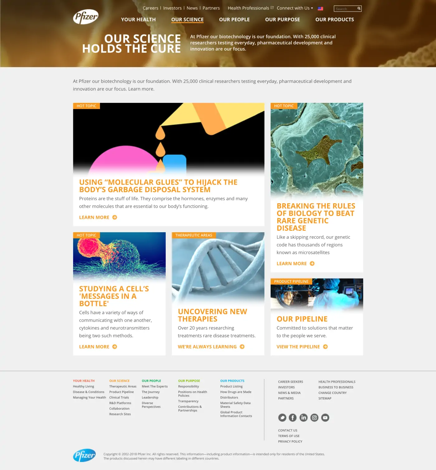
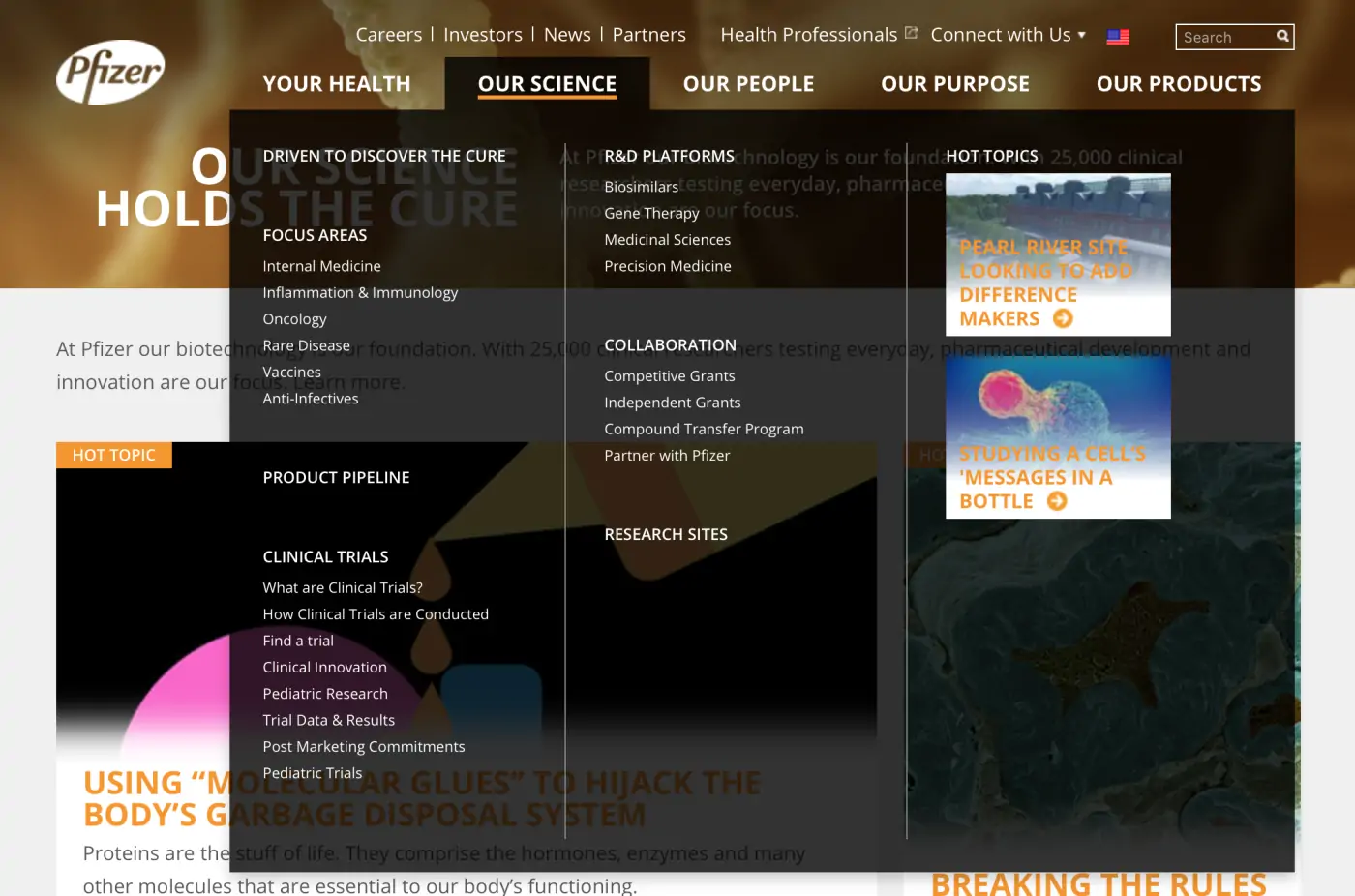
The above image shows all of the pages below Our Science, but let’s take a look at the Our Science page:
The options present on the Our Science page offer the user no direct path further into the content; it seems to be more of a blog feed. The UX design of these pages doesn’t provide a clear user journey. Not only do I not get a clear path deeper into the section, but what if I actually get interested in one of these articles and click on it? If I want to get back to it in the future, how would I remember that it happened to appear on the Our Science main page?
Consider an example of a top-level page that we created for Temple Health that follows my rules:
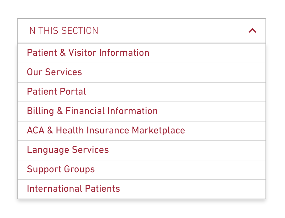
Above is a list of all of the secondary pages in the Patients and Visitors section of the Temple Health website.
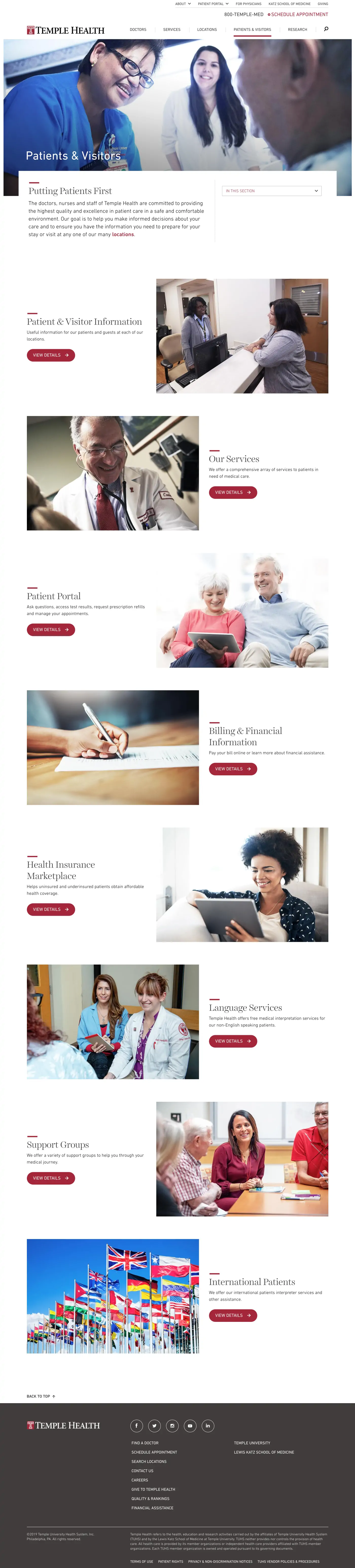
And our top-level page does nothing but provide users a clear path to each of those pages. So refreshing.
Top-level pages should not be a necessary part of a user journey; they should be entirely skippable
This is related to the note above. Consider the case where you have dropdown menus or a push menu on mobile devices. A user should be able to (and they often will) go directly to the Our Values page without stopping at About. And when they do that, they shouldn’t miss out on any relevant content that was actually hiding on the About page.
Top-level pages should provide links to every page that lives directly beneath them in the menu structure
I often see top-level pages that provide big, bold calls to action to some of the pages directly beneath the section, but not all of them. The user is forced to refer back to the menu to see what else is in that section. If you establish that the user experience for diving deeper into a section is to use the calls to action, make sure everything the user might want is represented there.
Top-level pages should always be accessible by clicking the relevant link in the main menu, even if there is a dropdown or megamenu that allows users to skip directly to content beneath the section
I see the following way too often: Imagine a horizontal navigation bar for a university with sections for Academics, Admissions, Student Life, and About Us. Presumably, each of these sections has quite a few pages beneath it. Also assume that there is a megamenu or dropdown menu that, on hover, shows the pages directly beneath each section.
You might be inclined to think “we don’t even need to make the main nav items clickable because the user should always just drill directly to a specific page beneath it.” So your developer disables clicking of the main nav items, forcing the user to choose an item from the dropdown.
This is awful; please don’t do it. Here’s why:
1 — People will rage-click the items in the main menu, not understanding at first why their click seems to do nothing. It’s there, it looks like a navigation link, but it doesn’t behave like the navigation links on 99% of the other websites they visit.
2 — What about your breadcrumb trail? In the example above, when you’re at Home > Academics > Majors and Programs, you would explicitly have to de-link the Academics breadcrumb because there’s not actually a page there.
3 — On mobile, assuming a flyout/push menu, you’ll probably have to implement the menu such that tapping a main navigation link expands the menu below it, but tapping an item in the expanded menu actually takes you to the page. So you have the same interface component where the same user behavior (tapping) does two different things. And what if that subpage has children? Then you have to introduce some kind of plus sign or other indicator that the user can tap to expand a section rather than go directly to the page. But that same pattern — the plus sign — would be irrelevant on the main navigation items since they only have one possible behavior.
You can see an example of this pet peeve of mine on TD Bank’s website (as of August 2019). This one is doubly egregious because I cannot click Products or Services directly, but I *can* click Learning. Oof.
Side note: The Learning page does follow my rules, although I’d wonder if users are missing those tabs toward the top. I’d probably implement these with the tabs serving as jump links to the content below, and have the CTAs for each of those categories all visible (though separated by category) as you scroll.
These top-level section landing pages are an important part of the UX design equation, and should be treated accordingly. Approached with intention and backed by sound content strategy, these pages can help you funnel traffic through your site in a logical way that directs users to find the information they seek and prompts them to take actions that help you reach your site’s goals.
Working with a digital marketing agency to build SEO focused landing pages in 2026
In 2026, structured site architecture and top-level landing pages remain critical for both user experience and search performance. A digital marketing agency with expertise in SEO and information architecture can help you design landing pages that strategically guide users and search crawlers through your content clusters. Agencies assess user intent at each taxonomy level, optimize internal linking to distribute authority effectively, and use data-driven insights to refine page layouts that reduce friction.
They also ensure that metadata, schema markup, and header hierarchies are consistently applied at the section level to support both discovery and relevance. Partnering with specialists enables your team to scale landing page efforts in ways that improve topical authority and conversion without introducing structural inconsistencies or technical debt.
Q&A
What is the primary purpose of top-level section landing pages?
Top-level pages should serve the exclusive purpose of directing users to content that lives beneath them. There should not be any unique content on the landing page that doesn’t exist elsewhere in the section. Avoid the temptation to fill them with miscellaneous content or overall section messages.
Why should top-level pages be entirely skippable in the user journey?
Users with dropdown or push menus often go directly to subpages without stopping at the landing page. When they do this, they shouldn’t miss any relevant content hiding on the parent page. Top-level pages should not contain must-see content that users would miss by navigating directly to deeper pages.
What links should top-level landing pages include?
Top-level pages should provide links to every page that lives directly beneath them in the menu structure. Don’t just provide bold calls to action to some subpages while forcing users to refer back to the menu for others. If calls to action are the experience for diving deeper, represent everything users might want.
Why should main menu items always link to top-level pages?
Making menu items non-clickable causes rage-clicking when users expect link behavior, breaks breadcrumb trails since there’s no page to link, and creates inconsistent mobile tap behaviors where the same action does different things. Every main navigation link should take users to an actual page.
Eastern Standard delivers strategic digital solutions for complex organizations. Our full-service team combines strategy, design, and development expertise. Contact us about your digital project.


