
Creating a Simple Analytics Spreadsheet

The content of your emails communicates a story to your subscribers — and the behavior metrics of your subscribers communicates an important story back to you.
TL;DR
• Simple analytics spreadsheets help teams track KPIs outside dashboards.
• Templates support consistent weekly/monthly reporting.
• Spreadsheets facilitate goal tracking, annotation, and cross-channel comparison.
• Manual data exports reinforce understanding of metrics.
• Data hygiene practices prevent reporting errors.
Being able to track their open and click rates is one of the huge benefits of email marketing. In fact, put simply, if you’re not taking the time to stop and review your data, you may as well be sending a physical mailing.
Luckily, nearly all email service providers (ESPs) automatically apply their own kind of analytics tracking of these metrics, making the analysis process much easier for you. However, while you may know you have access to these analytics, how often do you look at them and make decisions based on them? To make this task even simpler, we recommend creating a spreadsheet to track all of the campaigns you send and make side-by-side comparisons of their performance.
How Our Tracking Method Works
To give you an idea of what this tool looks like, view a sample email analytics tracking spreadsheet we created for one of our own clients.
It’s important to stay on top of recording this data every week because the longer you wait, the longer it will take to record, review, and analyze. We set aside an hour at the end of every week to record the data and look for trends.
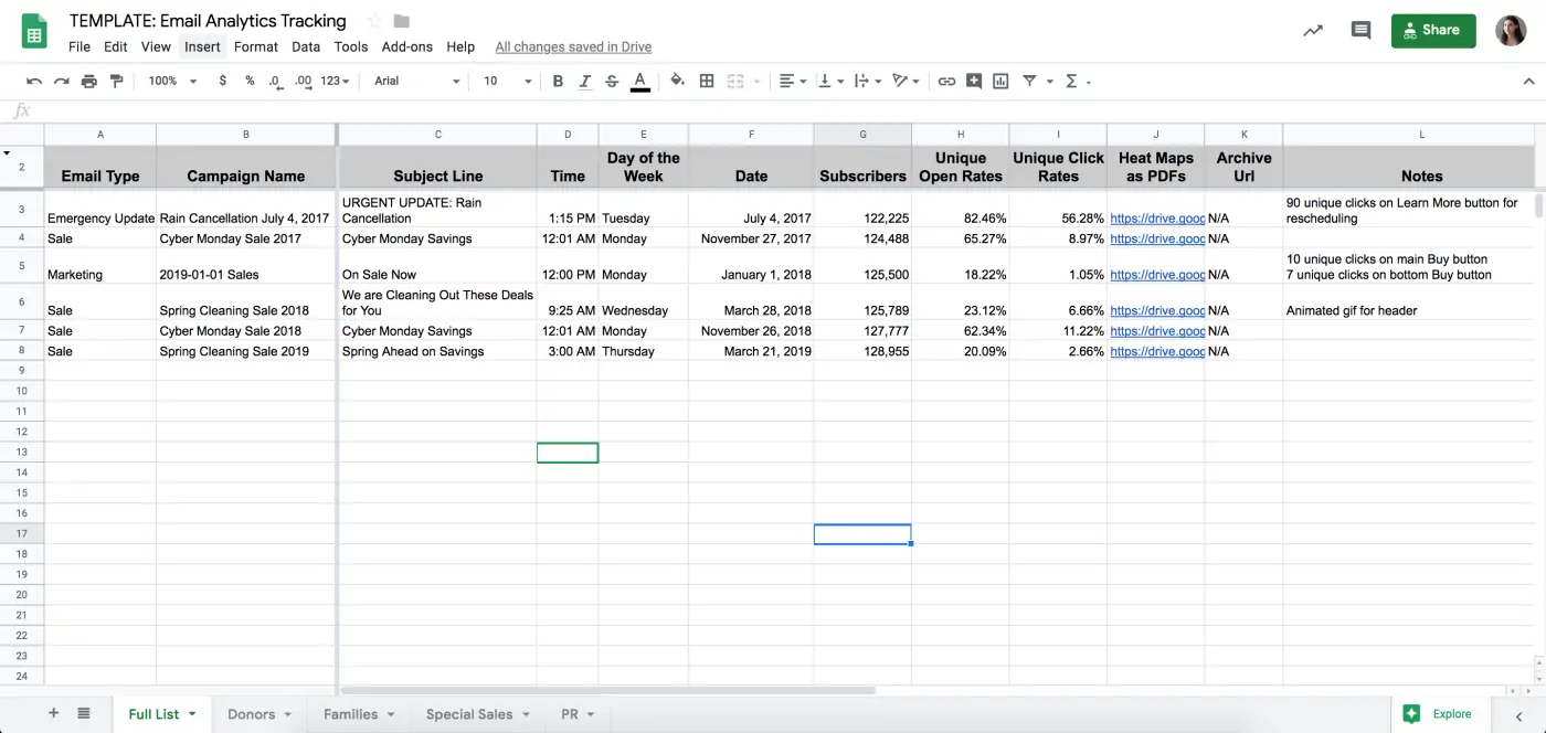
We created the master spreadsheet above to keep track of all of the campaigns our nonprofit client sends each year, with each campaign type assigned to a different sheet tab. For example, some emails are focused on selling tickets to regular customers or marketing free tickets targeted toward families, while other campaigns go to annual members, volunteers, donors, or members of the press.
In this sample spreadsheet, we have additional categories for family performances and special sales. However, the spreadsheet we update regularly for our client contains 15 different sheet tabs since they send such a wide variety of emails throughout the year. Due to the fact that our client uses a variety of subscriber list types and occasionally sends certain campaigns to all of their subscribers, we also have a sheet tab called Full List. This means that certain campaigns appear both in their appropriate category sheet tab and on the Full List one.
In order to focus on overall trends and keep things simple for each campaign and reference it faster, we only note the following:
- Subject line
- Number of subscribers for that campaign
- Number of unique open rates
- Number of unique click rates
- Archive URL
- Day of the week
- Calendar date
- Time the campaigns are sent (which allows us to track the best time for subscribers to engage with the campaigns)
We make sure to link to a PDF copy of each campaign’s heat map or click map so our client can have a visual breakdown of which content in their campaign received the most clicks. Our Email Type column is especially important on the Full-Base sheet tab to distinguish the type of campaign so the client can easily assess different results between, for example, an emergency update message and a Cyber Monday Sale.
The beauty of the spreadsheet is you can sort each sheet tab chronologically and more easily compare results over time. When we compare them, we ask ourselves questions, such as:
- How does a sale you had in the fall compares with one you had in the spring?
- Which campaign had more opens?
- Which campaign had more clicks?
- How do their subject lines differ?
- Did one include an animated GIF promotional image?
This is where the Notes column comes into play since you can note for your client anything unusual or something that may have had an impact, such as a press campaign having zero unique clicks because the content did not contain a clickable call to action (CTA). These notes can be brief, as long as they provide some thoughtful analysis.
The spreadsheet we made for our clients is a Google sheet, and it provides the advantage of being a living document that our client can see whenever they want, rather than having infinite versions of Excel files. Our client has been very receptive to this process so far. Since we take care of the recording and have it all live in one spot, they spend less time in their ESP application hunting for reports and have access to their analytics sooner. This has empowered them to switch up email designs faster when they see that certain elements, such as promotional graphics, perform better than those used in the past.


Copying the Spreadsheet for Your Use
Feel free to copy our spreadsheet of sample data to repurpose for your own campaigns. To do so, open the link provided, click on File, then click on Make a Copy, and rename it for your purposes. You can keep our data as an example, but I recommend you delete this campaign information, as well as any sheet tabs you will not need. If you want to add additional data, such as the number of unsubscribes, insert a column for those. You can easily duplicate our sheet tabs and name them by a category appropriate for your work. If you want, you can also update the permission settings to limit who can view the data, and who can edit or delete it.
A regular reminder on our calendars helps us remember to record and analyze these campaigns at the same time every week. Since we have noticed our client’s subscribers sometimes open their campaigns a few days after they are sent, we wait until the end of the week to cut off our recording.
Adding the heat/click maps takes the most time for us and perhaps the link to your archived campaign URL is enough for you. If not, download a PDF of your heat map or click map, name it the same name as your campaign name, and upload it wherever you store files. This can be done via Google Drive, Dropbox, SharePoint, or a similar platform. Just make sure the share settings are updated to enable anyone with the link to view them and copy the link to paste in your spreadsheet.
When you alert either your client or your internal team, try to send the message at the same time each week and always include the link to your spreadsheet with your short message. This message is a good opportunity to share any important tracking insights you noticed since the last report, such as how the first campaign of a new year performed.
What is a digital marketing agency’s role in building custom dashboards?
As organizations look to democratize data in 2026, many teams still leverage simple analytics spreadsheets for performance tracking and reporting.
A (good) digital marketing agency plays a key role in designing spreadsheet frameworks or customized dashboards that tie directly to business outcomes, whether that’s lead generation, user engagement, or e-commerce conversions. Agencies help identify the most meaningful KPIs for your goals, set up automated exports or connectors when possible, and build annotation systems that record campaign changes alongside metric shifts.
They also create validation checks and standard naming conventions to maintain data hygiene across reporting periods. Rather than static tables, agency-built spreadsheets become living insights hubs that teams can use to inform strategy, highlight outliers, and communicate performance clearly across stakeholders without overwhelming technical complexity.
Taking the time to set up your email analytics tracking in this manner now will pay off later — just remember to update this important tool regularly.
Happy tracking!
Q&A
What data should I track in an email analytics spreadsheet?
Track subject line, number of subscribers, unique open rates, unique click rates, archive URL, day of the week, calendar date, and send time. Include heat map or click map PDFs showing which content received the most clicks. Add a notes column for anything unusual that may have impacted results.
How should I organize email campaign tracking across different audience types?
Create separate sheet tabs for each campaign type or audience segment, such as regular customers, members, volunteers, donors, or press. Include a Full List tab for campaigns sent to all subscribers. This organization allows you to assess different results between campaign types and track performance by audience.
Why use Google Sheets instead of Excel for email analytics tracking?
Google Sheets provides a living document that stakeholders can access anytime rather than managing infinite Excel file versions. Clients spend less time hunting for reports in their email service provider and have faster access to analytics. This enables quicker decisions about switching email designs when certain elements perform better.
When is the best time to record email campaign analytics data?
Wait until the end of the week to record analytics since subscribers often open campaigns several days after they are sent. Set a regular calendar reminder to record and analyze campaigns at the same time every week. Consistent timing ensures you capture complete engagement data before cutting off your recording.
Eastern Standard helps organizations make data-driven decisions with robust analytics. Our digital strategy team implements measurement frameworks that drive results. Contact us about your analytics needs.


