Infinite Nesting Menus and Navigation Alternatives for Large-Scale Websites

Architecting multiple design systems for large websites has put me in pursuit of the perfect navigation system.
Update! We’ve incorporated this solution into a plug and play javascript library
We’ve incorporated our infinite nesting menu into a vanilla javascript library that you can download here
We’ve incorporated our infinite nesting menu into a vanilla javascript library that you can download here
When a website has 100, 1000, or many more pages, reliable navigation is critical for information finding, content discovery, and context in the experience. I’ve worked with many clients struggling with insufficient tools that leave their users lost, frustrated, or utterly unaware of available information. One particular challenge I’ve faced is putting together a navigation system that would be used across several websites, many with extremely large amounts of content.
Objectives
My research began with identifying the objectives the perfect navigation for a content-deep website needs to meet.
Always Provides Context
The navigation needed to provide context to where the user is in the website and answers questions like, What section am I in? What other information is available about this topic? Where can I go next? Assuming the site has a solid information architecture, exposing the context of the user’s position in the site structure will answer these questions and prevent them from feeling lost.
Allows Down, Up, and Lateral Traversal From Anywhere
There is no single path for users to follow when it comes to large sites. When a user understands where they are, navigation needs to allow them to move down (from landing pages to subpages), up (to landing pages from subpages), or laterally (from subpages to other subpages) without hassle.
Also, users of a large website are often not starting at the top. Search traffic typically lands users in the middle of a menu structure. Context and clear navigation paths in any direction allow for further exploration.
Supports a Wide Menu Structure
“Wide” here refers to a high number of lateral pages (think of 7+ links at the same level of a sitemap). Menu interfaces with fixed visual space lead to a practical limit for how many links can appear next to each other. While good information architecture will avoid an overwhelming number of links on the same level, I set out to find a solution that didn’t have arbitrary content requirements forced by the limits of the interface.
When I refer to an “overwhelming number of links on the same level,” I’m basing that on the links themselves and how distinct they are among each other and whether they actually offer clear parallel choices for a user. This is not tied to a specific number. Zoltán Gócza has a well-sourced summary on the fallacy of sticking to 7 links over at UXMyths.com.
Supports a Deep Menu Structure
In comparison to “wide,” “deep” refers to a high number of menu levels (think of 5+ levels of links, or subpages of subpages of subpages of subpages). Information-heavy websites have a valid need for deep menus, with many sub-sections and complex categories of granular information. I was after an interface that wouldn’t require work-arounds like section-specific navigation forced by the interface, rather than for content or user experience reasons.
A false assumption about user behavior is that content more than 3 clicks away is never going to be seen. Even ignoring users that land deep in a site from following results in Google, the evidence doesn’t indicate that 3 clicks is a meaningful limit. I again point to UX Myths for a good list of references. However, don’t use this as an excuse to forgo thoughtful simplification of a menu structure and abuse a flexible interface.
If your site is extremely deep or wide, it can be a red flag for a poor information architecture.
Accounts for Growth
The previous two objectives largely cover this one, but I knew I needed to specifically keep future growth in mind. No amount of new content should break the interface, and significant structural changes in the future shouldn’t require rethinking it.
Offers Full Accessibility
This objective applies both to responsive considerations (for example, will this work for tablet users?) and considerations for users with disabilities (for example, will this work with screen readers?). While this doesn’t mean the interface couldn’t be different as appropriate based on where and how the menu is accessed, all means of access needed to accomplish the objectives above.
Provides an Intuitive Experience
Finally, this interface needed to be intuitive for users to understand and comfortable to use. All would be lost if users couldn’t, or wouldn’t, use this. With this in mind, my search began with ubiquitous examples that users were already familiar with.
Considering Solutions
Without being exhaustive, here are a few familiar menu concepts/elements I reviewed and how they stacked up to the objectives above.
Horizontal Header Links

We begin with the obvious: links horizontally across the header. They aren’t a full menu interface, but are about as ubiquitous as it gets when it comes to web elements. However, they fail to hit a number of the objectives. They have limited real estate on desktop (while horizontal links running onto multiple lines have been tried, they suffer visually and become confusing), let alone on mobile. Their value as clear indicators and links to the main site sections, however, wasn’t something I could ignore.
Multi-Column Dropdowns and Mega-menus
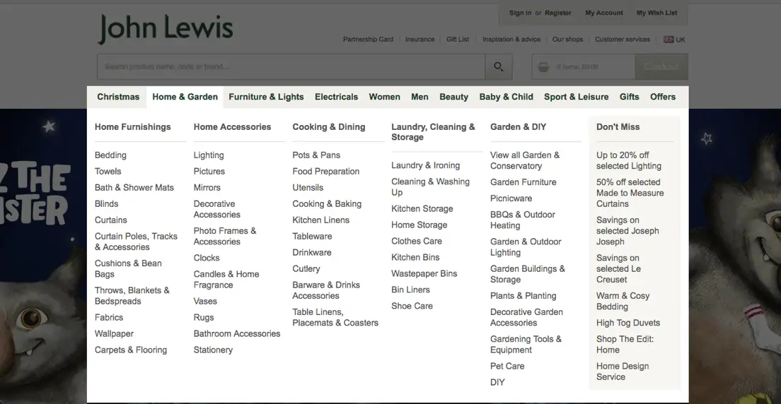
These are often attached to horizontal header links and are sometimes (sadly) considered a full navigation solution. While mega-menus can show more levels of hierarchy than a simple dropdown, there is a finite limit to what they can support. Multi-column dropdowns can, in theory, support a high number of link levels (with levels opening to the right, then to the left when real estate runs out), but the experience of carefully navigating anything beyond a level or two, with any error forcing you to start over, can be frustrating (especially for those with motor disabilities). While using a keyboard may be a technical solution to that issue, multi-column dropdowns also fail at providing context and fall apart on touch devices.
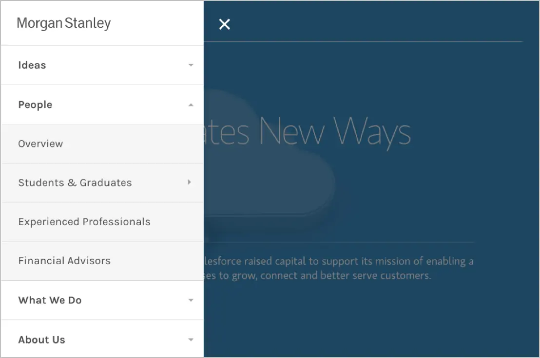
Indented Submenus

Appearing in sidebars, submenus with indents bring us much closer to a solution. Context and hierarchy are possible and, due to links being stacked vertically, levels can be wide. This approach can also be used on desktop, tablet, or mobile. Depth, however, is the main limitation of this concept. If we consider a reasonable minimum width to be 320px, fitting in more than 4 levels of links will start to impact visual distinction, and eventually you will hit a limit when keeping to a readable text size.
Collapsed Menus With Accordions
This approach is common for mobile menus, but it suffers the same fate as indented submenus. Eventually, you simply run out of room.
Finder’s Column View
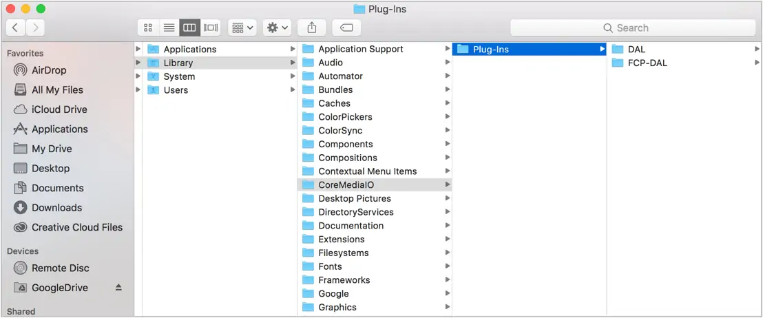
A non-web example with similar challenges is the Finder application on OS X. Focusing on the column view, our space concern is eliminated. Context is provided, and traversal is supported easily in all directions. Of course, on websites, all items in a menu can be both content to be navigated to and a folder for other content, a problem the desired menu interface would solve. The Finder interface also doesn’t need to worry about showing context alongside the content itself.
Infinite Nesting Menu
Following that exploration, my concept landed on a solution similar to “multi-level push menus” (here is a notable example from Codrops) that have seen use on mobile sites as an alternative to the accordion-style menu. In this menu, sub-menus can be nested infinitely. Notably, however, this concept is not fundamentally tied to a “push” animation, is intended for use across devices, and comes with a few specific elements to meet the objectives above and to improve usability.
This menu appears behind a hamburger menu button in the header, in the sidebar on wide viewports, and at the bottom of pages on narrow viewports. Let’s test this concept against our objectives. When the menu appears in the sidebar or below page content, it is contextualized to the current content’s placement.
(Note: We’ve incorporated our infinite nesting menu into a javascript library that you can download here)
Does it always provide context?
Wherever you are, you can see what is above your current page and what is below your current page. If the current page has no children, you can also see any siblings.
Can I go in any direction?
From any page on the site, the menu will allow you to navigate to any other page. Users don’t need to jump to a sub-section’s landing page first in order to see what’s below it.
Does it support wide, deep, and changing menu structures?
The menu can be theoretically infinite in size, letting information architecture be ruled by the best experience of content rather than by interface limits.
Is it fully accessible?
This approach allows the menu to be consistent at any viewport width, solving the same problems and providing the benefit of a familiar experience for those accessing in different ways at different times. From the technical side, we’ve also taken steps to make sure it is as accessible as possible for those using keyboards, screen-readers, or other alternative tools.
Is it an intuitive experience?
While anything not ubiquitous will challenge expectations and require some degree of learning, this approach provides clear indicators for its functionality, developed over a long course of testing and iterations, and avoids the frustrations of navigating deep content that alternatives suffer from.
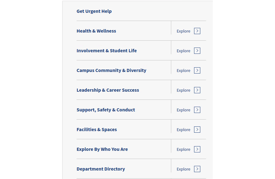
Testing demonstrated the importance of visual clarity and labeling. For example, navigating to subpages without strong visual distinction between the link text (which directs immediately to the associated page) and the arrow to each link’s right (which moves the menu down a level) prevents users from understanding the two separate actions available. Adding “Explore” has also helped with indicating this.
On viewport sizes that can support them, header links, dropdowns, and breadcrumbs are always optionally considered. While the menu system provides all the same functions, these tools serve as familiar navigation aids.
Final Thoughts
Always let the needs of the experience dictate the interface solution. While this menu has, so far, best addressed the needs of large websites, especially in the context of flexible design systems where future content can’t be predicted, more testing is always needed — and simpler, more traditional solutions shouldn’t be ignored when a site’s needs aren’t as complex. Pursuing the perfect menu doesn’t end here.