
A Guide to Web Accessibility for Designers, Content Managers, and Developers
There’s a lot of web accessibility information online, but it’s not always easy to get a concise overview of best practices for WCAG/ADA compliance for your team. As a result, we’ve created this brief handbook on web accessibility.
Before You Get Started
For a deeper dive into the topics covered here, read the W3C full-length current Web Content Accessibility Guidelines (WCAG) 2.2. Note: Starting in April 2026, websites and mobile apps offered by state and local government organizations — as well as a wide range of entities that support them — will be held to higher ADA accessibility standards. Learn about them here.
Table of Contents
Why Accessibility Matters
What It Means to Have an Accessible Website
How and When Designers Should Think About Accessibility
How and When Content Managers Should Think About Accessibility
The Business Case for Accessibility
For Content Managers: Guidelines for Creating Accessible Web Content
Write Descriptive Page Titles
Use Headings to Separate your Content
Make Link Text Meaningful
Write Meaningful ALT Text for Images
Add Transcripts and Captions for Video and Audio
Write With Accessibility in Mind
For Designers: Guidelines for Accessible Design
Contrast Ratio
Text Size and Font Style
Accessibility for Graphics and Animations
For Developers: Guidelines for Accessible Web Development
Keyboard Navigability
Aria Attributes
The Role Attribute
HTML5 Elements and Accessibility
Tools for ADA Accessibility Scanning and Testing
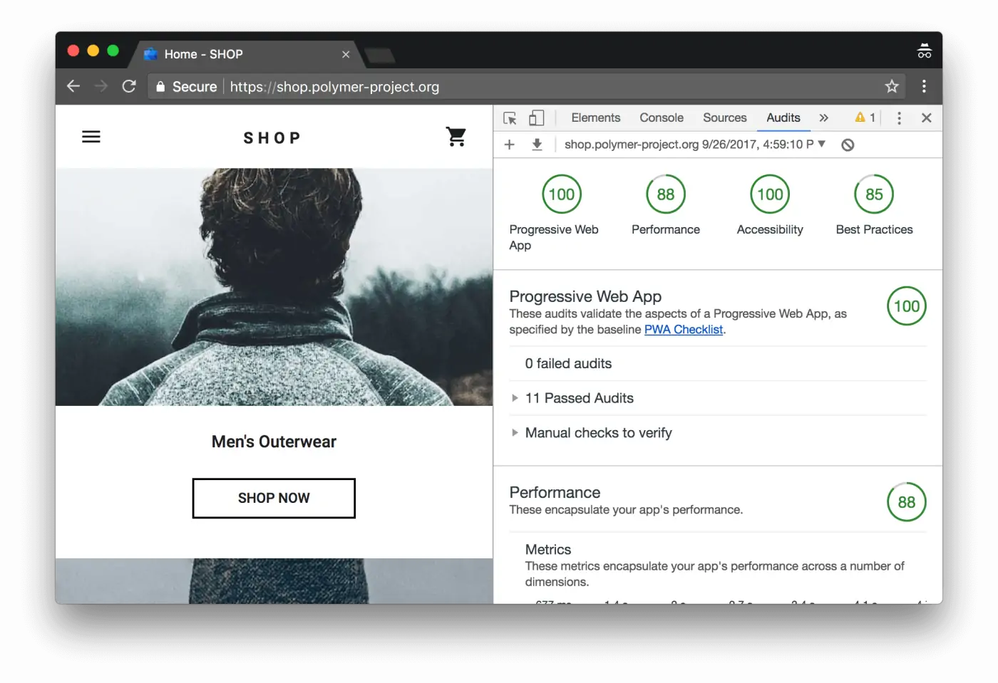
Google Lighthouse
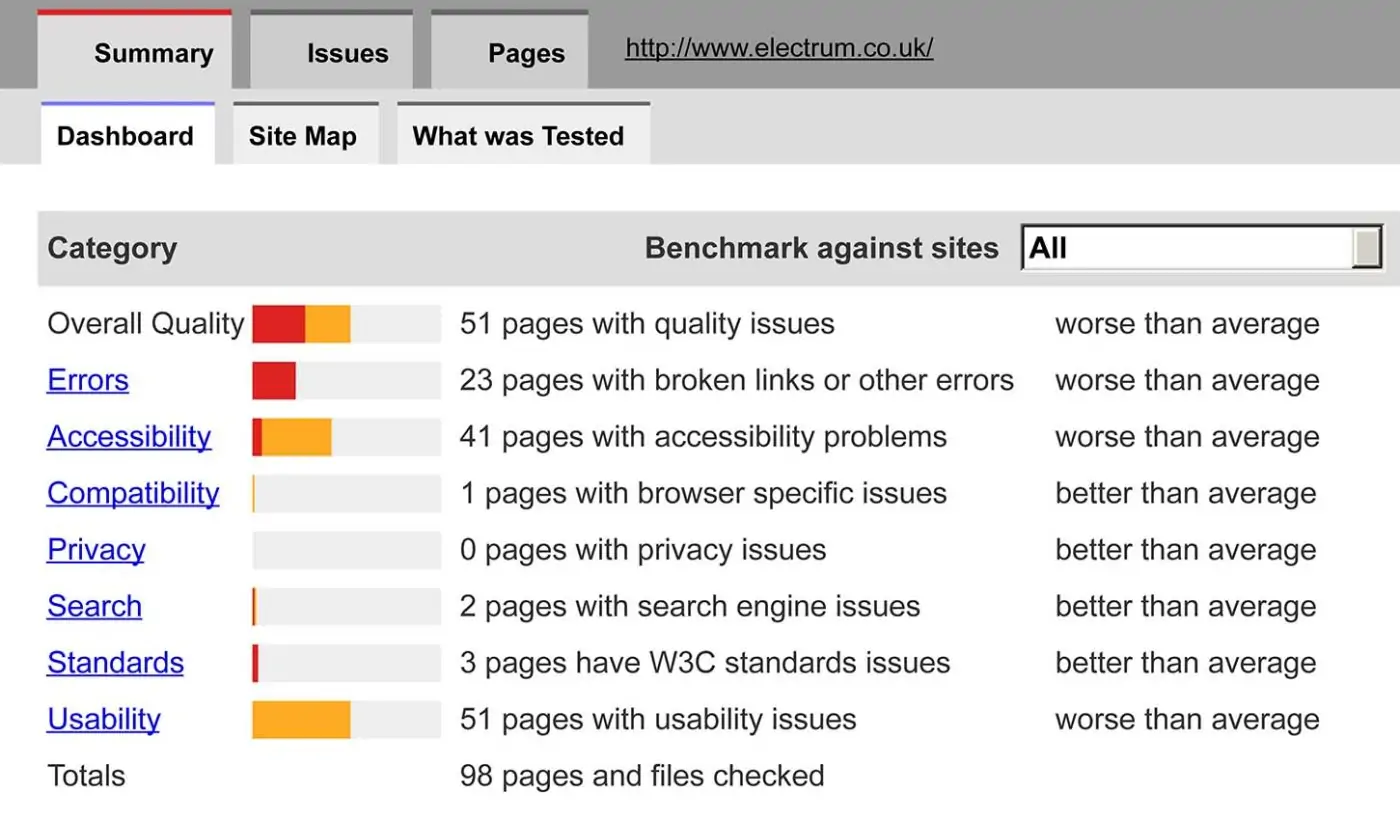
Powermapper Sortsite
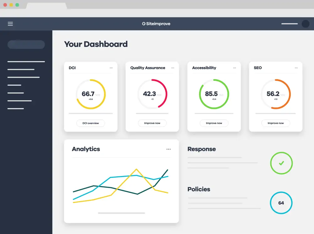
Siteimprove
Introduction
Why Accessibility Matters
In designing and building a web-based experience, mobile application, or desktop application, it is easy to assume that all of your users will navigate and consume that experience in a very similar way: They’ll read text from the screen, navigate using a mouse or their fingers, and interpret and respond to visual cues in a predictable way.
In reality, this approach to design and implementation fails to account for differences in how people interact with the world around them. Blind people, for example, don’t have the luxury of reading text directly off the screen. Other people may not have the dexterity or physical capabilities required to properly use a mouse or touchscreen. Those with color-blindness will not be able to interpret subtle differences in colors, and those with epilepsy are at risk of seizure if the screen flashes too quickly or too brightly.
The spirit of the web is that it is an open, accessible place for everyone to share information. While that mission may be more than enough incentive for many of us to commit to the charge of making our interfaces accessible, a more concrete rationale is also available: The Americans with Disabilities Act requires that websites and other interfaces be designed and built to accommodate those users who must use assistive technology to browse the web.
What It Means to Have an Accessible Website
Accessible design and implementation is sometimes talked about in nebulous terms, making it seem more abstract and less approachable than it actually is.
It’s true that there are many nuances to creating truly accessible experiences, but at a fundamental level, the reality is very concise:
Simply put, there are ways of coding your website and structuring your content that make the website more compatible or less compatible with assistive technology. Maximum compatibility with assistive technology or alternative interfaces (e.g., using a keyboard instead of a mouse to navigate) is considered “accessible.” Poor compatibility with assistive technology or alternative interfaces is considered less accessible.
There is no singular governing body or certification that determines whether a site is accessible. There are, instead, a variety of tools (WebAIM, SortSite, Google Lighthouse, SiteImprove, etc.) that measure your website against a series of tests to determine how compatible it is with accessible best practices. There are also professionals in the space — many of whom themselves use assistive technology — who will directly “field test” a website or application to determine its level of accessibility.
How and When Designers and Developers Should Think About Accessibility
Possibly the biggest dangers faced by designers and developers when it comes to accessibility is leaving conversations about accessibility to very late in the process, when a majority of the design or implementation is already complete.
You must bake accessibility into your design and development processes the whole way through; otherwise, your schedule and scope will be compromised by the nontrivial exercise of “backporting” accessibility into your website or application.
Or accessibility will just get swept under the rug and ignored, leaving you with an inaccessible experience, at best, and a lawsuit, at worst. Even in 2025, we still see design and development processes that either don’t account for accessibility at all, or leave it until the end and then face the monolithic challenge of analyzing a huge accessibility scan report and retrofitting their code to comply with the results.
How and When Content Managers Should Think About Accessibility
Over time, websites are likely to degrade in terms of accessibility. This is because as new content is added, best practices are not followed. A site that once passed an accessibility scan with flying colors will suddenly show a multitude of errors and problems. Like designers and developers, content managers should include accessibility best practices as part of their day-to-day process. Remembering just a handful of these accessibility requirements can save you a lot of time and headaches down the road:
- Including descriptive ALT tags with ALL images
- Using heading tags appropriately, and always in the right order
- Make link text meaningful (don’t use “read more…”)
- Provide captions and transcripts for audio/visual media

The Business Case for Accessibility
Creating an accessible website can increase the cost and budget for a project. So what’s the business case for accessibility? If you read no further, the most to-the-point reason is as follows: You are at risk of a lawsuit (many such lawsuits have been filed) if you take no steps to provide an accessible experience. Information about web accessibility lawsuits: Over 2250 Web Accessibility Lawsuits Filed in 2018 Web Accessibility Lawsuits are on the Rise Number Of Federal Website Accessibility Lawsuits Nearly Triple Other reasons it is worth implementing accessibility into your business practices:
- You may be losing customers if they cannot access your website effectively.
- You care about the mission of creating accessible, inclusive experiences.
For Content Managers: Guidelines for Creating Accessible Web Content
Write Descriptive Page Titles
- Every page should have a primary title that is descriptive.
- The title should appear in the <title> tag (i.e. what you see in the browser window when the page is active). That is determined by the title tag.
- Generally speaking, the same title should appear in the only top-level heading (h1 tag) on the page.
- If you include the organization name in your page’s title tag, it should appear after the descriptive title, not before (e.g. “Macbook Pro Technical Specifications – Apple Computers” rather than “Apple Computers – MacBook Pro Technical Specifications
As a side benefit, descriptive page titles are also valuable for search engine optimization.
Use Headings to Separate your Content
Headings are important for screenreader and other tools to properly parse content, not to mention they are a better way for search engines to use to understand your content.
- Do not fall into the trap of using bold text or larger text to create the appearance of a heading on a page. Use the actual heading tags in your CMS to separate content.
- Generally speaking, your headings will always start with <h2> because <h1>is reserved for the page title itself. There should always be an <h1> tag on the page with a descriptive page title in it.
- Headings must go in order. Do not, for example, start with <h3> without having an <h2> above it on the page.
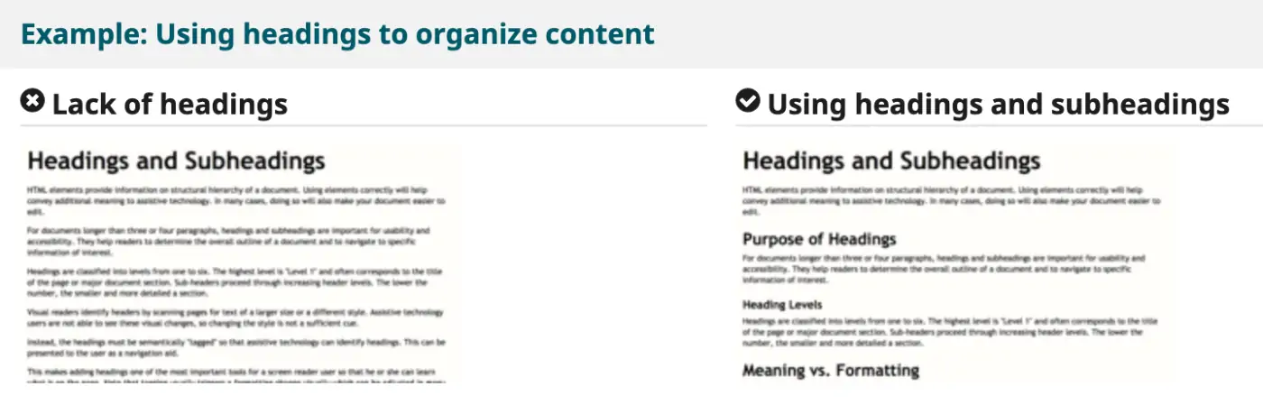
Image from: https://www.w3.org/WAI/tips/writing
Make Link Text Meaningful
- Avoid using “Read More” or “Click Here” as your link text. When read aloud by a screenreader or shown in a document outline, this kind of text provides no context for what the link is about.
- If you are in a situation where your design or CMS forces you to use “Read More,” talk to your developer about implementing a solution where accessibility tools like screenreaders see the “hidden” descriptive text, but fully sighted users still see “Read More” (and presumably have the visual context to understand what the link refers to) .
Write Meaningful ALT Text for Images
- Your content management system should offer the option to add “ALT” or “alternative” text to every image uploaded and displayed in the system. Speak with your developer if this is not the case, or if you do not know where this option is.
- Every image on your website should have accompanying ALT text. There are no exceptions.
- Avoid using the filename as the ALT text. “IMG_9997.JPG” might technically allow you to fulfill the requirement of having ALT text, but it doesn’t actually help accessibility.
- ALT text should be as descriptive as possible. For example, “students” might be technically accurate, but “diverse group of college students gathered around a picnic table” is much better.
- Don’t start your ALT tags with “Picture of”. Many screenreaders already say “picture of” when reading the ALT tag, so it ends up saying “picture of picture of…”.
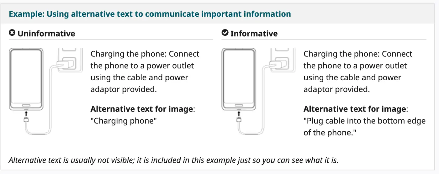
Image from: https://www.w3.org/WAI/tips/writing
Add Transcripts and Captions for Video and Audio
- For audio-only content, such a podcast, provide a transcript.
- For audio and visual content, such as training videos, also provide captions.
Include in the transcripts and captions the spoken information and sounds that are important for understanding the content (e.g., “door creaks”). - For video transcripts, also include a description of the important visual content (e.g., “Athan leaves the room”).
(list above taken directly from https://www.w3.org/WAI/tips/writing)
Write With Accessibility in Mind
- Break content into sections on the page separated by headers.
- To emphasize content, do not simply change its color or underline it; screenreaders will not interpret font changes as emphasis. You can use the <em> tag or <strong> tags for emphasis, or add exclamations points and question marks, which are intoned by screenreaders.
- Do not include text within images.
- Write plainly in an active voice (e.g., “I finished the race in 25 minutes” rather than “The race was finished in 25 minutes by me”).
- Use tools like the Hemingway App to check the readability of your content. Aim for readability no higher than grade 8.
- Use plain language. You can find a list of plain language phrases and words here: List of plan language words and phrases
For Designers: Guidelines for Accessible Design
Contrast Ratio
- All text must adhere to a contrast ratio, which means that the color of the text must be easily distinguishable from the color of the background that the text sits on.
- In practical terms, this means that dark red text on a purple background or white text on a bright yellow background will not be considered accessible; the colors of the text and background are too similar.
- This accessibility rule exists so that people with color blindness can still read text and distinguish different interface elements.
- Oftentimes, this issue comes into play when placing text on top of images, as in the case of hero banners or carousels. Text on top of images is often unreadable. Use a background on the text to ensure contrast is always consistent.
- Many modern design tools such as Sketch have built-in contrast checkers. There are also online tools such as https://webaim.org/resources/contrastchecker/

This text is too easily obscured by the image behind it. It will not pass an accessibility review. Consider adding a background to the text, or adding a dark overlay to the image or the part of the image where the text appears.
Text Size and Font Style
- Avoid small text; 16px should be considered a minimum text size.
- Sans-serif fonts are good choices for body text.
- Keep color contrast in mind, as discussed earlier.
A deeper dive into accessible typography and font styling can be found at:
Designing Accessible Content: Typography, Font Styling, and Structure
Accessibility for Graphics and Animations
- Avoid animations that flash with bright colors.
- Design focus states. In other words, design for what happens when a button or other element on the screen is “focused” (e.g., someone has tabbed to that element using the keyboard). These are different from hover states, which aren’t visible when using only a keyboard to navigate.
- All videos, including looping “b-roll” backgrounds or looping animations, must have a pause button.
- Don’t use color alone to distinguish important elements. For example, if it’s important for a user to understand the difference between the green button and the red button, those buttons must also have a text label. Some people cannot distinguish colors.
- Infographics must have a text-based alternative.
For Developers: Guidelines for Accessible Web Development
Keyboard Navigability
The site should be fully functional and navigable with a keyboard only (in other words, without the use of a mouse or touchscreen).
- The “tabindex” — the order in which the focus moves from element to element as you tab — should follow a logical order, moving from the first to the last focusable element on the screen.
- It should not be possible to get “trapped” inside an element when tabbing, where it’s unclear where the focus is and there’s no clear path out. This sometimes happens inside elements such as collapsed accordions, where the content is hidden from view but it’s still tubbable.
- Menus should be fully navigable using the tab key, and dropdown menus should also open on tab or enter.
- Hint: Check document.activeElement in the javascript console to find out which element has focus.
Additional information on keyboard navigation can be found at: https://webaim.org/techniques/keyboard/


Aria Attributes
“Aria” attributes provide a means to offer additional information to screenreaders so that the behavior of various interface elements is more apparent.
There are a variety of aria attributes that can be added to various HTML elements on the screen. We’ll discuss just a few common ones here, but the full list can be found at https://www.w3.org/TR/wai-aria-practices-1.1/
- The aria-label attribute can be used to provide additional labels to elements that will be read aloud if the user is using a screenreader. For example: <button aria-label=”Click here to open menu”>…</button>
- aria-hidden=”true” will hide a screen element from assistive technology such as screenreader.
- aria-expanded=”true” will tell a screenreader that a particular element (e.g., a dropdown menu) is currently expanded.
- aria-controls=”id_of_element” tells assistive technology that this button controls another element on the screen. For example, the “hamburger” menu icon that opens a fly-out menu should have its aria-controls attribute set to the id of the fly-out menu.
- aria-haspopup=”true” tells assistive technology that the element is a trigger for a popup/flyout menu.
- aria-hidden=”true” will hide a screen element from assistive technology such as a screenreader .
- aria-labelledby=”id_of_element” will tell assistive technology that a particular element (e.g., a dropdown menu) is “labelled by” another element (e.g., the navigation item used to expand that dropdown menu)
Additional information on aria can be found at the following links:
Introduction to ARIA (Google)
ARIA specification
ARIA authoring practices
The Role Attribute
Adding role attributes to your HTML helps assistive technology understand the exact function/behavior of an element on the screen. Some common roles are below, but a full list is available at: https://developer.mozilla.org/en-US/docs/Web/Accessibility/ARIA/ARIA_Techniques
- role=”presentation” is useful for telling assistive technology to ignore trying to parse any functional or behavioral meaning from an element. For example, a table used for layout purposes could have role=”presentation” so that it’s not interpreted as an actual data table.
- role=”tabpanel” and role=”tab” are useful for visual tabs that exist above or to the side of a content area and change the content when a new tab is tapped or clicked.
- You do not need roles if you are already using semantic HTML5 elements, which are discussed next.
HTML5 Elements and Accessibility
Wherever possible, you should use semantic HTML5 elements in your markup, such as those below. Using these elements helps assistive technology understand the page layout and semantics without the need for additional tags.
- <header> should be used for headers, where the main organization’s logo and navigation appears
- <nav> used to wrap navigation items
- <main> used for the main body content
- <aside> used for related or sidebar content that is tangential to the main content in its purpose
- <section> should wrap any unrelated content sections that appear on the same page
- <article> should be used for teasers
- <footer> should be used for the page footer
- <figure> should wrap inline images, illustrations, or diagrams that are used within the content of the page
- <figcaption> should wrap the caption text for any <figure>
- <table> should used for any tabular data, and should always feature a <thead> and <tbody> section, along with a caption attribute
More information on HTML5 elements (and a complete list) can be found at: HTML5 Semantic Elements
Best Tools for ADA Accessibility Scanning and Testing
There are a number of tools available for accessibility scanning and reporting. Below are some of our favorites.
Google Lighthouse
Google released this tool in 2018, and it is built right into the Chrome browser. Just open up your dev tools, go to “audits”, and choose to run an accessibility audit. The only downside is that it only operates on one page at a time.
Powermapper Sortsite
A powerful scanning tool for accessibility and other errors with your site, we use Sortsite quite a bit. It’s worth noting that while it runs on both Windows and Mac, the Mac version is far superior.
Siteimprove
Many of our clients with in-house digital marketing teams use Siteimprove to keep track of what’s happening on their site, and to scan for accessibility issues and other errors.
A Final Note
Whether you’re starting from scratch or have an established accessibility strategy in place, the key to success is to create a plan for regularly monitoring its effectiveness over time. You’ll want to make adjustments as necessary to remain in compliance with current regulations — as well as to ensure that all of your visitors have optimal access to the best digital experience you can offer at any given point in time.
Q&A
What does it mean to have an accessible website?
There are ways of coding your website and structuring content that make it more or less compatible with assistive technology. Maximum compatibility with assistive technology or alternative interfaces like keyboard navigation is considered accessible. Various tools measure your website against best practice tests to determine compatibility.
What are the key accessibility guidelines for content managers?
Include descriptive ALT tags with all images, use heading tags appropriately and in correct order, make link text meaningful rather than using ‘read more’, and provide captions and transcripts for audio/visual media. Following these practices prevents accessibility degradation as new content is added.
What contrast and typography requirements apply to accessible design?
All text must adhere to contrast ratios where text color is easily distinguishable from background. Dark text on similarly dark backgrounds fails accessibility. Use minimum 16px text size and sans-serif fonts for body text. When placing text on images, use backgrounds to ensure consistent contrast.
What is the business case for investing in website accessibility?
You are at risk of lawsuit if you take no steps to provide an accessible experience since over 2250 web accessibility lawsuits were filed in 2018 alone and numbers continue rising. You may also be losing customers who cannot access your website effectively, in addition to the mission of creating inclusive experiences.
Eastern Standard builds accessible websites that work for all users. Our website development team ensures ADA compliance and inclusive design across all projects. Contact us about accessibility for your website.


