Creating Better User Experiences Through Everyday Inspiration
There’s an expression in French for a specific cognitive bias: deformation professionelle. This is the bias that leads a person to see the world through the lens of their profession rather than from the perspective of a regular human.
In my case, as a UX Design Strategist, it leads me to be more critical with some user experiences and interactions. And at times, more demanding of the products we use.
Once I get an idea of a better interaction in my head, it’s hard to convince myself that I am the only one thinking this, and I start wondering: Why hasn’t this been done yet? And of course there are many answers to this question, starting with the obvious fact that I am not always the target user. I also know I would need to conduct research to find out if a product exists and if anything similar has already been created what was missing from it, and what opportunities there are to improve upon this one. Which leads me to believe that some of these ideas might have been prototyped but during testing were proven as either not desirable, not feasible, or not viable (the three pillars of UX strategy and product design).
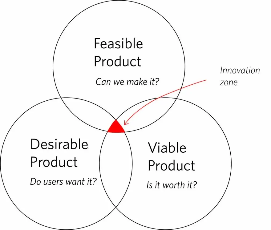
(more on how to find out if a product is desirable, feasible, and viable in my last blog)
Knowing that all products, features, and interactions were once an idea — and in the interest of trend-watching and predicting new behaviors on the web — I wanted to share my latest three ideas for iPhone features to get some feedback on how these would be of interest or completely irrelevant to you, and share some thoughts on how these could then become features we all enjoy.
1. I wish I could highlight and save
As we create user experiences for the web, it’s important to look for opportunities to create experiences that are familiar to our users’ existing behaviors off the web. Doing this allows users to feel more at ease with new interactions given their predisposed connotation of a specific action. This is one of the reasons why the web is full of terms that come from the non-digital world in our digital interactions (e.g., “Add to cart”).
Why highlighting? I personally have a fond memory of highlighting my favorite passages of books I read and think it is so easy to just highlight important information in documents I read. And this is why when Medium came up with the signature experience of highlighting content on their site, I was ecstatic that someone finally felt there was a need for it (outside of the traditional PDF highlight feature). But, in general, I wish I could highlight information everywhere, and my phone would save it in a reading list that I could access any time — as well as allow me to go back to a page and see what I had previously highlighted. I know this is easier said than done, but I would consider it worth exploring.
2. I’d like to add notes to photos
I’m not talking about photo markup. I’m talking about being able to add metadata to images I take without having to use a separate app or having to organize them using notes.
When ideating new features, it is valuable to think of what other functions already exist that would complement the new features you create. The iPhone already has a great search tool that is pretty impressive and even fun. You can look for all photos with “hats,” for example, or “concerts,” or a specific person or place. The next step, in my opinion, is being able to customize this further, letting users add a hashtag or notes to a photo. And users are already familiar with this behavior since it is already being done by Instagram — why not integrating as an iPhone feature? The use case could be both practical and even for creative use, such as associating photos to a poem (and obviously I recognize this might be an edge case, but an interesting audience group nonetheless.)
3. I’d appreciate hearing Siri say, “You’re welcome”
As a UX Strategist, I feel responsible for the interactions we create. I feel we always need to be inclusive, empathetic, and kind. In the copy we write, we think about the tone to use that will have the most positive impact on our users. This is why it comes as a surprise to me that Siri just isn’t that polite. When you say “Thank you,” after you interacted with her (asking for her to set a reminder or find the nearest restaurant), Siri doesn’t say, “You’re welcome!” back. I know there are parental control apps and controls that can force the user of a voice interface to say thank you. But shouldn’t we want this to be the norm? And if that’s the case, shouldn’t you get a final reply from Siri saying, “You’re welcome”? Furthermore, if we think of the full user journey of a user interacting with a voice UI, this would make these commands the norm to close the launcher after you ask for something. Instead of how it currently works where Siri stays open requiring the extra step of closing it manually (defeating the whole point of using Siri) and potentially making some people, who are concerned about voice assistants listening in, more concerned.
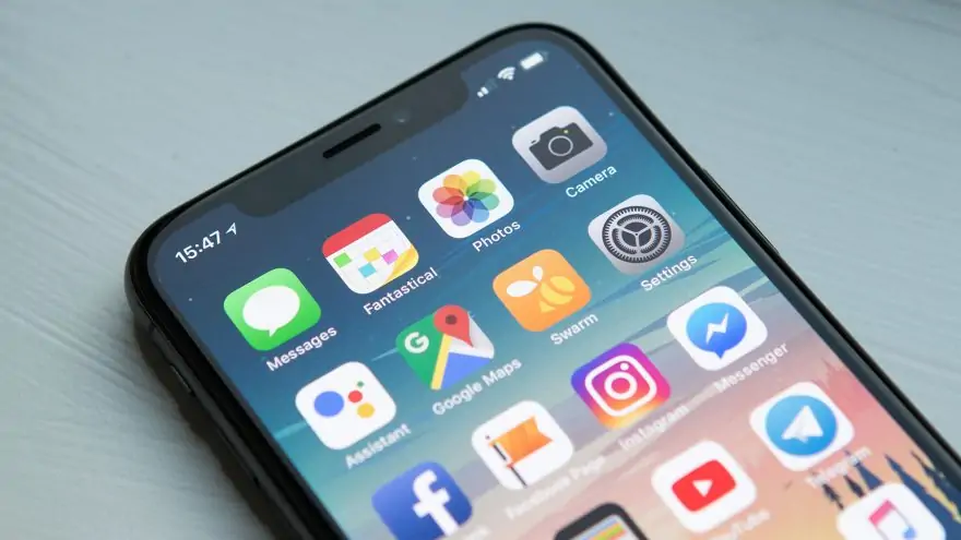
In today’s world, where we all interact with dozens of user interfaces throughout the day, the deformation professionelle experienced by UX/UI strategists and designers provides us with a great opportunity to design products and improve existing interfaces for users who share our dissatisfaction with the current experience. These ideas can and should be explored to become new features that we can all enjoy. As designers, we have the advantage of being able to translate pain points into better products. This is not only valuable in assessing the interfaces we interact with daily, but it is also the way to create better websites and interfaces for clients who want to do more to support their audiences’ exploration of their sites.
This instinct and eye for challenging or incomplete interfaces can lead you to great discoveries. Of course, we all know we can’t rely solely on ideas, which is why we always encourage doing research before any redesign, to make sure these new interactions align with your audience’s perspective of your brand and the needs of your target segments.
At Eastern Standard, we believe design decisions should always be informed by insights from research and data, which is why strategy and research are such an important part of the work we do.
If you want to find out more about how to conduct research, read about it in my last blog post. And although most people think research and discovery should only take place prior to development, we are fans of testing and will put our own site designs and solutions under the pressure of user testing to pinpoint the best and most valuable interactions and the aspects of these one we might have missed. Testing can be done on sitemaps to review how intuitive the information architecture is, as well as on design to test how people respond to certain button styles and layout.
Once the desire for this feature is validated, you can go from ideas into testable prototypes. These prototypes are a low-fidelity version of the feature you want to create. Sometimes these can be wireframes, hand-drawn sketches, designed screens or even existing websites that your test participants interact with. We do this to find where people click through heat map and what interactions are more valuable than others.
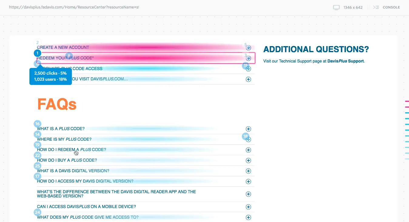
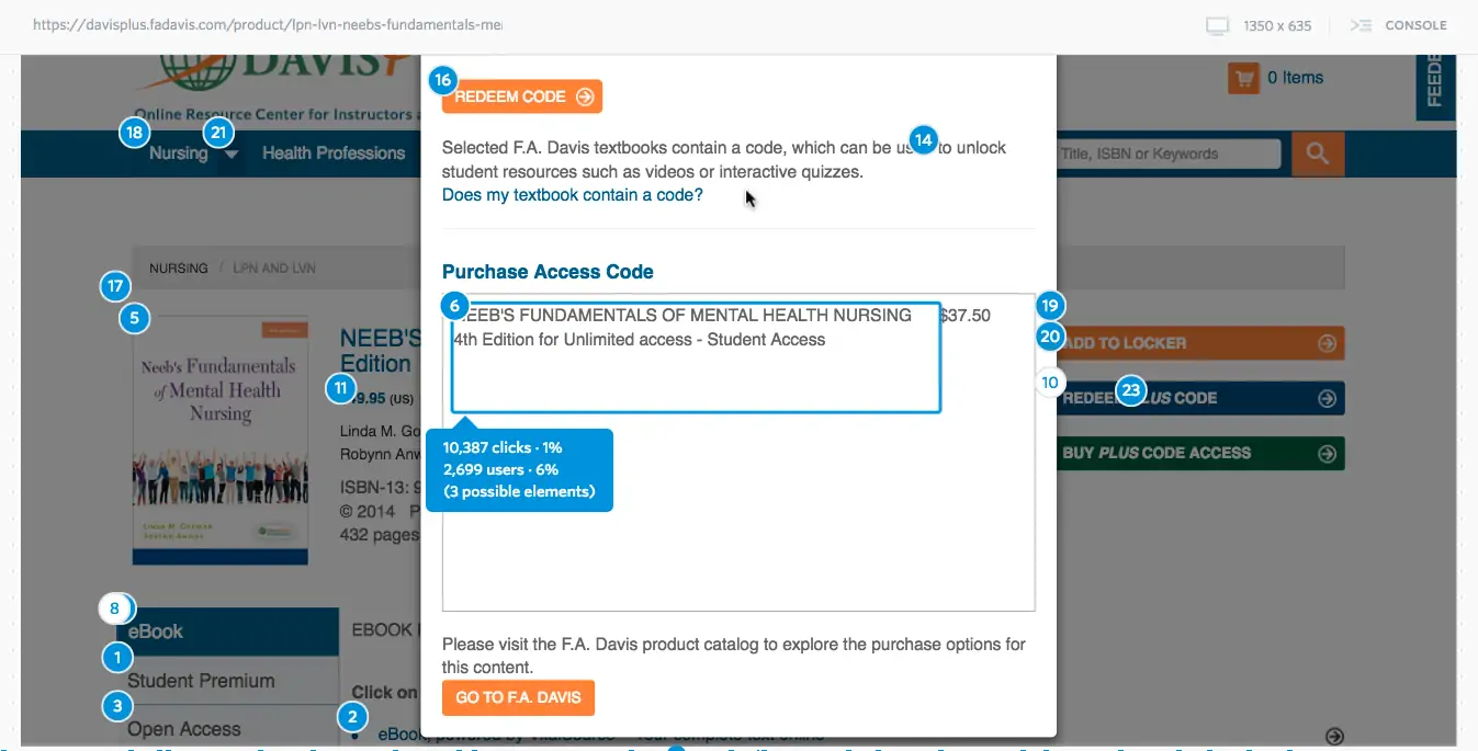
In these tests, you should not lead users to validate your solution, but rather provide scenarios and opportunities for them to interact with the product and discover on their own what your new features offer.For example, in the case of the highlighting function: Don’t tell users to find something interesting in the text they read, select it, and highlight it. Instead, tell them to read the text and explore the dashboard you created for options to make the most of what they read (hopefully they are as interested in highlighting as I am!).
So What Do You Do to Translate an Idea Into a Feature?
The first thing we do is identify when in a user’s journey they would want or need to seek out this product feature. We do this to understand how to make the experience more smooth, to add details that would make them truly valuable, and to make sure we identify a “problem-solution fit.”
One way to capture this is with the following statement:
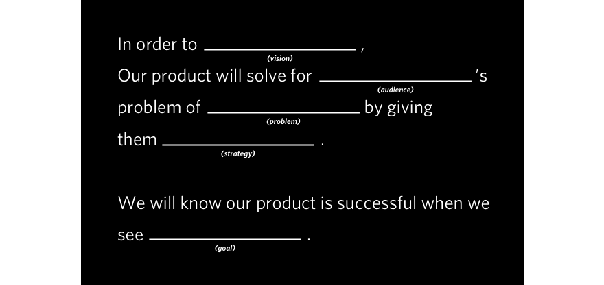
This exercise will guide you when making decisions about a new feature or component on a site, and it can help you and your clients identify which ideas are a good brand fit and worthy of further exploration — and which ones should simply be captured in your personal “Almost a Billion-Dollar Idea” notebook.
Remember, an idea that is invalidated should not be thought of as a failure.
As Thomas Edison famously said, “I have not failed. I’ve just found 10,000 ways that won’t work.” With the right strategy, team, insights and product development, you will eventually find the best product or feature for you and your audiences — so go ahead, make the most of those ideas you have!
Q&A
How can UX designers translate everyday frustrations into product improvements?
When you get an idea for a better interaction, conduct research to find if similar products exist, what was missing, and opportunities to improve. Test whether ideas are desirable, feasible, and viable through prototyping and user testing before development.
Why should new digital features mirror familiar offline behaviors?
Creating experiences familiar to users’ existing behaviors off the web allows them to feel more at ease with new interactions given their predisposed understanding of specific actions. This is why the web uses terms from the non-digital world like ‘Add to cart’ in digital interactions.
How do you translate an idea into a testable feature?
First identify when in a user’s journey they would need this feature to understand how to make the experience smooth. Create low-fidelity prototypes like wireframes, sketches, or designed screens. Test without leading users to validate your solution; instead provide scenarios for them to discover what features offer.
What framework helps evaluate whether a feature idea is worth pursuing?
Use the problem-solution fit statement to capture when and why users would seek this feature. This guides decisions about new features, helps identify which ideas are a good brand fit worthy of exploration, and which ones should simply be captured for later consideration.
Eastern Standard creates user-centered digital experiences that drive engagement. Our UX design team applies research-backed methods to solve complex challenges. Contact us about your UX project.


