
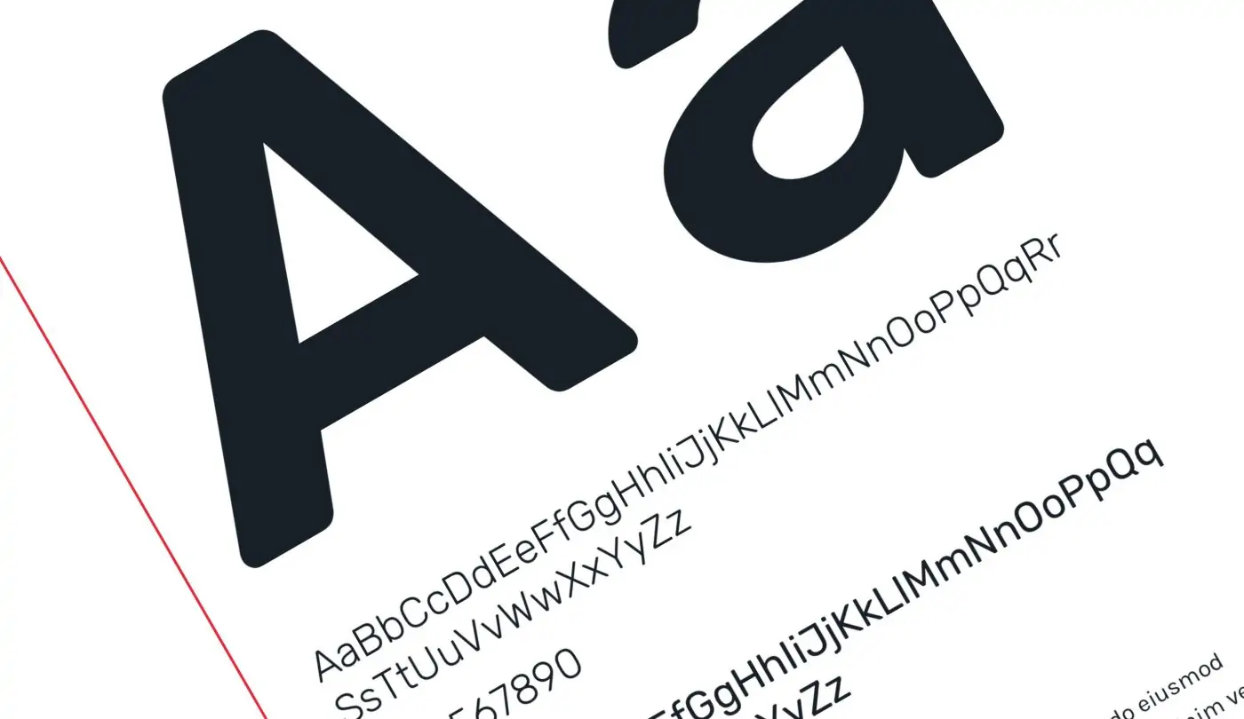
Accessibility in Web Design
As a web design and branding agency, we know that clients want their website to be engaging, forward-thinking, and usable. But the surface-level concept of usability often leaves many people out of the equation.
Access to the Internet — now seen as a fundamental human right — is only accomplished if websites cater to all users, regardless of visual, auditory, motor, cognitive, learning, neurological, and/or physical abilities.
This may seem like a daunting ideal, especially in regard to visual design, but that doesn’t have to be the case. Making your website accessible does not mean compromising your design or business goals. In fact, accessibility often increases the overall value of a website: a wider audience reach, improved search engine optimization, and the participation in creating a better web experience for user groups who are often ignored. Plus, you mitigate the potential for any lawsuits over the usability of your website, and now more than ever, that’s a very real possibility.
The Elements of Web Accessibility
There are many elements that designers, content strategists, and developers should keep in mind when trying to build a website that anyone can easily use. Here, I’ll highlight some of the easiest ways to establish and maintain accessibility:
1. High Color Contrast

For visually impaired and colorblind users, it’s difficult and sometimes impossible to read text that is not high contrast enough. Tools like WebAIM’s color contrast checker give designers an easy-to-use way to check if their color contrast is compliant under the World Wide Web Consortium’s (W3C) Web Content Accessibility Guidelines 2.0. High contrast doesn’t have to be a detriment to a design, and in fact, high contrast, minimalist designs are actually a huge trend in web design right now, like this site for Intern magazine.
2. Text Size
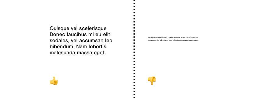
While websites don’t necessarily have to be designed at extremely large type sizes, web designers need to at least accommodate for the scaling of text sizes for visually impaired users. (This resource from W3C goes into much more detail about the technicalities of that process.) But using large text in a design can actually be a forward-thinking design element. Sites like redclayhotsauce.com use large text sizes as a progressive and successful design feature.
3. Establish Content Hierarchy
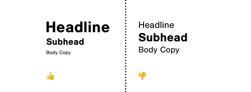
Establishing hierarchy of content through type sizes and white space is a pillar of good design, and it’s no different in the context of accessibility. Designating rank through the appropriate tags (like h1-h6 tags for headers), as well as through visual cues (i.e., scale and font weight) allows users to scan content not only visually, but also through assistive technologies like screen readers. This W3C guide on page structure is particularly helpful for figuring out how to properly arrange and tag your website’s content.
4. Using Alt Text

Alt text is set for non-text-based content to be able to be read by screen readers for visually and/or cognitively impaired users. Every time you, as a web user, see an image or video, there is (or at least should be) a text summary of that content coded into the html of the page (contained in the tag alt=” “). It’s an important element of web accessibility that is not noticeable at a cursory glance, but is crucial to the web experience of certain user groups. For more information on how to properly use alt tags, check out this guide by WebAIM, a resource that aims to expand knowledge of best practices for web accessibility.
5. Using Forms, Labels, and Errors
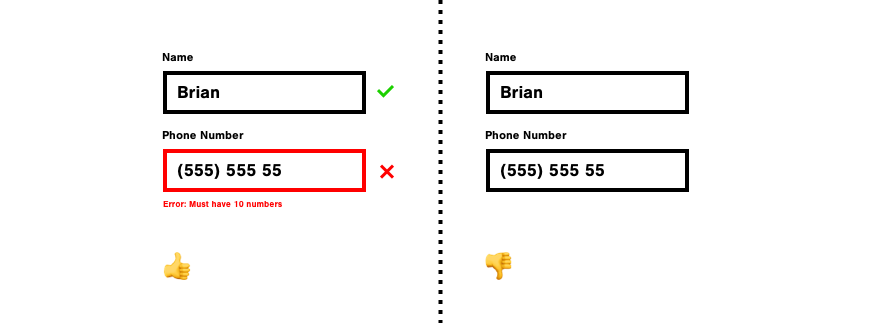
It’s important to have proper labels, a clear hierarchy, decently sized text input areas, and a range of text input states (active, filled out, error, etc.) to give users the right feedback and cues while filling out a form. Like alt text, correct form structure also helps people using screen readers to “identify and understand form controls more easily because they are associated with labels, field sets, and other structural elements.” (Source: https://www.w3.org/WAI/tutorials/forms/)
6. Avoid Blinking Content
When you attend a concert or event, there is often a warning for people prone to seizures to leave the event before any strobing effects begin. With websites, you don’t want any users to leave your site, so you want to avoid blinking, flashing, or strobing effects altogether. W3C’s guidelines put the limit at three flashes per second, and provide additional (but not required) techniques for avoiding any effects that may trigger a seizure.

More to Explore
In addition to these accessibility principles, there are many more to consider. Exploring resources like W3C’s Accessibility Principles and Tips for Designing can give you a fuller picture of what to consider when designing an accessible site. W3C’s Stories of Web Users is also particularly helpful for giving real-life examples as to why these standards have been established.
These accessibility guidelines are an advantage for anyone building a website.
Design is about problem-solving to provide visual solutions that work for any user, and accessibility guidelines empower website creators to produce their most meaningful work.
Not to mention that well-designed, accessible websites are a clear asset for your business.
While it’s nearly impossible to memorize these guidelines, or to even know all of the disabilities that may impair a user’s experience, it’s our duty as web designers to understand the core principles of accessibility, and to move forward making decisions with all users in mind.
Q&A
Does making a website accessible mean compromising design?
Making your website accessible does not mean compromising design or business goals. Accessibility often increases overall website value through wider audience reach, improved SEO, and creating better experiences for often-ignored user groups. It also mitigates potential lawsuits over website usability.
What are the key elements of accessible web design?
Key elements include high color contrast for visually impaired and colorblind users, scalable text sizes, established content hierarchy through proper heading tags, alt text for images and videos, properly structured forms with clear labels and feedback, and avoiding blinking or flashing content that could trigger seizures.
Why is content hierarchy important for accessibility?
Establishing hierarchy through type sizes and white space is a pillar of good design. Designating rank through appropriate tags like h1-h6 headers and visual cues like scale and font weight allows users to scan content not only visually but also through assistive technologies like screen readers.
What is alt text and why is it important?
Alt text is a text summary of non-text content coded into HTML that can be read by screen readers for visually and cognitively impaired users. Every image or video should have alt text. It’s not noticeable at cursory glance but is crucial to the web experience of certain user groups.
Eastern Standard builds accessible websites that work for all users. Our website development team ensures ADA compliance and inclusive design across all projects. Contact us about accessibility for your website.


