From Paper to Web: Tips for Successfully Transforming Print Materials Into Digital Publications
For almost any business, taking print-based publications and marketing materials to the web opens the door for exciting opportunities in user accessibility and content presentation.
But it’s a transformation that requires careful consideration of the medium. Because users experience content online differently than in print, the interface and experience needs to take several factors into account.
Provide Direction and Destinations
Print materials have the benefit of immediately communicating their volume by physical attributes like size and thickness as well as a Table of Contents with sections clearly labeled as you move through them. Online publications must use different tools to communicate place and scale. Whether you’re creating a digital annual report, viewbook, marketing brochure, or news article, you’ll want to define a set path (down one page or across several) that provides context for where users are at within the publication so they don’t feel lost or “stuck.” Clear destinations along the way give returning users guideposts to find their way back and new users a sense of scale to set their expectations.
Use obvious navigation to tell users everywhere they can go — but focus on making exploration possible from the content itself.
In many cases of physical media, a quick scan is the easiest way to find content. When possible, support that same experience. Most users are only scanning your content anyway. In a single page, use clearly labeled sections for your users to follow. For the website as a whole, strongly consider giving a means to “flip” through the content with prominent “Next/Previous” buttons or calls to action to other sections or pages.
Keep in mind that users are on your site for the content, not the navigation, so let them start there to find what they are after. However, navigation is still crucial as a means of finding content, especially when it spans many pages or topics.
While print media offers the ability to quickly flip through pages to find content, navigating online pages one at a time is a more exhausting process. Viewing an immediate list of pages with links is far more efficient once a user is ready to look for something specific or trying to understand all of the options that are available.
While online interactivity offers great opportunities for creative navigation, don’t fall into the trap of making your navigation more flashy than useful. Get your users to your content. It’s what they came for.
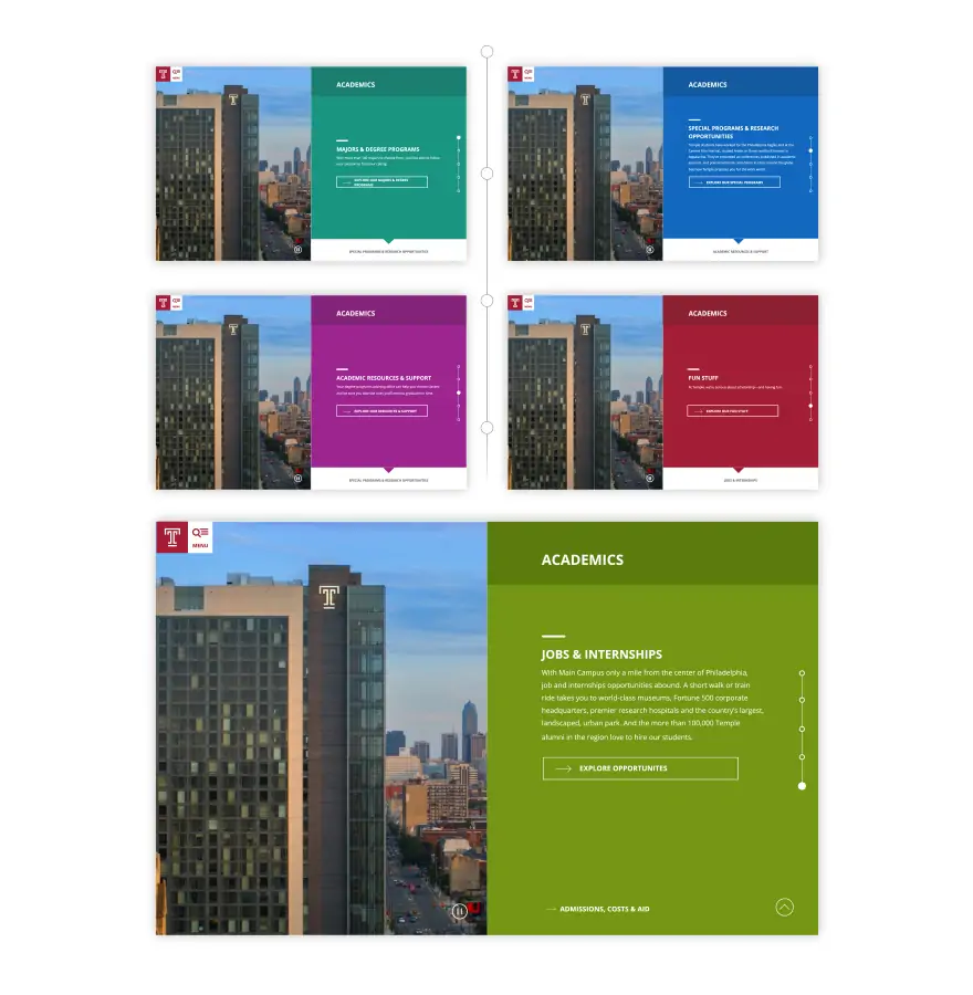
Temple’s Next Stop Viewbook, a digital version of a previously print-only publication, balances providing a flowing narrative to follow while giving users clear direction for specific content.
Make It Readable
While print materials come in a set size, modern responsive websites come in many. Because of that, you’ll need to keep readability in mind. Always preserve readability in line length, with 45–75 characters as an optimal range. Avoid painfully wide lines on wide screens or annoyingly short ones on mobile.
Regardless of screen size, the web offers an infinite canvas. Pages can be as long as you want. Take advantage of this and give users a comfortable reading space. Add breathing room around elements and please avoid shoving all your content “above the fold.”
Users do scroll, and they’ll love to do it if you give them a pleasant experience and compelling content.
Balance Depth and Brevity
Because “pages” do not have the same kind of limitations online, your organization of content can be more complex. Content can be collapsed into accordions or split into separate detail pages below a landing page. With these tools at your disposal, keep the content scannable, but don’t make your landing pages excessively brief and lacking in actual content themselves. Know both your content and your audience, and then customize the information based on how you expect they will read it (making sure to test your assumptions once they do).
If the copy is dense, consider collapsing it or putting it on a subpage with a meaningful link so interested users can dive in and others can ignore it and move on to the content they are after. Provide important, high-level information up front so users can quickly ingest it, then decide if they want to keep going or move on to another page. Not only will keeping a steady pace with your content make a more enjoyable experience, it will also enhance a user’s comprehension of where they are.
Avoid Dead Ends
Print material has a physical end. Online material doesn’t have to. Even if you have an “end” to your site’s content, link users back to other areas to support those who may have jumped ahead and out to your other online content. Always provide a next step to keep users engaged and avoid giving them an obvious opportunity to leave.
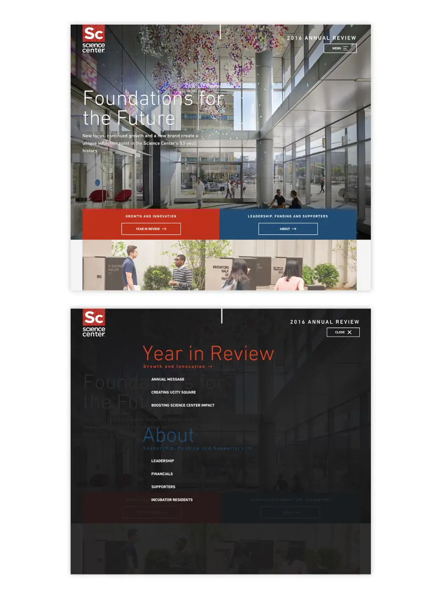
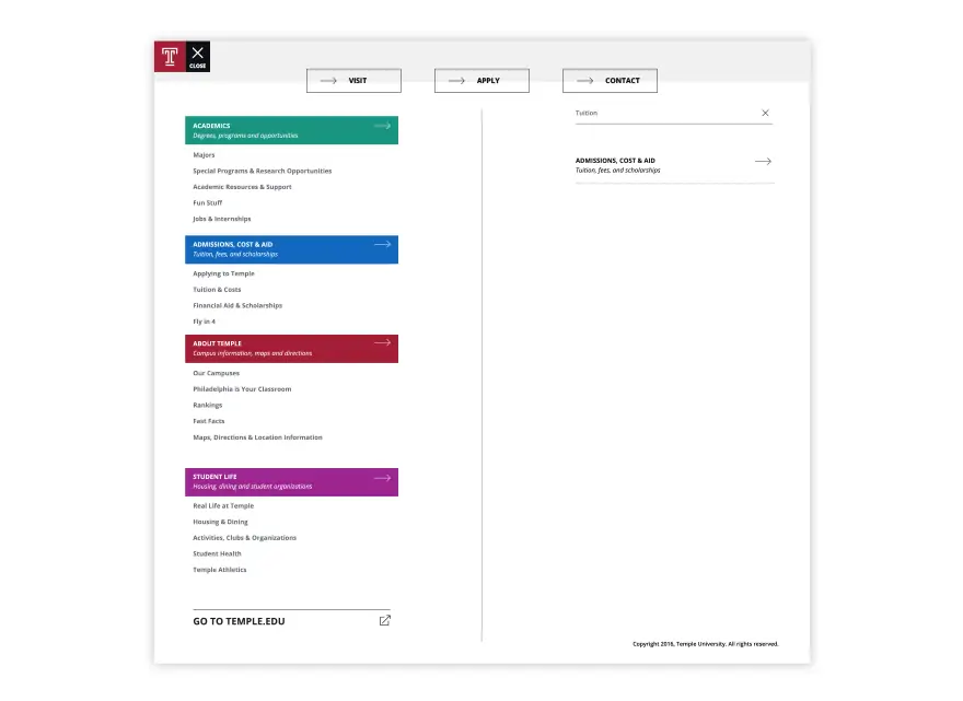
University City Science Center’s Annual Review uses simple, ever-present navigation to guide users through the center’s latest accomplishments.
Bringing print publications online offers massive potential for access, exciting opportunities for interactivity and incorporated media, and instant connectivity to other online content. I encourage anyone with printed annual reviews, newsletters, viewbooks, and beyond to take advantage of the medium.